In an age of increasing digitalization, where user data mining is the new gold rush, there is a movement emerging for wider personalization in design.
Large corporations like Google and Facebook have been able to collect millions of data points on all (un)registered users. This data is used to present close and distant friendships, agenda appointments, and can even predict if and when an employee will quit.
Through this data, (enterprise) companies can provide useful advice on upcoming appointments (e.g. automatically add planned flights from Google Mail to Google Calendar) and give people the latest news on the topics they prefer. These personalizations, when done right, create the sense that these products have the best interests of the user in mind—whether that’s true or not.
However, is this preferred? What is the overall emotional impact these personalized changes have on people’s lives? And what responsibility do these companies and their UX designers have in how personalization impacts design and emotion?
Personalization in design
When taking a closer look at the aspect of personalization in design, multiple patterns that are currently used in products and services are recognizable.
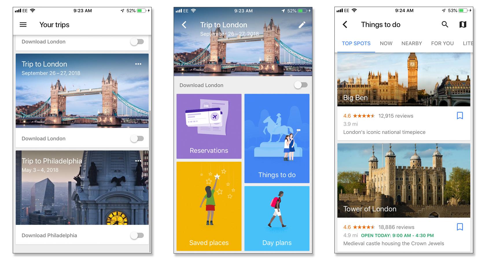
Take the example of Google Inbox. To provide the user with intelligent data based on the emails that he or she receives (e.g. tagging messages as personal, social, or newsletter), Google needs to implement user personalization to determine the right data to show to the right person.
Another example is how Facebook and LinkedIn provide a list of new contacts based on your existing contact list and your personal or professional preferences (e.g. your favorite movies or your current and past job roles).
[Read: Designers! Read this definitive guide on how to build apps for kids]
An important aspect here is how to present this to the user in a visual way that doesn’t create negative emotions (e.g. distrust or fear). Companies achieve this by presenting personalized data as a secondary visual element, and by using copy that focuses on guiding the user toward efficiently completing their conscious or unconscious goals. Of course, this is generally all done with the overarching goal of collecting more data to build out a digital fingerprint for every user, thereby increasing the business value of the company.
A first look at how personalized design will grow over the coming years shows that it will expand in the direction of IoT (internet of things) hardware. Google Nest learns a user’s preferred temperature, and Amazon’s Alexa uses natural language processing (NLP) to better recognize voice commands and minimize mistakes.
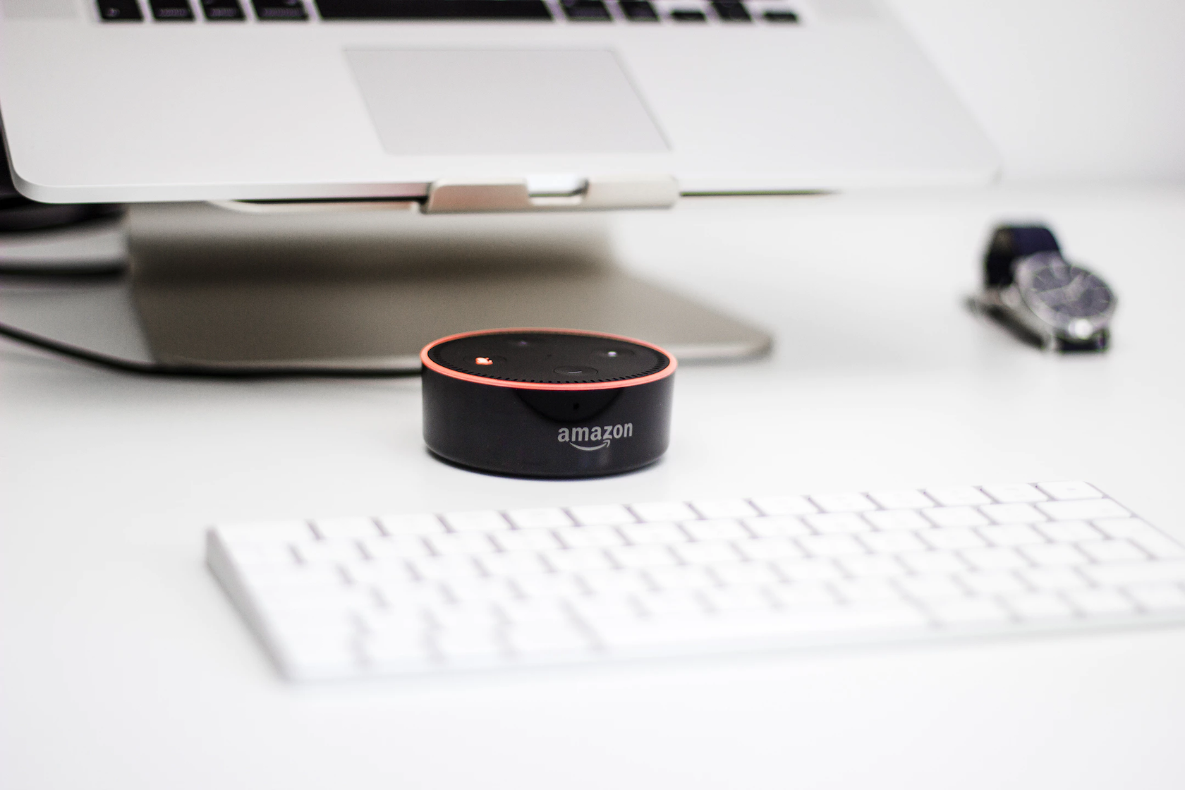
In both examples, personalized design isn’t limited to a digital screen, but carries over into the audio and visual aspects of physical, IoT objects.
In the example of Alexa, that among others can play a user’s preferred music or advise them on new recipes, it’s important that the digital voice appeals to the user. This is why companies like Amazon and Apple spend so many resources on making sure that the voice experience of their smart speakers is as pleasing as possible for the user.
Simultaneously, the physical object should have a pleasant feel to it and should be able to blend into a variety of environments, from homes to offices. This is why many smart speaker manufacturers create their products in a range of colors and materials (e.g. Sonos, Bower & Wilkins, JBL).
Design and emotion
In 2003, Don Norman coined the term Emotional Design in his book of the same title. While early editions of the book focused largely on the importance of emotion in physical objects, later editions focused more on the importance of emotional impact in digital designs.
Norman believes that good emotional design works on three levels: visceral, behavioral, and reflective. In short, the visceral level concerns itself with the aesthetic or attractiveness of an object. The behavioral level considers the function and usability of the product. And the reflective level takes into account prestige and value; this is often influenced by the branding of a product.
Norman strongly emphasizes that technology should bring experiences of pleasure and joy to the user. It’s important to be aware of this, as it sets the stage for implementing emotional design into new products and services.
To implement emotional design into a digital product, designers need to be aware of the effect certain design decisions have on a user’s short and long term emotions. Especially when focused on branding, where affinity, loyalty, and advocacy play a considerable role in the success of a business.
To achieve this level of emotional bonding with an audience, designers can take Don Norman’s three principles, and add to that the decision a business needs to make in terms of how they want to be perceived.
While some companies use positive emotional triggers, others use specific negative UX and psychological triggers to generate the user actions they want. Booking.com, for example, does this through a variety of patterns. They create a sense of urgency in users by showing when there are a limited number of rooms left, which also creates anxiety over missing out on a great deal: “I have to book now as there is only one room left.”
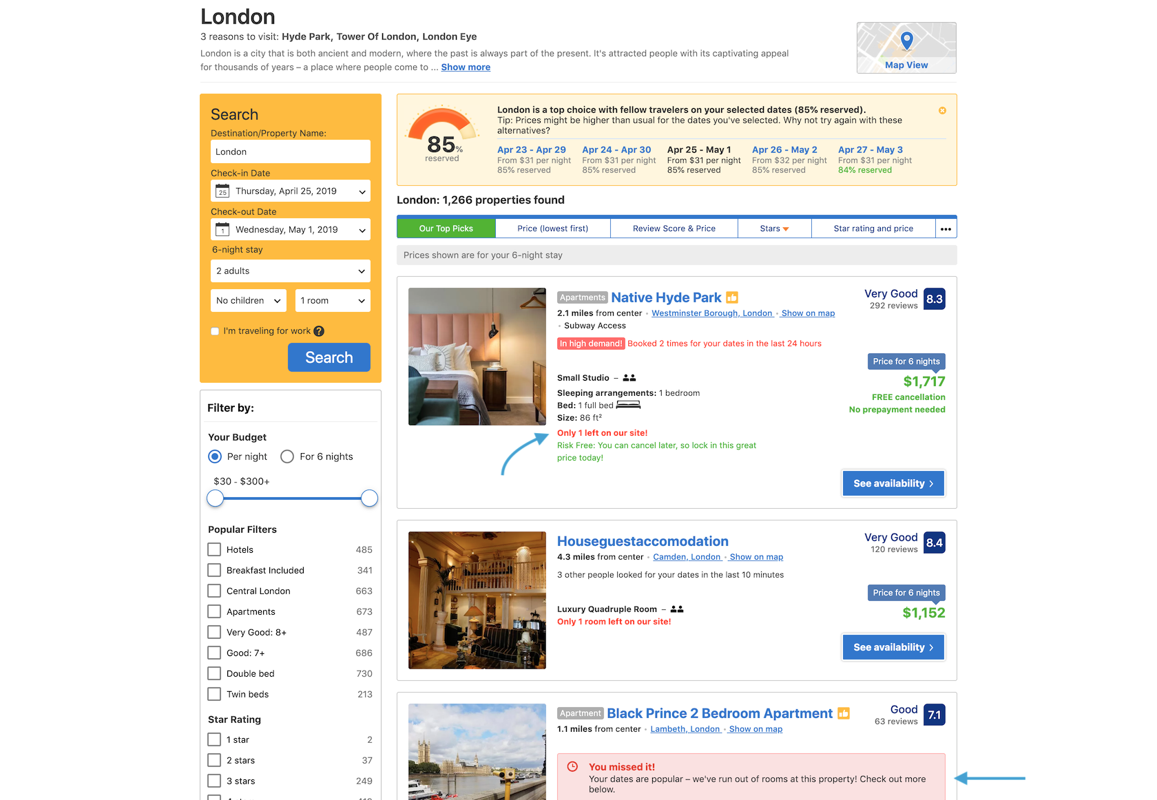
They also create a sense of scarcity by showing hotels that are already sold out, complete with a timer showing how long ago the last room was booked. That can also create feelings of sadness for the user, as well as adding to their sense of urgency: “The room I wanted is already booked. I better hurry up and book my next choice before that’s gone, too.”
Negative emotional triggers aren’t necessarily a bad thing. There are plenty of things people do in life because they want to avoid negative repercussions if they don’t do them (e.g., people pay their utility bills because not paying them results in services being shut off, not because it makes them feel good directly). But if an organization wants to remain on the right side of business ethics, they need to use negative emotional triggers responsibly.
While negative psychological triggers can be very effective, so can positive emotional triggers that aim to enrich a user’s life instead of scaring or stressing them into action.
Combining a user experience based on actual research with an aesthetically appealing user interface lays a solid basis for using positive emotional triggers. Understanding the target audience is vital to creating triggers that will effectively elicit the desired action.
Spotify is an excellent example of a company that uses positive emotional triggers in their product. Their mobile and web content personalization features can delight users, especially their custom mixes based on a user’s recently listened-to tracks. They’re also sensitive to user needs on things like push notifications, which are only sent when something that a user would be really interested in happens, like when one of their favorite artists drops a new album.
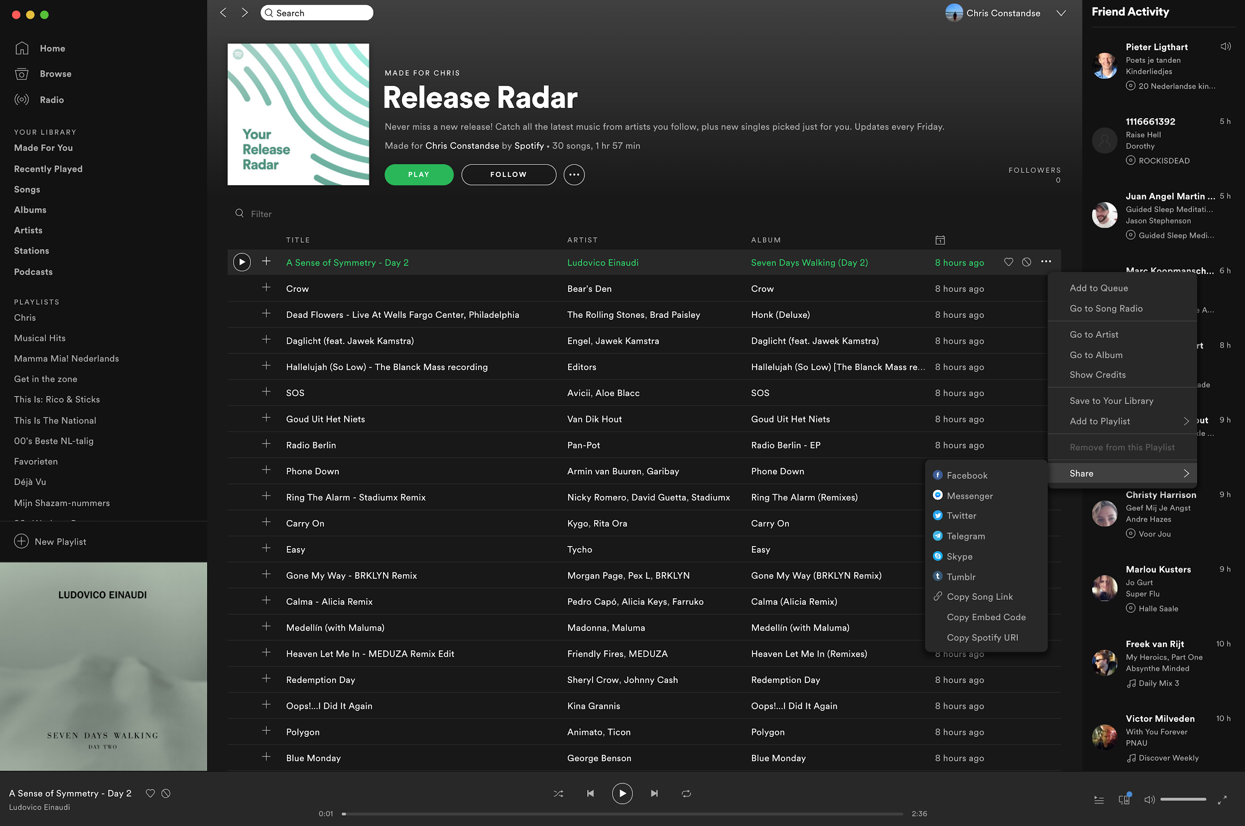
Spotify’s interface is also appealing to a large swath of potential users since their audience potentially includes anyone who listens to music—which is most people. It’s easy to use and makes things like sharing via social media intuitive and simple.
Understanding core motivations, both positive and negative, is vital to creating any kind of emotional trigger in UX design. User research can reveal to designers what their specific audience desires as well as what they choose to avoid. Using this information, designers can then decide whether negative or positive triggers will be most useful in getting people to the actions desired. Creating personas and archetypes can also be useful in this process.
Combining personalization with emotional design
Combining the personal and the emotional is where the real magic happens. Personalization in design is all about visually communicating a message that is aimed directly at the individual user. Emotional design focuses on the overall emotional impact design choices have, including those that involve personalization.
To create a personalized product that appeals emotionally, it is important for designers to be aware of the how and why before they begin communicating a particular message to the user. The reasoning here is that in order to establish a positive emotional relationship with a user, a business needs to create a sense of trust with their customers.
Before embarking on a new design project, designers should make sure they know the answers to these questions:
- What is the purpose of this product?
- What are the goals of this product?
- How should this product be perceived by its users?
- What kind of emotional reaction should it achieve?
Once these questions have been answered, a designer can then decide what types of personalization would serve users in context, and figure out how to create an optimal user experience. This can be done in many ways:
- Push notifications should never be intrusive, but should instead enrich UX. Messages should be personalized according to the user’s needs and preferences.
- When assisting the user with specific automated actions (e.g. adding a restaurant reservation directly to their calendar), provide them with the option to accept or decline this type of automation (give the user control).
- When urgent action is required, due to something like a breach of sensitive information (e.g. password data has been stolen), make the user aware of the situation through authoritative copy and a personalized message (a confident sense of urgency should be created).
Equally important are Norman’s visceral, behavioral, and reflective levels. When creating a personalized design that should appeal to the emotional side of the user, consideration of these principles is vital.
One thing designers should note is that personalization can carry privacy concerns for many users. It’s important for a brand to build a level of trust that’s appropriate for the level of personalization being offered. Without trust, personalization can feel like an invasion of privacy and turn users off, which creates a negative emotional reaction.
Conclusion
When looking to the near future, we can expect that personalization in design will play a more significant role in our digital landscape. With the goal of creating more extensive user profiles and, as a logical consequence, an increase in revenue, the analysis and mining of user data will become more extensive and valuable.
However, what’s especially interesting to keep an eye on is how companies will handle the emotional effects triggered by their apps and services. With more options to choose from than ever, customers now have the ability to make their decisions based on feelings. For example, Apple Music, Spotify, and Deezer all have huge music libraries with millions of songs, for approximately the same monthly subscription cost ($10). How enterprises large and small will implement emotional triggers to create products people love to use, that simultaneously trigger positive emotions will be vital to their success in the 21st century.
In the future, design will continue to play a huge role in the emotional perception of products, services, and brands. It will only be a matter of time until the role of an “emotional engagement designer” will become a separate specialty aside from the user experience designer. Their entire job will be to create a design that will appeal to the exact user group being targeted, and create a delightful experience before, during, and after their use.
The Toptal Design Blog is a hub for advanced design studies by professional designers in the Toptal network on all facets of digital design, ranging from detailed design tutorials to in-depth coverage of new design trends, tools, and techniques. You can read the original piece written by Chris Constandse here. Follow the Toptal Design Blog on Twitter, Dribbble, Behance, LinkedIn, Facebook, and Instagram.
Get the TNW newsletter
Get the most important tech news in your inbox each week.

