When it comes to app design, 2015 is the Year of the Card.
Screen-size cards are everywhere, from websites to native apps and are designed to look like their physical counterparts. It’s an easy way for you to shuffle through a series of digital containers with the flick of a thumb.
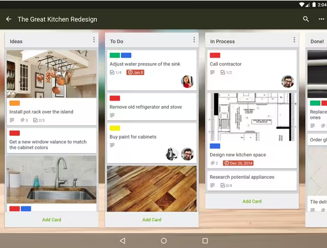
Photo credit: Trello
Regardless of how you feel about the concept, cards are here to stay. Frankly, cards are a style that seems just made for apps. There are so many apps using cards nowadays, that you almost don’t even think about it.
Let’s do a little experiment. Pick up your phone. Open the first 10 apps you see. How many feature cards?
Now that we’ve established how cards dominate mobile design, let’s dive into how you actually use them.
Card-Style Interfaces 101
Card layouts put information — images, text, buttons, links, etc. — into a series of rectangular containers. These blocks can be layered or moved and tend to adjust to the size of the screen, stacking and falling into columns if you turn your phone on its side.
Cards are neat little containers for information. And as pointed out in the e-book Mobile Design Trends 2015 & 2016, it’s best to think of each card as a singular thought, or primary action.
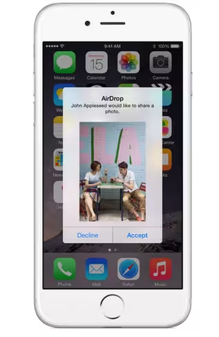
Photo credit: Apple AirDrop
Consider the common AirDrop function on Apple devices. When you have incoming data, a card pops up with a notification to accept or decline — a single action no matter the choice you make. The action works in the same way whether you are on a phone, tablet or computer, which means that the user easily understands what is supposed to happen and how to use the design.
While the proliferation of cards is fairly recent, the design is not all that new. Pinterest really gave first life to cards as a dominant design technique. But plenty of other companies soon followed.
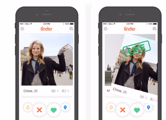
Photo credit: Tinder
One of the reasons cards became a popular design choice is their compatibility with mobile screens. The digestible chunks are a perfect match for most mobile user scenarios while the rectangular aesthetic also works well for the UI design.
Just think about the design of a card: it’s almost the exact shape and size of a mobile phone screen. (Not exact dimensions because of all the different models available, but a good representation based on aspect ratio.)
Card-style design lies at the intersection of design for desktops and mobile devices, bridging bridges the gap between interaction and usability.
Cards create a consistent experience regardless of device. This is even more true when thinking about responsive design since cards act as “content containers” that easily scale up or down (like restacking boxes).
Two Distinct Uses for Card-Style Design
When it comes to cards, they are most commonly being used in one of two ways: as the interface or as a distraction within the interface (often in the form of advertising).
1. Cards as the Interface
Sometimes you don’t even see the cards in the design since they’re perfectly sized to the screen. But you can still identify the techniques if you pay close attention.
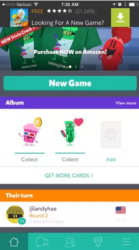
Photo credit: Trivia Crack
Card-style interfaces are often one-touch elements. Tap or swipe anywhere on the screen for an action. Cards are also used as a reward in gaming interfaces.
Take the popular Trivia Crack, for example, the home screen is a series of cards that organizes each game and opponent. It also embeds an advertisement (cleverly disguised as a card) and in-app card collection as another level to the game. The card stacking makes the game easy to use and understand.
2. Cards as the Distraction
Cards are also a very common style of mobile and in-app advertising, with elements that drop down to cover all or most of the screen. Unlike the interface-style card, these cards contain two links – one very large and one very small. The large link gets you to the product being advertised. The tiny link (which is often difficult to activate) takes you back to the original interface.
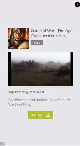
Photo credit: Trivia Crack in-app advertising
Let’s keep thinking about Trivia Crack. After your turn is complete, an ad fills the screen. It too is a card. These advertising containers can include a static image, sound, video, and a variety of other bits of information to help persuade you to engage with the paid card content.
From a UX standpoint, the advertising feels more integrated within the overall interface. Even though the ad might occupy the screen, the transition is less jarring since you’re just layering cards on top of each other.
Cards help users browse information quickly and provide direct business value with visually consistent advertising.
Cards Work Well With Content
Cards are design “containers” that can hold almost anything. Because cards can work with various types of content, they are perfect for content-heavy sites and apps. Nothing gets left out when creating this type of universal framework.
Photo credit: Card Star
Think of all the different elements cards can contain:
- Photos
- Text
- Video
- Coupons
- Music
- Payment information
- Signups or forms
- Game data
- Social media streams or sharing
- Rewards information
- Links
- Combinations of these elements
Placing content in cards makes it digestible for users, who can quickly scan and swipe. When used in a typical layout, like the Card Star example above, cards are equal players on the screen, neither one dominating the other. They provide variety without clutter, allowing users the power to engage in any way they want.
Cards and Behavior Patterns
Cards are made for thumbs. It sounds very primitive, right? But it is a key part of the popularity and usability of cards when it comes to mobile app design.
As explained in Mobile Design Trends 2015 & 2016 by UXPin, what makes cards easy for users is that this digital interface mirrors reality. Think about how you would handle a deck of physical playing cards. You can stack them, expand them, turn them over, spread them out, fold them and put them away in another container. Digital cards behave in the same ways, making a comfortable experience for users. Users don’t have to think about how to make things work.
The design can then take this physical idea of cards to the next level when thinking about apps in the digital sphere. The metaphor transfers over seamlessly.
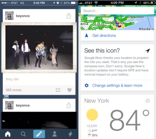
Photo credit: Tumblr (left), Google Now (right)
When users interact with cards they fall into a handful of behavior patterns, according to a great talk on cards by UI designer Chris Tse. Cards tend to do one of three things: record information, tease users with information or alert users to information.
That further breaks down to different types of containers for each of these card elements:
- Narrative: Cards appear in a stream, creating a natural timeline of events. Think about how Medium uses cards to present a quick overview, then deliver the details of that story in a linear flow.
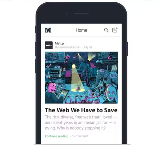
Photo credit: Medium
Discovery: Cards allow relevant content to naturally reveal itself. When presented in a grid or stream layout with fade-in effects, the cards feel fun and inviting. Take a look at Spotify’s card pattern below: as you swipe left or right, you reveal songs that match your tastes.
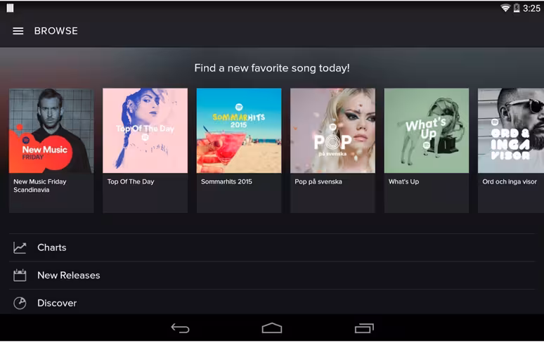
Photo credit: Spotify Android App
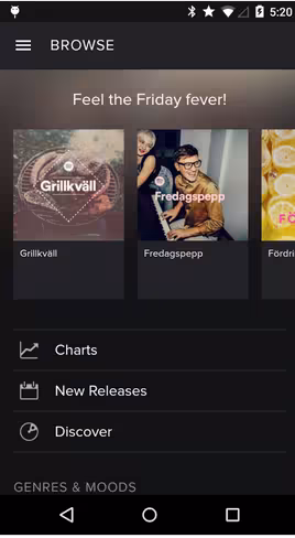
Photo credit: Spotify Android App
Conversation: Since cards are self-contained, they’re perfect for representing ongoing conversations. In the below example from WeChat, notice how the interface uses the Law of Proximity to create the card with close spacing between profile picture and text. The two pieces aren’t physically connected, but our mind helps close the gap.
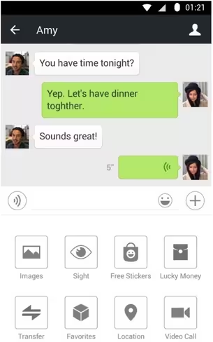
Photo credit: WeChat
Workflow: Cards are easily categorized for a quick to-do list of tasks. With Evernote, for example, you can create cards that each represent a note or to-do item. As you erase them, the remaining cards rearrange themselves naturally back into position.
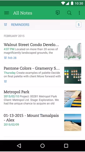
Photo credit: Evernote
Now let’s think about cards from a multi-device standpoint. While cards often live within the container of a particular app, they can also move between apps, devices and users. (Think back to the AirDrop example, where one user transmits a card of information to another user.)
Cards Are Easier to Organize
Like their physical counterpart, cards are easy to organize for both designers and users. When it comes to the actual design of cards, you’ll need to make a few important decisions.
What size will the card be? And what type of aesthetic are you trying to create?
When it comes to container size, the most popular options are: small, summary-style cards; a medium-sized option that fills part of the screen or allows for multiple cards; a full-screen card; or a card overlay that pops up on top of other elements.
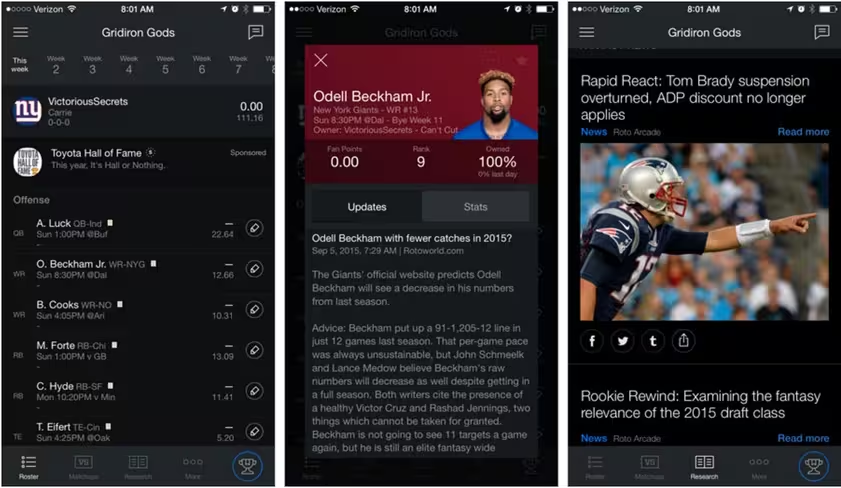
Photo credit: Yahoo! Fantasy
The Yahoo! Fantasy app actually delivers cards in each of these ways. The first screen shows a player roster, where each player name is a card. Tap a name and a new card pops up with detailed player information in an almost full-screen layered style. Switch to the news stream for full screen stacking cards that take you to recent headlines, pertaining to your league or team.
Each of these different cards makes it easy for the user to know what content they’re digesting and where they’re in the the app. Layered cards, for example, are understood as extra information on the screen (such as the detailed player card above).
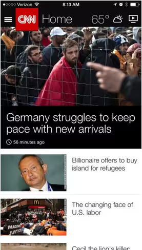
Photo credit: CNN
Cards have evolved aesthetically as well. While the overall trend is moving to less “gimmicky” card visuals, it is important to understand the evolution of the design (and why some of these patterns continue to live on).
Pins were made popular by Pinterest and are still quite popular although they often result in designs with similar aesthetics.
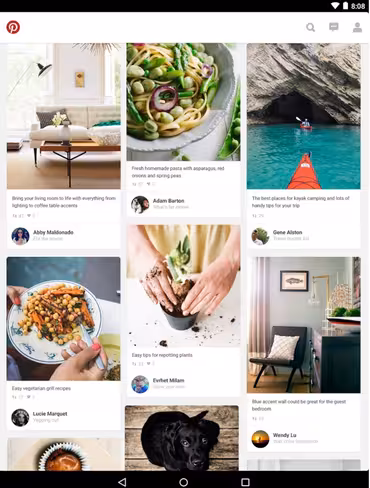
Photo credit: Pinterest
Metro (from Microsoft) and flat-style cards were some of the earliest uses of cards specifically for apps and mobile devices. While Metro-style cards aren’t used very much anymore, flat in particular continues to grow and evolve as a popular card-style option.
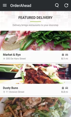
Photo credit: Order Ahead
Grid or masonry styles are one of those classics that just seem to work. Cards in a neatly packaged container allows flexibility.
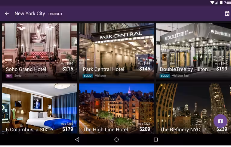
Photo credit: Hotel Tonight
Magazine-style cards are starting to emerge even more in apps, especially those for news sites or where there is a lot of text to display. Flipboard, CNN and Newsify all use this style.
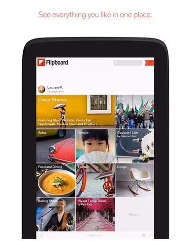
Photo Credit: Flipboard
Thinking Aesthetically
Finally, what makes cards work is good design and great usability. Because of all the content options available with card-style design, you need to be an expert in everything from typography to color, image use, and cropping. Design theory is your best friend when planning and executing this type of framework.
UX designer Erik D. Kennedy wrote a fantastic two-part article (part one and part two), that breaks down the basics for in a practical manner. Here are his rules that we think apply most to card pattern design:
- Understand the physical properties of lighting: Consider carefully how you use shadows and gradients to make elements feel “real.” This is especially important when it comes to card design. If the shadows are cast at all corners and sides, then the illusion of it being a physical element is ruined.
- Ensure the UI works in black & white: Design without color first. This will allow you to focus on what’s important — usability and content. According to Kennedy, you should add color last and only with purpose.
- Apply white space generously: Give your cards some space to inhabit, then slowly scale back. As we described in the Zen of White Space for Web Design, negative space is your ally in organizing and separating elements.
- Master the art of layering text: This can be tricky. Be sure to use a clear, crisp image for the background. To ensure text looks good, you can use a dark overlay, put the text in a box, or blur the background image.
- Know how to create contrast with typography: Draw users’ attention with the use of either big, bold text or smaller text with less weight. Simply typography often works best when it comes to cards. A sans-serif typeface with medium weight for the card headlines and normal weight for body copy.
By giving cards a bit of aesthetic polish, your card design feels familiar yet still creative. Elements like shadows go a long way in making users relate to the cards as they would with their physical counterparts.
What’s Next for Mobile Card Design?
You are probably getting a good feel for why card-style design is increasing in popularity.
And it’s a trend that won’t die out any time soon. That means more card-style apps and interfaces, including designs that use more layered cards, cards that look less card-like, a rebirth of flat cards and strong use of cards for sites with a lot of content.
Layered cards using Material Design characteristics are going to hit us in a major way. Layers will emerge in two ways:
- As subtle container elements, such as shading or shadows that set cards apart from the container element.
- As stacked card elements that you can swipe through on the screen, rather than scroll.
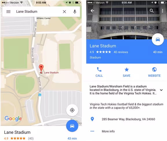
Photo credit: Google Maps
Google Maps uses layered cards to help users navigate. Look at the example above, which contains a base map of a location and two distinct cards, one at the top and one at the bottom. The top card is the identifier and helps you map the location, while the bottom card expands for site-specific details that can be swiped over the initial map.
Designers will eventually look for new ways to make cards less … well, card-like. The common aesthetic pattern is a image or video, then headline, followed by the main text in a stack so that none of the elements really touch each other.
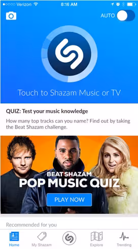
Photo credit: Shazam
Card design will likely take on characteristics of other design trends, such as hero headers or adding buttons on images.
While the outline and framing of cards will be maintained, the design will keep changing, especially for larger card styles. Some apps already do this. Take Shazam (see above), which stacks cards along with other elements, such as text and buttons, all within a single container. The design is sleek and highly usable.
While flat design never really went out of style, its evolution will continue to inspire cards. Cards in this style will include plenty of color, streamlined typography and subtle design tricks to help users navigate content.
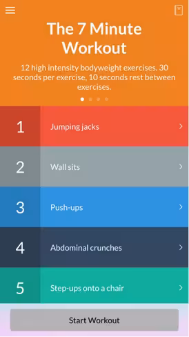
Photo credit: The 7-Minute Workout
The 7-Minute Workout app features this type of flat style with rows of colored cards. Each expands to another card with instruction for the exercise that includes embedded content such as images, text and video.
More content-heavy sites will likely shift to card-style interfaces. Right now, this is the best method for organizing a lot of content in a manageable way. The packaging is almost newspaper-esque in that every piece of content comes in a box ready for users to digest.
Photo credit: Facebook
Facebook continues to be a great example of content-driven card design, and will continue to lead the way with more news- and blogging-based features. As one of the dominant places where people find a lot of content, it is not surprising that their card style interface and patterns will only encourage others to follow.
In the end, cards are here to stay and will continue to be a fixture in mobile app design. The trick is to now build upon the common design language created with cards to find more interesting ways of incorporating them into our apps.
For more useful mobile design techniques, check out the free guide Mobile Design Trends 2015 & 2016 by UXPin. 79 examples of outstanding mobile design from companies like Slack, Tinder, Waze, and others are deconstructed into simple design techniques. The book also includes 61 useful resources for mobile design.
Get the TNW newsletter
Get the most important tech news in your inbox each week.