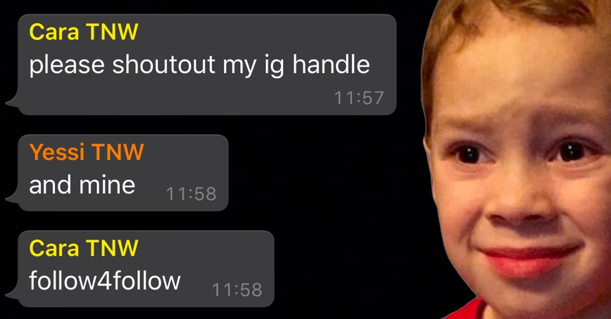
When Apple officially rolled out dark mode for iOS back in September, most apps were quick to update to accommodate the new theme. Facebook’s WhatsApp, the most popular chat app in the world, took six months to get its shit together. Unfortunately, the new theme is bumming me out.
Since this week, WhatsApp now supports dark mode on both Android and iOS, and it looks like something out of a badly designed 80’s sci-fi movie. Have a look:
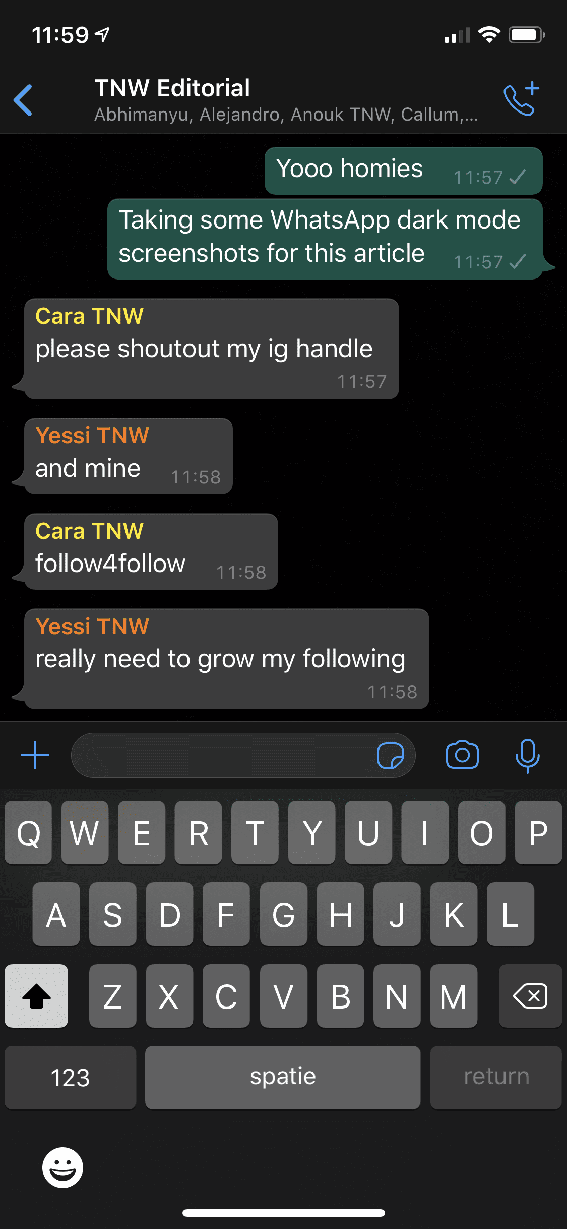
It hurts my eyes and it bums me out, especially when I think about how I’ll be stuck staring at this dogshit theme a couple of times per hour every day. WhatsApp is my main mode of communication, and they made it ugly.
Now I’m not a designer so I can’t tell you how this happened, or what makes it so ugly, so I asked TNW’s head of design, Alexander Griffioen, for his expertise..
Alexander said the theme reminds him of the Monokai theme coders use in their development environments. “They didn’t put a lot of effort in optimizing it”, he continued. “The contrast of the name colors on the mid-gray bubbles is terrible compared to light mode, where the colorful names sit on a crisp, white bubble. This just isn’t friendly-looking, like light mode is. It’s… muddy.”
Hear hear, Alexander.
It’s especially baffling considering that Instagram was one of the first apps to support dark mode and looks great doing it. Facebook Messenger just got updated to finally support dark mode too and, like Instagram, it looks perfect. You’d think the different design themes of these Facebook-owned apps shared some of their knowledge.
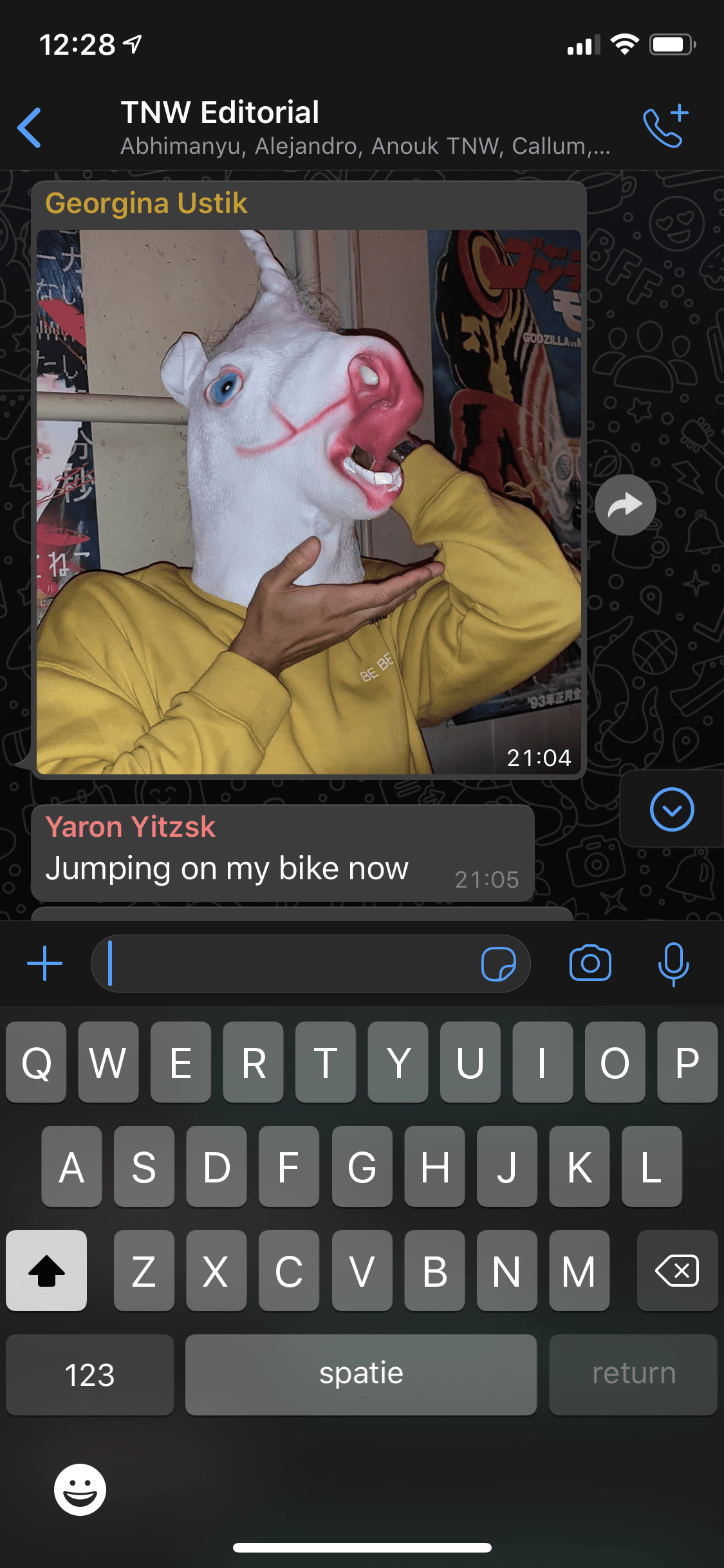
You can alleviate some of the pain by picking the right wallpaper. The default one looks bad:
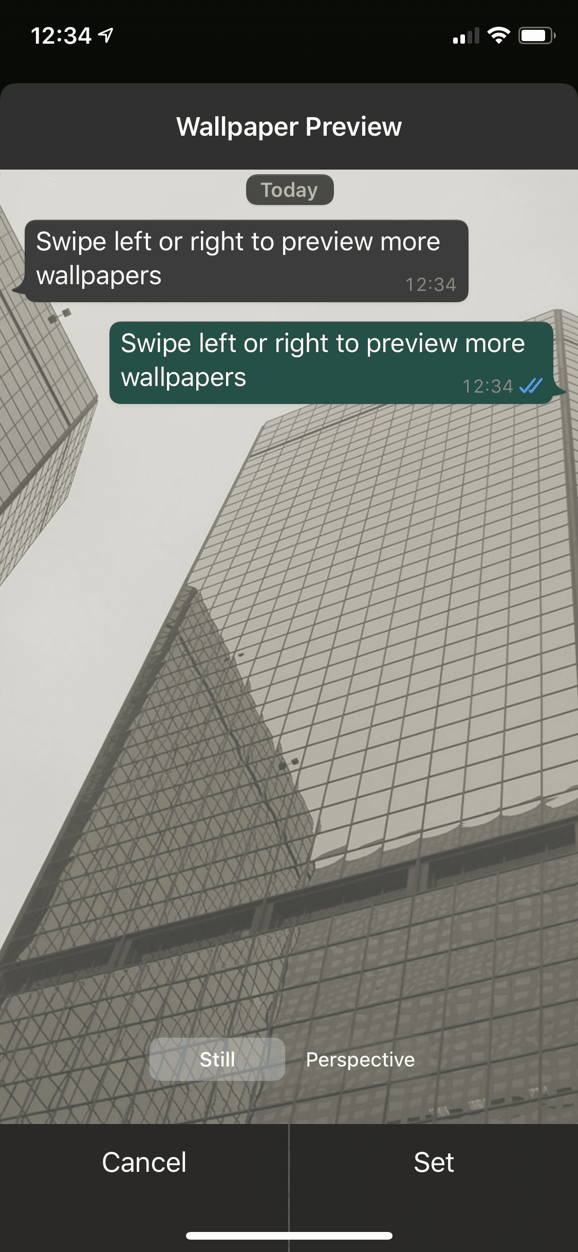
This one photo from WhatsApp’s built-in wallpaper library looks better:
Unfortunately there’s no easy on/off-switch for dark mode on iOS. You can use iOS’ Shortcuts app to switch your entire phone (and thus the app) to light mode with these settings:
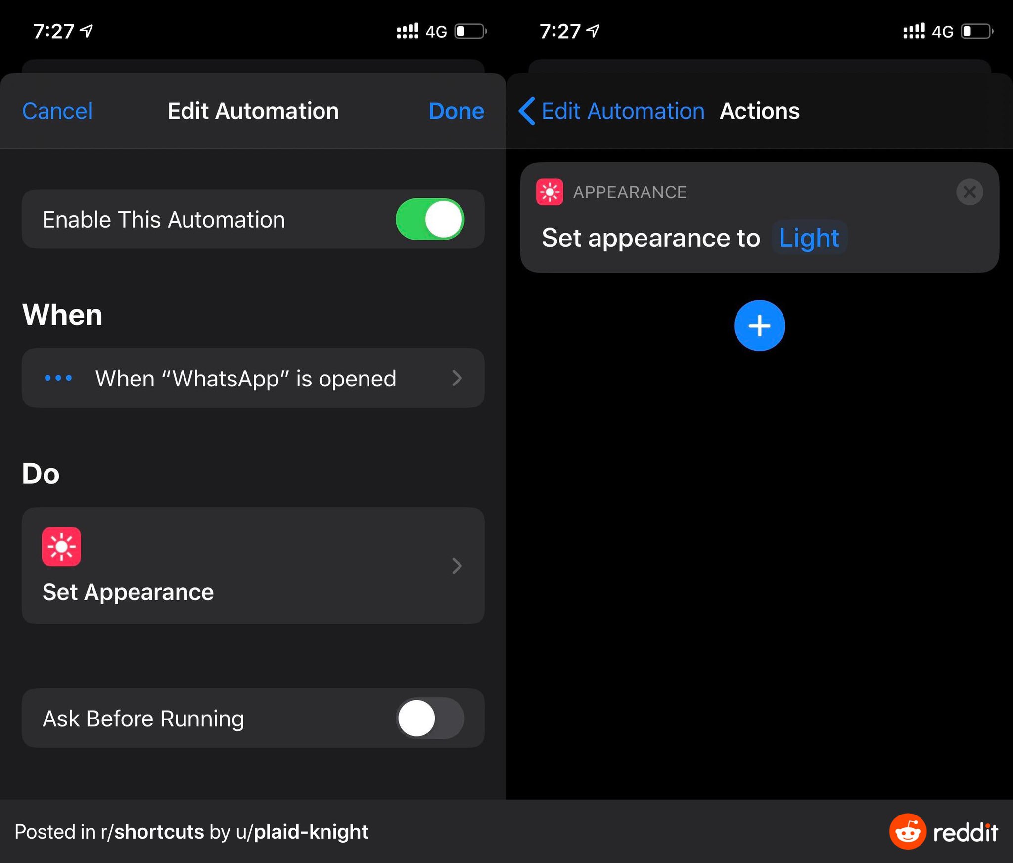
But it’s not an ideal solution.
I don’t expect WhatsApp to address this problem anytime soon. If it took them six months to implement this ugly-ass theme, I can’t imagine it getting fixed quickly either. I guess I’ll just have to live with the fact that my most-used app got ugly.
I hear you screaming ‘cry me a fucking river, Nino’ to your screen and you’re not wrong, but let’s face it; this article would be boring if I was being reasonable about this whole thing.
Get the TNW newsletter
Get the most important tech news in your inbox each week.

