When first starting out on a project, major aspects of a site like color, form, shape and whitespace get all the attention. Of course, these traits are extremely important, but it’s imperative to see that larger elements of your site aren’t the only things that deserve your attention. Experienced designers know that what makes or breaks a website is often hidden in the details.
Little Big Details, curated by Floris Dekker of Gidsy.com, offers up a much-needed dose of UI inspiration that takes a deeper look at the user interfaces we use everyday, and deciphers some of the hidden gems. Think of it as Dribble but with follow-up rational for what’s exactly special about each screen grab.
LBD collects exemplary UI designs, looking at the finer details from popular sites we use everyday like YouTube, Twitter and Gmail. It gives designers the chance to see why some experiences are so enjoyable, even if the best parts go unnoticed.
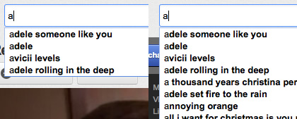
YouTube – When typing in the search box, the autocomplete dropdown size will be limited so it doesn’t cover the video.
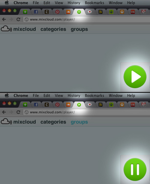
Mixcloud – The favicon indicates whether the music is playing or paused.
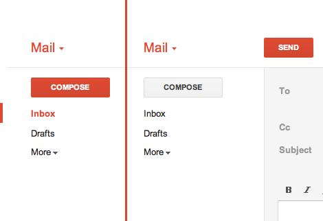
Gmail – While in the inbox, the Compose button is red. Then when composing an email, the Send button is red instead.
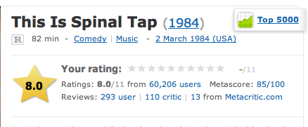
IMDb – The rating for ‘This is Spinal Tap’ goes up to 11
Little Big Details shows that you can’t shy away from looking at your design on a pixel-by-pixel level. Subtle signals of what’s been selected, visual cues during loading and highlighting important information in special contexts are just some of the ways to drastically improve user experience while keeping your design beautiful. If you neglect the details, your users will often hate the results without even understanding exactly why.
Check out the site and let us know what you think in the comments below! Do you have a favorite UI (or even UX) detail to share?
Get the TNW newsletter
Get the most important tech news in your inbox each week.


