As the prices of apps have fallen towards free, many developers have turned to either freemium or ad-supported business models. While many of these apps are simply crapware, there are some high-quality apps that thrive displaying ads or selling virtual items via in-app purchase.
When app developer David Barnard got set to introduce the newest version of Appcubby’s app Timer, he was also introducing a new business model for the app. When it was introduced, the app was $0.99 on Apple’s App Store. A fair price for what I thought was a well designed and executed timer app.
A few weeks later the app would go free and see an enormous boost in downloads, a pretty standard occurrence when apps drop their price to zero. Over the next few months, Timer would remain free, with no ads and no in-app purchases.
Then, yesterday, Barnard launched the new version of Timer with a set of in-app purchases offering pictographs to customize timers, themes for the buttons and packs of sounds. A nice set of well-designed purchases that aren’t necessary but allow for customization.
I spoke to Barnard yesterday about the new business model of Timer. “As a small indie app developer, I’ve spent quite a bit of time over the past few years thinking about the future of apps and how to build a sustainable business selling apps,” said Barnard. “I’ve dabbled with freemium in the past, but seeing Sparrow sell out to Google this summer was a bit of a wakeup call.”
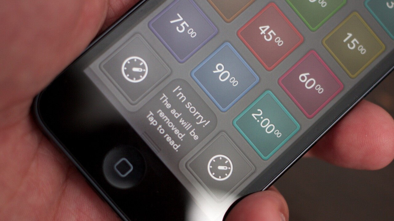
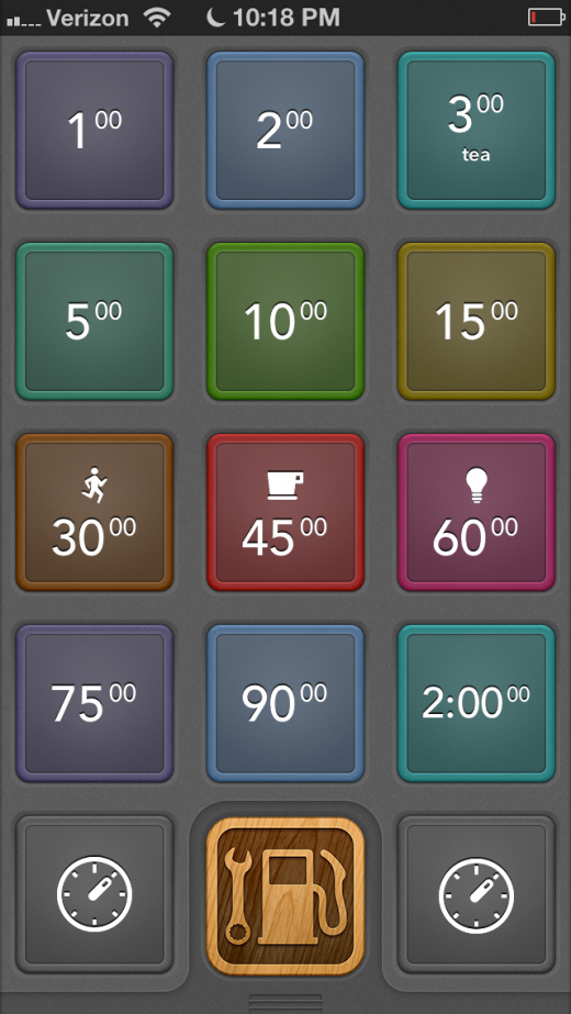
But that switch to freemium wasn’t the most interesting bit about the app. It also included an ad. One of the most clever that I’ve seen in any app I’ve reviewed so far. It took the form of a simple app icon, you can see it in the screenshot below:
Barnard says that he felt it was clear he needed to give freemium a chance with Timer, but he wanted to do it in the right way.
“Manipulative free-to-play games have given freemium a bad name,” he told me. “My goal with Timer 2.0 was to see if I could make money on freemium without being a jerk. And that’s ultimately what led to using just an icon as an ad.”
Barnard planned to both ship paid ads in this slot and to trade ad impressions with other developers.
And that icon, which I think is an extremely clever way to present an ad in an app, was incredibly effective. Barnard said today that he was seeing a tap-through rate of 24%, which, if you know ads, is insanely high. Normal ads have a rate of around 1-3%.
Unfortunately, the rates were too high. It seems that many people simply didn’t see the ad as an ad and were tapping through on accident. Timer’s reviews quickly filled up with folks who were either irritated at the way the ad was presented, or annoyed that there was suddenly an ad at all in their free app.
Today, Barnard made the decision to remove the ad from the app entirely and to apologize to customers in a blog post.
“I don’t want to trick people into tapping on an ad, and even if I were a jerk and did, the ads wouldn’t be very valuable since people weren’t intentionally tapping with the intent of learning more about one of the advertised apps,” says Barnard.
There were certainly ways that he could modify the ad to make it more clear that it was an ad, perhaps a red banner like the ‘new’ banner on iOS apps, but that says ‘ad’. But, since he feels that it was a fairly major false start in the process, he’s decided to remove the ad completely.
In the end, it was an honest mistake made by a developer who has been extraordinarily open about the development process and his experiences in the business. I was never confused about it being an ad, even in the beta versions of the app before it was explained to me what it was. But, as the app had some initial paid customers who were disgruntled that they’d now be served an ad, and as the ad appeared to be just a little bit too confusing, Barnard decided to remove it.
“I think the ad could work if it had some sort of “Sponsor” banner to help people know what it was,” says Barnard. “But given how badly I handled everything else, I think pulling it was the best move.”
As the App Store gets more and more friendly to low-cost or freemium apps, developers will have to continue to get more clever about the way that they serve ads and sell virtual content. But sometimes, they have to be careful about being too clever.
Get the TNW newsletter
Get the most important tech news in your inbox each week.


