One of the best ways to improve as a designer is to study the greats. There’s no doubt that Candy Crush is one of the best selling mobile games of all time, but how does its UX hold up?
Consistency
Consistency is one of the best ways to get your users comfortable with your product. If they know what to expect from screen to screen it will cut down on confusion.
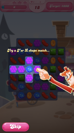
Candy Crush is consistent in its style. Sticking with a bright, playful tone that can be seen across the fonts, sound effects, animations, etc. Unfortunately, this playful style can be detrimental to clarity. For example one of the fonts they use is stylistic and can be hard to read. This doesn’t mean fancy fonts should never be used, but you need to consider where they would be appropriate; a tutorial is not one of them.
Read: [Designer turns Dragon Ball’s radar into a mobile app]
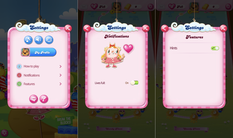
Also, there are a few minor inconsistencies that could easily be fixed. In the settings menu, they use toggle sliders for the hint and notifications options but change the toggle design between the two for no apparent reason. These options are also stored in separate sub-menus when they could easily be consolidated into the main settings page.
Efficiency
Good design gets you to your goal as quickly and effortlessly as possible. Candy Crush’s menu system is simple, but there are still some tasks that take too many clicks to accomplish.
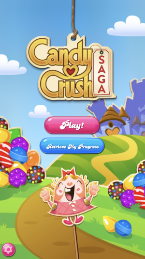
When you first open the game you are presented with an intro screen that contains a nice colorful background, the title of the game, and a few buttons. The settings and retrieve progress buttons can be found on the main game page, so there really isn’t a point in this intro screen as users have to take an extra step of pressing the play button. An alternative approach would be to use the intro graphic as the loading screen background. This gives the player something nice to look at while they wait for your game to load.
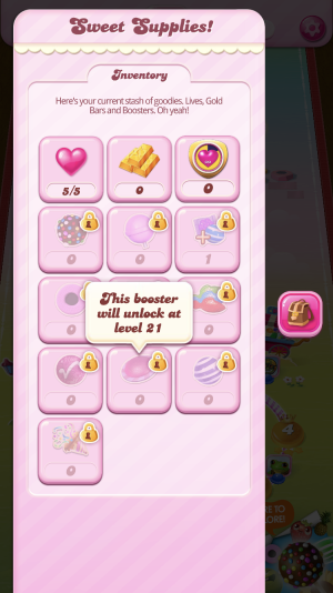
The inventory screen contains some drawbacks as well. You must click a locked booster to see the criteria it takes to unlock it. This info can be condensed to “unlocks at level 21” and be incorporated into the design so it’s always displayed.
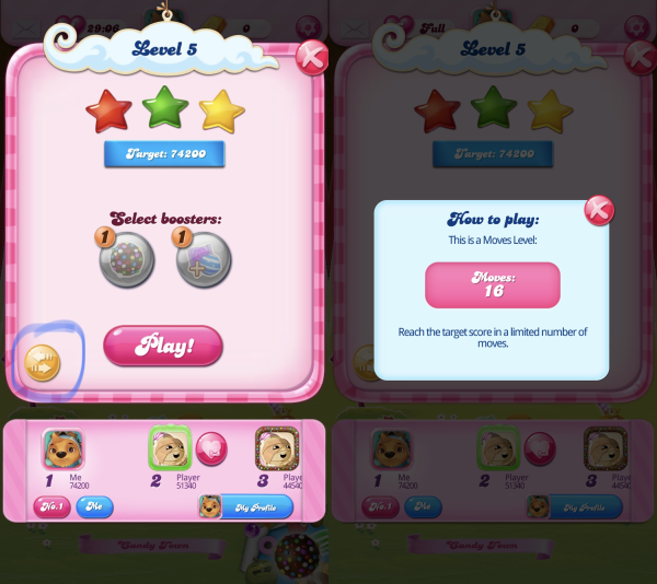
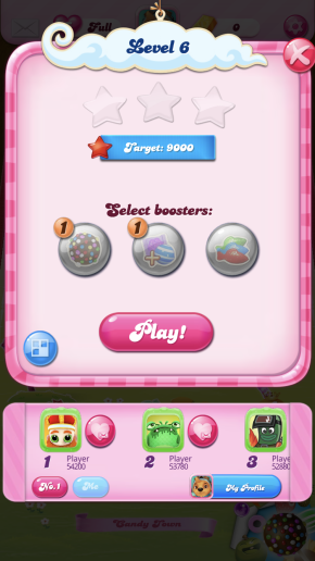
The same design choice is found on the level screen. The criteria for beating a level must be sought out, and the icon you must press to find the criteria is not as clear as it should be. On top of that, the criteria for beating a level is split up in 2 places. This may be easy to pick up on and get used to, but for someone new, you’d want to minimize confusion. You never know what small annoyance will turn a user away.
Attention to detail
One of the best ways to make a digital experience memorable is to pleasantly surprise the user. Candy Crush does this well by borrowing ideas from other industries and going against the grain.
Most apps utilize Apple and Google’s built-in leaderboard features which are hidden from the user on a separate page, Candy Crush presents the leaderboard to the user without any extra clicks. This shows the player the competition before they start a level, and is a great way to drive engagement.
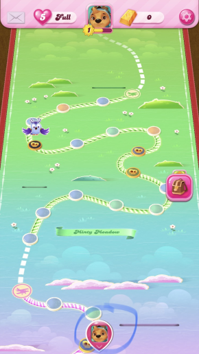
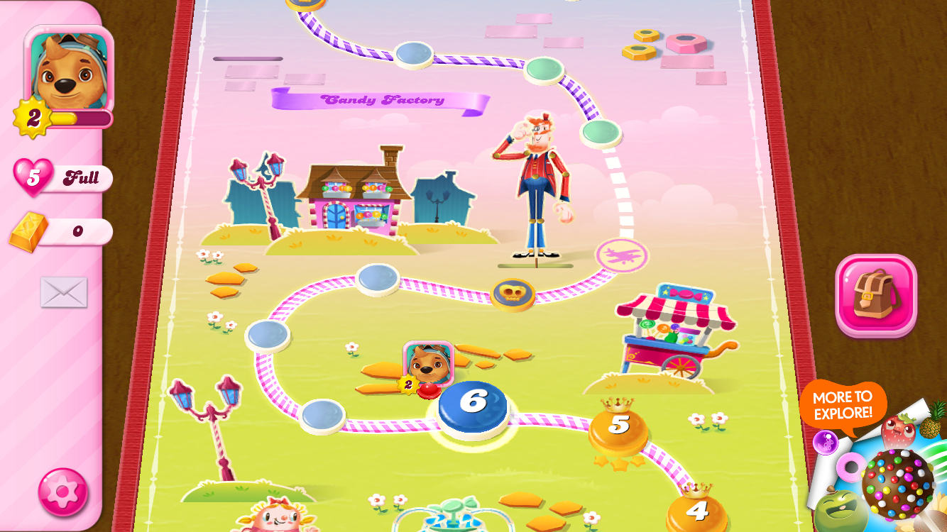
When you scroll too far up on the level map an icon appears that takes you back to your current level. This is standard practice on most websites but is a nice touch to see incorporated into a mobile game.
Candy Crush provides a skip button on the tutorial. An overlooked feature that is used by more people than you would think.
The game can be played in landscape and portrait mode, a feature most games don’t have. Elements are adjusted based on the orientation making the game feel comfortable to play any way you fancy.
Takeaways
I hope this design analysis gives you a better idea of things to consider when creating your own digital experiences. I’ll leave you with a few main takeaways.
- More often than not, choose clear and legible fonts in your designs. If you do choose to use a fancy font, save it for titles and headers, not substantial amounts of text. As a rule of thumb use legible fonts for tutorials, descriptions, and dialogue. These are areas that will frustrate the user if they cannot easily read or understand the text.
- A deep menu structure can be just as bad as a claustrophobic page, you need to strike a balance with the number of sub-menus and information on a given screen. Consider the organization scheme and structure that best fits your product.
- Don’t make the user search for important information, make it clear and easy to find. If you do need to hide information make sure to use affordances: a visual clue to elements function and use, so that hidden info can be easily accessed. If you cannot create a button or icon that clearly portrays the function, err on the side of caution and use things like descriptions, animations, or sounds to help get the meaning across.
- Look to other industries for innovative solutions to your design problems. For example, Medical professionals examined race car pit crews to learn about synchronizing a team and working quickly with complex procedures. Another approach is testing early and often with a diverse group of users, and even people that may not be typical users of your product.
This article was originally published on UX Collective by Andrey Spencer. His passions include more than design and technology, but that’s what you’ll hear him talk about the most. You can read the original article here.
Get the TNW newsletter
Get the most important tech news in your inbox each week.
