Lover.ly, a New York-based service which lets you discover and save wedding ideas in one, easy place, has just revealed a site redesign and a fresh rebrand.
The new look is quite impressive — gorgeous, actually — and so, we’re diving into the new designs head-first, comparing the old with the new to show you what’s changed and why it’s noteworthy.
The Brand
Loverly’s new logo has come a long way since the startup’s humble beginnings; founder and CEO Kellee Khalil designed the first one herself back when the service first launched 13 months ago. The original certainly wasn’t terrible, but there was room for improvement. Here’s the new design, followed by the previous look:


The new logo, made by former Apple designer Gary Williams, is significantly simpler than the old, but is also more than just a swap from script type to a bold sans-serif. The heart “v” in particular is special, as it has become the company’s logomark. As you’ll see on the site, the logomark persists even when the logotype cannot, keeping branding present
A Site-wide Redesign
Unlike the logo, Loverly’s site redesign was created internally by new hire Melissa Mandelbaum. She joined the team in the middle of December, after leaving Mixel (which was recently acquired by Etsy).
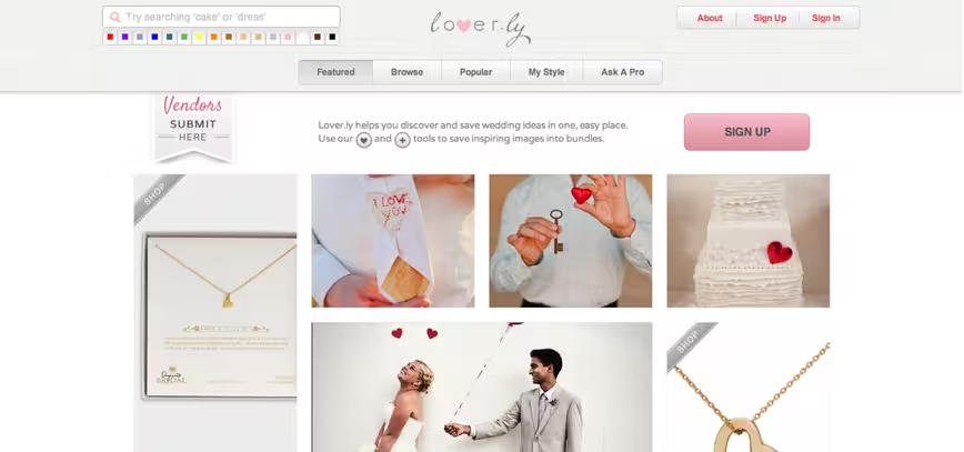
The previous site had taken the company quite far, but the search functionality was limited and the navigation complex. Khalil shared with us that it ended up looking like a “Mr. Potato Head product: there was a lot of design and functionality tacked on for testing.”
For the new site, Loverly set out to accomplish a number of goals:
- Separate content into verticals – featured, explore and shop for now
- Support both a guided and free-form search experience
- Approachable ux for everyone
- Let our imagery take center stage
- Delightful
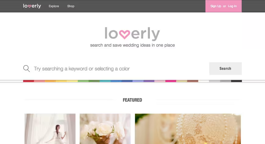
Here’s the new design, followed by the previous design:
The floating search bar (shown below) has been given extra attention:
As the primary interaction, it holds prominence as a field sweeping across the top of every page, stemming from each tab name. When browsing results, the nav collapses, and the search bar presents itself in a more passive state.

The site’s minimalistic design places emphasis on imagery — Loverly’s strong suit, and the navigation (pictured below) is refreshing.

Perhaps most importantly, the redesign makes us feels as if Loverly has matured as both a service and a company — there’s more to the site than “Pinterest for Wedding Planning.”
The results have proved to be quite impressive by our standards. Now, we’re left waiting to see how the startup’s user-base reacts.
Get the TNW newsletter
Get the most important tech news in your inbox each week.
