Garrett Heath is a technology storyteller with Rackspace.
In the midst of incremental technology changes, we can lose sight of how far we’ve come. Personal trainers understand this phenomenon, which is why they ask people to take photos throughout their journey to better health. It is hard to tell the progress from day-to-day, but a quick look at images a month or more apart can reveal big changes.
The look and feel of the Web has undergone an extraordinary transformation. It went from being a tangled Web of neon links, HTML tables and indexed themes to a sophisticated set of properties, powered by the latest in content trends and technologies.
While working on a guide to enterprise content solutions, I was struck by how far we’ve come from coding website content via HTML to having options that handle much of the heavy lifting for us. Travel through time as you look at snapshots from the Wayback Machine of well-known brands throughout the years.
AOL
If you came of age along with the internet in the mid-90s, the crackling modem line and “You’ve got mail” sounds will instantly trigger memories. As one of the first ISPs that gave an internet connection and email to the masses, AOL reinvented itself as a media company with the advent of DSL and cable modems.
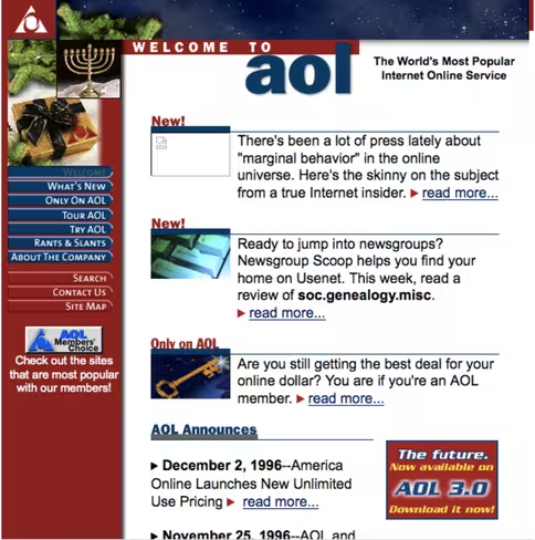
1996: The site offered several stories in addition to peddling its services.
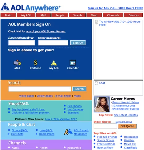
2002: As people began abandoning AOL as their ISP, there was still a need for all of those email addresses that ended in @aol.com, not to mention having the ability to check in on all your friends—or leave snarky away messages—via AOL Instant Messenger.
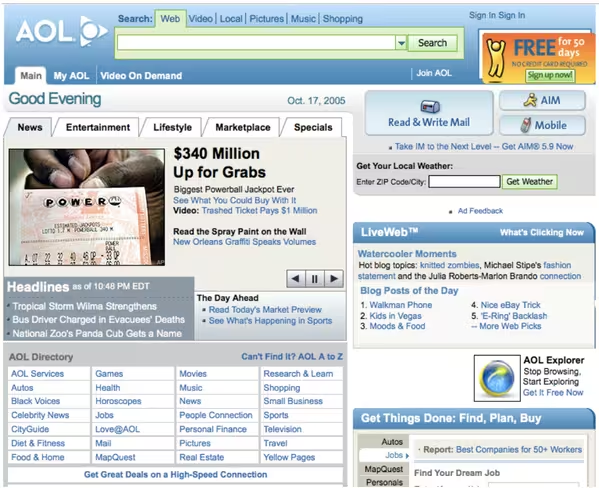
2005: By this time AOL made the jump to becoming more of a content portal as its ISP business began to shrink. Check out that classic table view for its AOL Directory.
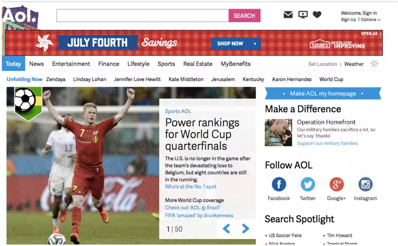
2014: AOL dropped all reference to the ISP business and gave only a casual nod to its email service. While there is no reference to the AOL Instant Messenger on the webpage, users can still visit AIM’s website and log in for nostalgia’s sake.
Yahoo
Long before Google was a verb, we would search the Web on Yahoo. While it seemed to always be on the top of the pile of early search engines (Alta Vista, Lycos and Dogpile), it gradually lost market share to Google.
Over time, the site became more of a media hub but it still features search as central to its business.
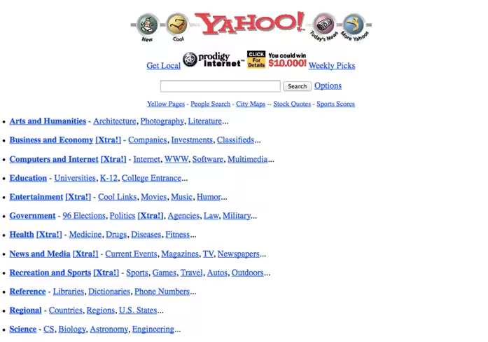
1996: Believe it or not, back in the day you had to actually “submit” your site to search engines. The baby icon for new links is as indelible to the early Web as the “under construction” GIF.
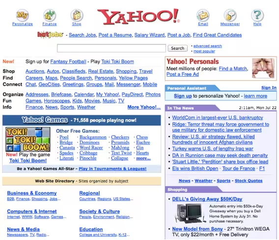
2002: In addition to being one of the first places to offer email for free, Yahoo also became a go-to place to play online card games and fantasy sports. But even in 2002, websites were still organized by subject on Yahoo.
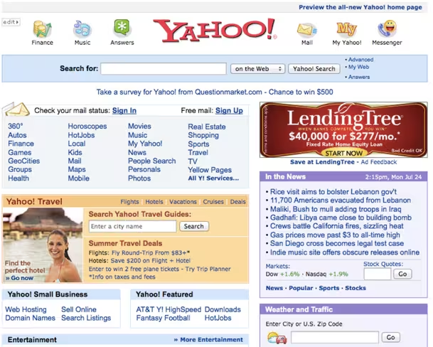
2006: Yahoo modernizes the look and feel, but still crammed plenty of links down the Web visitor’s throat. The news was presented with titles only, rather than descriptions or teasers for the story.
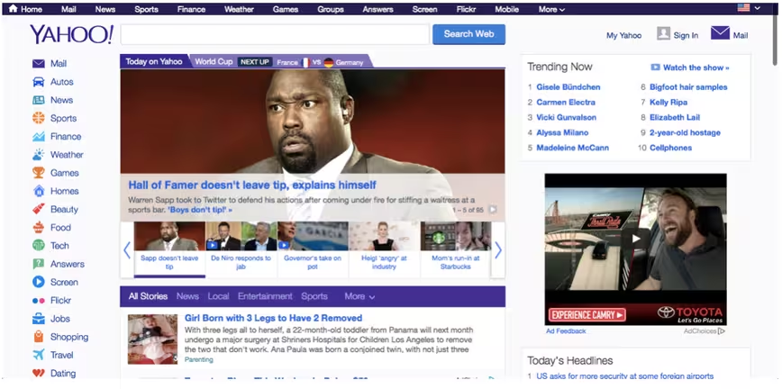
2014: Today, Yahoo has an emphasis on content, although rather than focusing on news it tends to look at lighthearted stories. Search is still prominent at the top, but seems to take a backseat to everything else going on the page.
ESPN
One of the pioneers in cable television, ESPN has also made substantial changes on its online property. In addition to providing highlights and recaps, ESPN also offers Insider, a paid content section of its website. The company was also one of the first to realize the value of letting sites like Grantland and FiveThirtyEight live outside the umbrella of the corporate site.
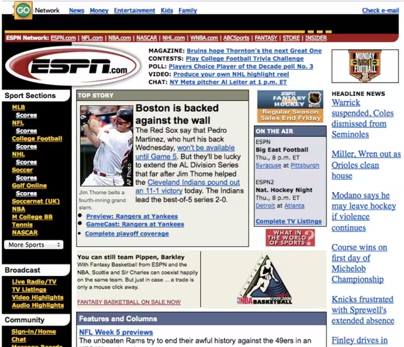
1999: Early on, ESPN realized that people enjoy more than just a list of headlines. It provided a description of the top story so users could get more information before clicking the link.
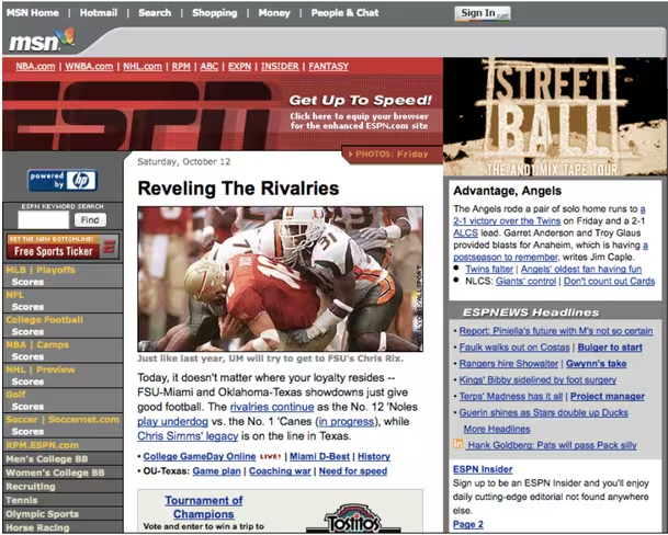
2002: The company changed the masthead from ESPN.com to just ESPN, while getting a little more modern logo. The previously harsh black/yellow sidebar was swapped out with a more easy-on-the-eyes grey sidebar.
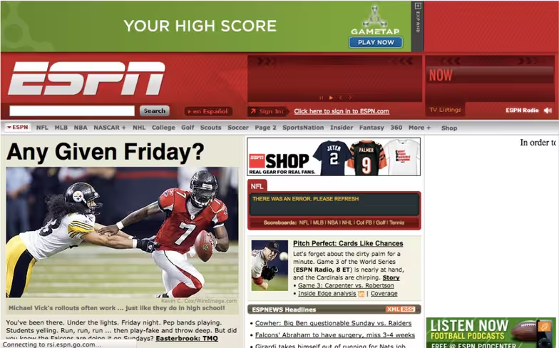
2006: The site made the leap to the more modern design, moving the sports from a sidebar to a breadcrumb trail at the top. However, the header was still massive and there was plenty of advertisements above the fold.
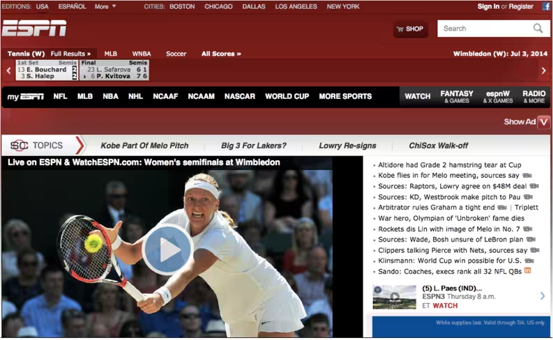
2014: The size of the logo was substantially reduced and mousing over the list of sports in the black bar will expand a box with current stories for that sport. The lead story is not a “story” at all—it’s a link to view live programming on its WatchESPN app.
How far the Web has come! Could you imagine if today, we’d be “Yahooing” things instead of “Googling”? A quick look back through the years makes us appreciate the modern Web so much more.
Check out the full guide to enterprise content solutions to see how technology can overhaul content chaos.
Read next: What the Internet looked like before Drupal, WordPress and Joomla
Get the TNW newsletter
Get the most important tech news in your inbox each week.
