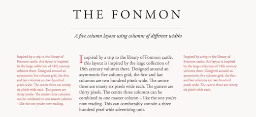
Gridset, created by Mark Boulton Design, is a tool that lets Web designers build and manage custom, responsive grid-based layouts for their projects. It first began as an internal tool but has since grown into its own product that, while still in private beta, looks quite promising.
But grids!? That’s been done to death, right?
Not exactly. Of course, there are options like the 960 Grid System, which exist to streamline your workflow, but that’s not why Gridset was made.
Way back when, before the Web and other digital mediums began engulfing the world of print design, grid systems played (and still play) an extremely important role in logically laying out text. Gridset has the potential to do three things: encourage the creation of unique, custom grid design (instead of everyone following the same exact template), provide an easy way to manage those grids, and lastly, do the dirty work for us (aka, math) that will turn these custom grids into responsive layouts.

To see what’s possible, check out these enticing samples made with Gridset: The Fonmon, The Gerstner, The Marber and The Carson.
Sign up for the beta and check out the promo video via the link below:
➤ Gridset
Get the TNW newsletter
Get the most important tech news in your inbox each week.


