
It’s little surprise that living in the UK’s capital can be rewarding, exciting and fun in equal measure, if you ignore the weather and occasional brusqueness of disgruntled occupants.
However, when it comes to the actual living part things can be incredibly tricky – it’s one of the most expensive and competitive cities in the world when it comes to securing a home. That process is made even harder if you don’t really have a specific area in mind, if you’re new to town or are only staying for a short time.
Generally, property apps and websites tend to show listings of available properties sorted by proximity to a specific location – usually the postcode search area you entered. However, if you don’t have a specific place in mind or want to check out a few different possibilities, trawling the Web can become a time-consuming task.
Instead, you can use Find Properly’s visualization tool to see which areas could save you the most time and money based on your daily commute.
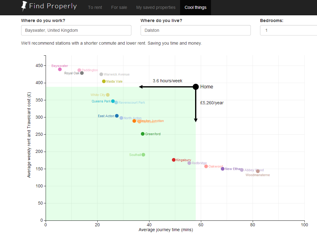
Using it is simple, just enter where you currently live and where you currently work in the boxes at the top, and it’ll return a range of options – some that save you time (but tend to cost more) and some that cost less but will increase your daily commute.
There’s an option at the bottom of the page that allows you to add the overall cost of travel into the equation too. If you do this, the figures it shows indicate how much time or money you would save by moving to that area versus your current location.

So, as you can see from the comparisons above, (if I worked in Bayswater) I could save a lot of time each week by moving to Queens Park, but if I wanted to save more than £11,500 per year, I should consider Redbridge.
The average (median) price is calculated using the prices of currently available properties within a 1km radius of the station and travel times always use the quickest forms of transportation (bus, train, tube, trams, walking etc.) using Transport for London’s journey planner tool.
There are obvious caveats here – it won’t tell you what that area is like, for example, but it serves as a good jumping-off point for a few different potential areas to research. There might be some very good reasons that I shouldn’t move to Redbridge too, so it’s not going to replace proper research.
Once you have found an area that seems suitable, you can click through to view properties that are available in that location.
It’s not going to save you trudging around to view different apartments and it won’t save you the disappointment of being gazumped, but it does at least give you a balanced idea of where to base yourself if you don’t have a lot of local knowledge or time to waste finding out.
➤ Find Properly
Image credit – Shutterstock
Get the TNW newsletter
Get the most important tech news in your inbox each week.