
We’re big fans of Visual.ly here at TNW, ever since it launched as the home of data visualization and infographics way back in July 2011.
The platform has evolved somewhat since then, launching Visual.ly Create for users to create their own infographics with ease, before going on to roll out a complete redesign with social features last July. And then in October, Visually unveiled a new marketplace to help put its community of infographic designers to work.
So, when we got wind of Visual.ly’s latest launch, naturally we were all ears (well, eyes). The Israeli startup has launched a new visual reporting tool designed to bring Google Analytics to your email inbox courtesy of a weekly infographic.
How it works
The core raison d’être of infographics is to make otherwise complex information easier to parse. And that is exactly what Visual.ly Google Analytics Report does with your valuable Web traffic data.
When you first sign-in (the sign-up process is swift, if you’re new to this), you’ll be asked to select which Google Account you wish to associate with. Once in, you’ll be asked to select which site from that account you wish connect with.

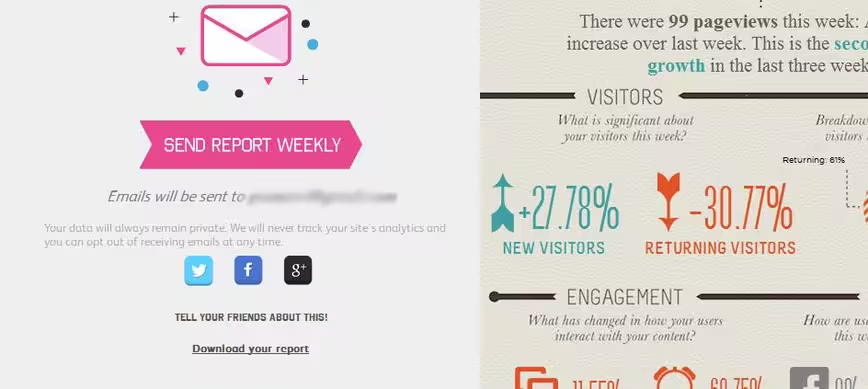
It takes a moment to load, then you’ll see a large infographic splayed across your screen on the right, with the option to sign up for weekly reports on the left. It’s worth noting here that a monthly (or longer) report option would be great here, as not every website owner wishes to track changes on a weekly basis. Similarly, a daily option would perhaps be a good addition for those really looking to keep tabs on their traffic.
Another minor point here – it would be good if there was an easier way to re-associate your Visual.ly account with a different Google Account from within Visual.ly itself. As things stand, you have to go to your Google Account and revoke access for it to ask you again.
In terms of the metrics this new tool serves up, what we’re talking about here is a ‘snapshot’. You have pageviews, social engagement, SEO, and bounce rate. If you require more details, such as top-performing posts, you’d maybe want to check out something like Parse.ly instead.
Indeed, there’s certainly scope here to enable users to select which metrics are displayed, and perhaps offer a wider selection of metrics, but as far as a free Google Analytics tool goes, Visually’s incarnation is certainly worth your time.
“As a website administrator myself, I wanted a tool that would provide key insights at a glance automatically, without me having to go to Google Analytics and wade through multiple screens to get what I needed, our infographic format was perfect for this,” said Tal Siach, Co-Founder and CMO at Visual.ly. “I knew that if I found it useful, others would too.”
Visual.ly’s new Google Analytics reporting tool is available now. Oh, and you’re probably wondering what a Visual.ly-powered Google Analytics report look like? Check out this one below that I made earlier.
➤ Visual.ly Google Analytics Report
Get the TNW newsletter
Get the most important tech news in your inbox each week.