We recently briefly touched upon the brand new publishing platform, Via.me, as it is one of the sites involved in PeerPerks, the new social media rewards system launched by PeerIndex.
Launching today, courtesy of San Francisco-based RadiumOne Labs, Via.me attempts to stray away from the social network label, but it certainly can be described as part social-network, part blogging platform. Using the site, you can share images, video, audio or text, or you can also publish to your profile using the free iPhone app.
Via.me seems to be a little bit of all of the popular social networks and publishing platforms rolled into one.
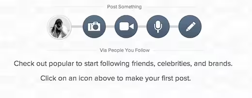
Its dashboard seems to be partially inspired by Tumblr, with both its simplicity and the use of icons for each type of content. And like Tumblr, posting to Via.me is a simple and intuitive experience.
 When it comes to checking out what other people have posted, the ‘Popular’ feed, as well as profile pages, are definitely reminiscent of Pinterest’s layout. Posts are displayed as a grid, and at a glance you can see how many views and comments a post has received.
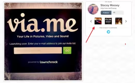
A nice Via.me unique touch is that when you’re looking at individual posts, you can see thumbnails featuring the rest of the content that user has uploaded to their profile, as well as a nifty link to other social network profiles.
The iPhone app affords you most of the same features you’ll get from the site – the ability to post content, keep up with your feed, explore popular photos, as well as find out which of your Facebook and Twitter friends are using Via.me.
As far as inspiration is concerned, the iPhone app seems to take a page from Instagram, providing users with 17 vintage and grunge filters. If we’re totally honest, we definitely prefer the look and feel of Instagram’s filters.
Other features that you’ll get signing up for a Via.me account include simultaneously updating your Facebook and Twitter profiles from the site, the ability to follow other users, comment on their content, and easily share content on other social networks using the social sharing buttons accompanying each post.
Our Verdict
As far as its UI is concerned, Via.me is as slick as they come. The minimalist layout gives users a great way to turn the focus on their content and their content alone. And while it clearly borrows heavily from other networks, it rolls them all into one to create something decidedly new. If Tumblr had focused on a mobile platform rather than a web-based one, we imagine the result would have been an awful lot like Via.me.
The site’s strength is the fact that it offers really solid options on both mobile and web platforms. Instagram is mobile only, Pinterest’s mobile app doesn’t really do it justice, and Tumblr simply lends itself more to the web experience.
One glitch we spotted was that once you post something, you can’t take it back. There doesn’t appear to be a way to delete content from Via.me, so bear that in mind before you starting posting photos and thoughts that you might later want to take down. But we’re hoping that’s something that will be fixed.
It is possible that Via.me may have struck the perfect balance between all of these options, but what remains to be seen, is whether or not social media users are looking for yet another platform to share their content on.
➤ Via.me | iPhone app
Get the TNW newsletter
Get the most important tech news in your inbox each week.


