Vevo just redesigned its Web presence to reflect the same smooth, slick interface you’ll find via mobile.
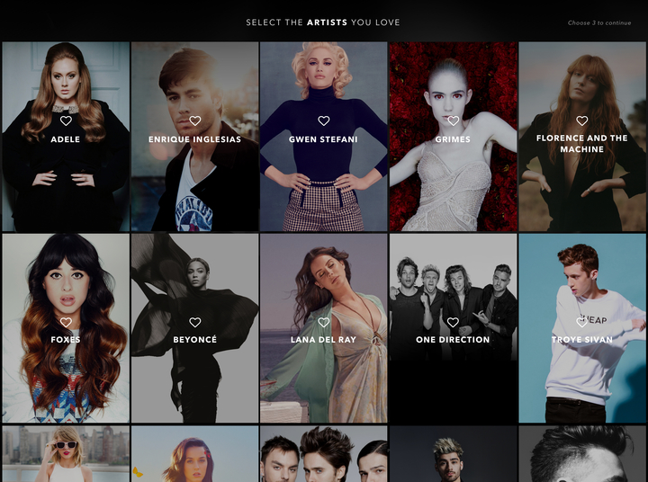
The company says it underwent a complete UI overhaul on the desktop that aligns it more closely with the mobile and Apple TV variants. Onboarding is also similar to the mobile version, where Vevo asks you to select some favorite genres ahead of streaming videos.
The app learns as you use it, too, meaning that over time its recommendations to you get smarter based on your stated likes and viewing history.
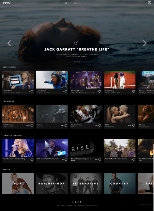
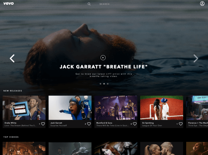
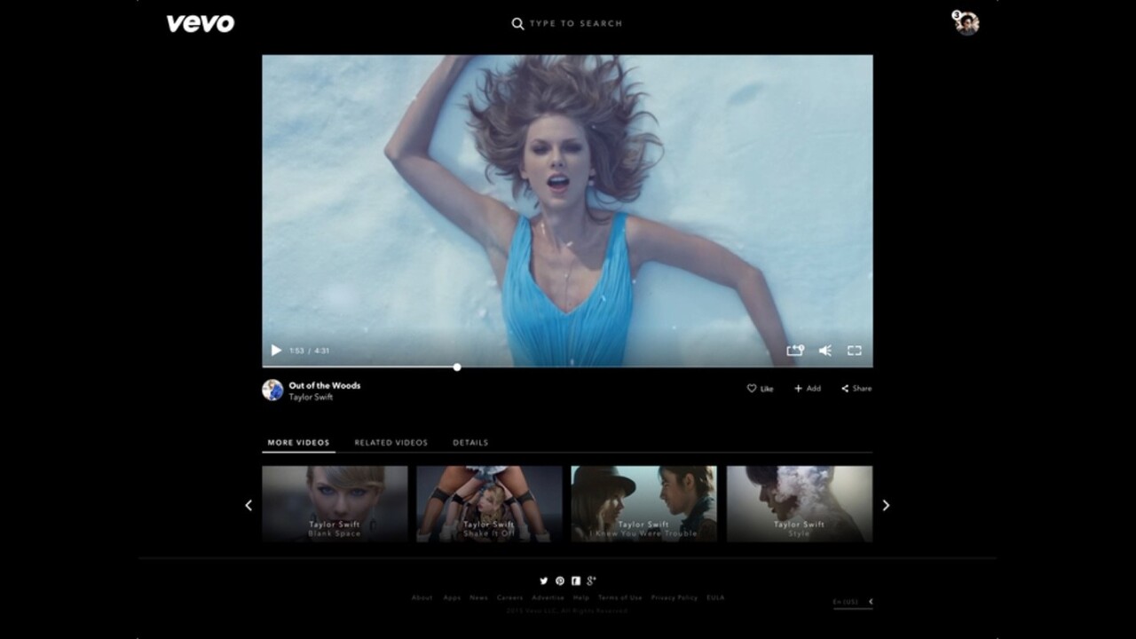
For the Web, Vevo also has a larger video player, and a home page that includes its Spotlight feature (a personalized feed of videos and playlists recommended by Vevo), new releases, top videos, genres, recently watched and featured playlists.
Vevo also killed Flash, and now streams everything in HTML5.
Overall, Vevo keeps with a familiar ‘Netflix’ theming that’s both immediately familiar and fresh. If you ever needed an excuse to rewatch Drake’s “dancing” in Hotline Bling without feeling like a goon, Vevo’s new look might be it.
Get the TNW newsletter
Get the most important tech news in your inbox each week.
