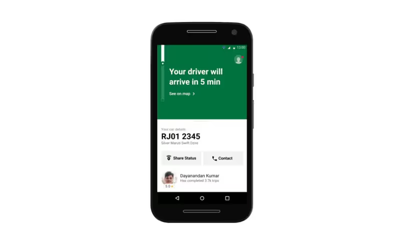
Last June, Uber launched its ‘diet’ app –Uber Lite – in India, with a view to support users with older phones, and those who frequently face connectivity issues. The app is now available in more than 14 countries, in English, Portuguese, and Spanish. The company claims it has 2.5 million downloads, and its users have completed more than 1.6 million rides in the past seven months.
So how do you build a usable app for emerging markets and solve problems for the next billion users? We chatted with the development team behind Uber Lite to understand what went into the conceptualization of the app, as well as some of the engineering that helped shape it into a product ready for prime-time.
Research: What’s wrong with our primary app?
In 2016, Uber’s Global Access Team – which works in Bangalore, India – began researching customers’ needs and expectations in emerging markets like India, Brazil, and Mexico, to improve the ride-hailing app’s experience for the next billion riders. It found three main hurdles that prevented potential users from getting on board Uber’s platform: their phones’ hardware limitations, poor network connectivity, and the app’s complex visual interface.
“We found that more than 80-85% of our users are on Android platform. We looked at our Android audience in emerging markets and found that the majority of our audience relied on devices which were from 2014 or older, as per the year-class scale for mobile phones. While these people were booking rides, we felt we could do a lot more to improve their experience,” Shirish Andhare, Head of Product and Growth, Uber India told TNW. The Year-class scale was defined by Facebook to compare the hardware specs of a phone with a certain year’s high-end phone.
He added that these Android devices had limited storage capacity and processing power. Many users with such devices deleted the Uber app – which took up several megabytes of storage space – so as make room for photos and videos they received from contacts via WhatsApp.
Some surveyed users told the team they found Uber’s app interface too complex to navigate, and that they’d often ask friends and family to help book them a ride. The team realized it had to redesign the ride-booking flow; I’ll get to that in just a bit.
The third aspect was to make the app work in areas with poor network conditions. During its research, the company found that more than 35 percent of its riders in emerging markets used the app in areas with low connectivity (Sub-3G conditions). As a result, they often couldn’t book a ride successfully.
A law student in Brazil, who uses Uber regularly to commute back to home at night, told the company, “When I get poor network service on my phone, and if the app doesn’t respond in time, I immediately feel unsafe.”
Re-engineering the app
After getting feedback from users in emerging markets, the Uber team went back to the drawing board and came up with the mantra of “Light, Instant, and Simple” for its Lite app.
Andhare said that the team decided to build a native app instead of a Progressive Web App (PWA) to address a larger audience:
Uber already has a PWA, however, the full construct and advantages of a PWA model as such, are still evolving and not universally supported on all browsers. Our typical Android device audience and the versions of Android OS we are targeting in our emerging markets do not support some of the PWA constructs.
The Global Access Team redesigned the app and removed many unnecessary features for users of the emerging market, like some digital payment methods and graphics heavy elements (e.g. car figurines). After several iterations, it managed to bring the app’s download size to just 4.5MB – almost 85 percent smaller than the original Uber app.
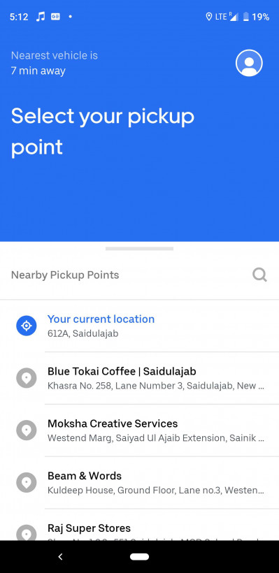
One of the key things the team did to streamline the app was to discard maps from the booking process. Instead of displaying a full-fledged map, Uber Lite simply detects your location and generates a list of nearby pickup points. It also loads up pre-cached popular or saved destinations in the city. If you don’t see your pickup point or destination in the generated list, you can type it out, or choose to pinpoint your location on a stripped-down map.
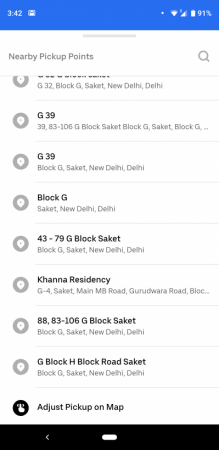
During its research, the team found that phones with smaller screens had the software keyboard taking up half the display area while users typed location names. That’s another reason why the “Tap before you type” approach made sense for the Lite app.
Andhare told us that Uber’s Bengalore team collaborated with a special unit within the firm called the “Uber Lite Gym” based in San Francisco to scale down libraries and code for the new app and reduce its file size. The team went so far as to strip out Uber’s proprietary font in favor of one of Android’s native fonts – making for a saving of 200kb. It may not sound like much, but little changes like this added up to make a big difference in the final installer’s size.
The team also ensured that each command from users fit within the carrier network’s Maximum Transmission Unit (MTU), unit to measure maximum data you can send at once in a network packet. This ensured there was no data loss, and allowed the app to function reliably in low-connectivity situations. The app also accumulates multiple requests, and sends it to the network when the signal is the strongest. Andhare claimed that because of these measures, the Uber Lite app is five times more network efficient than the primary app.
Conclusion
Andhare said that the team at Uber is determined to ensure its app is as reliable as can be: it’s had a crash-free rate of 99.9 percent thus far. He added that the team will soon work on localization to support users who are more comfortable with regional languages across India. The Lite app also recently added Uber’s carpooling option, as well as support for digital wallets for payments in India (in addition to cash payments).
The app’s success is a testament to how careful consumer research and clever engineering can help you build better apps for people coming online for the first time via mobile devices. You can try out the app for yourself here, or watch this video to learn more about it.
Got any tips for building efficient apps for the next billion mobile users around the world? Let us know in the comments.
Get the TNW newsletter
Get the most important tech news in your inbox each week.


