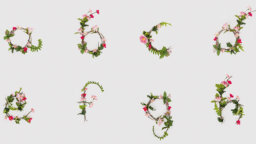
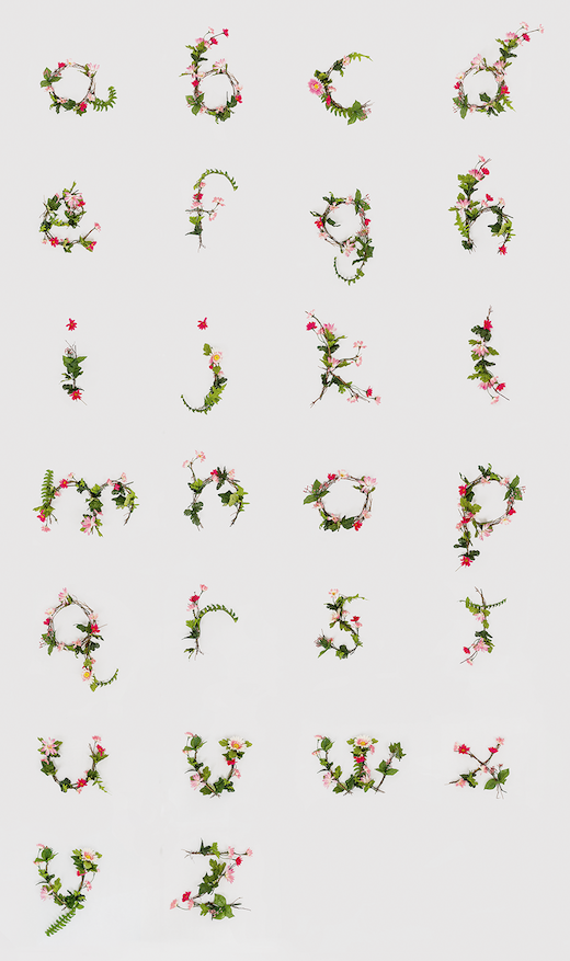
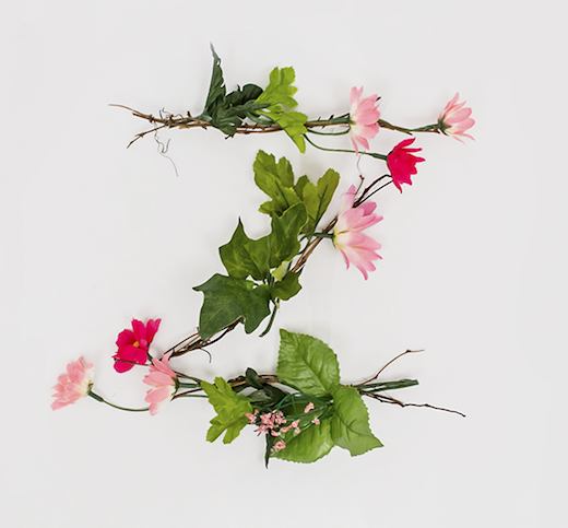
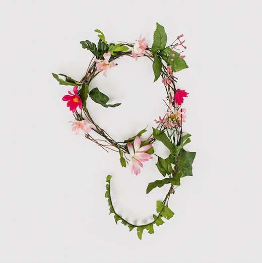
It’s no secret that we’re big fans of experimental typography here at TNW, and this “flower alphabet,” created by Maryland Institute College of Art (MICA) junior Anne Lee, is no exception.
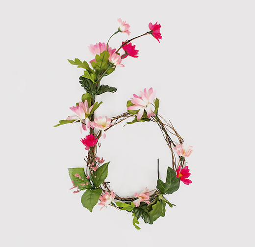
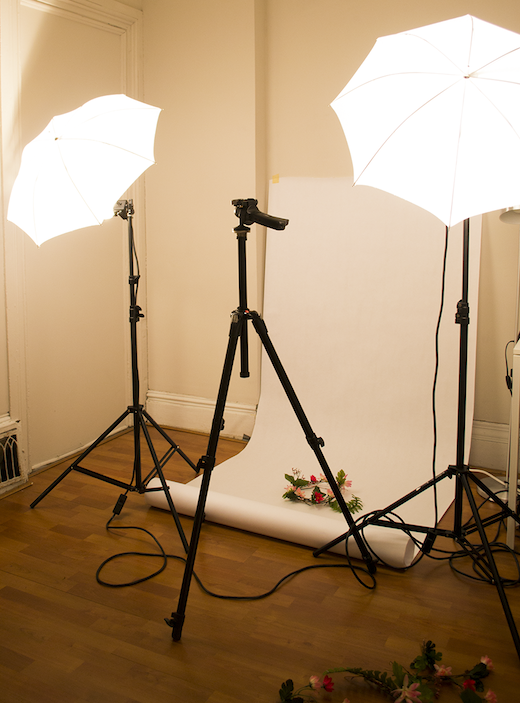
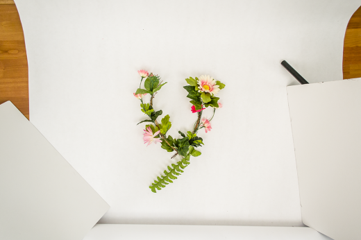
Crafted by hand and photographed in her apartment, take a look below at Lee’s completed typeface, followed by progress shots that show how it was created.
We spent some time talking with Anne Lee to find out more:
HW: Why flowers?
AL: I happened upon these flowers and couldn’t resist! I was faced with an abundance of raw material and knew I had to use it in some way.
HW: What was the most challenging part of creating this face?
AL: I got back to my studio and started sketching basic letterforms. Making lowercase letters seemed more economical, because there are similar shapes within the letters and I enjoyed playing with the ascenders and descenders. It was challenging to make sure all of the letters were approximately the same size. I started with a circle for size reference and went from there.
HW: How you expect to use it in the future?
AL: I’m brainstorming ways to make the alphabet more accessible. Making posters and prints is the next immediate step. Turning it into a free display typeface for others to use is another possibility.
Check out more of Anne Lee’s work here. You can also take a look at TNW’s own Design & Dev channel.
Get the TNW newsletter
Get the most important tech news in your inbox each week.
