Much like this gorgeous, giant ice typography project by Nicole Dextras and the well-known “trying to look good limits my life” series by Stefan Sagmeister, designer David McGillivray has created an incredible, experimental typeface by merging together typography and architecture into what he calls: Pre-Fab Type.
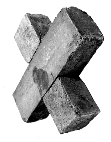
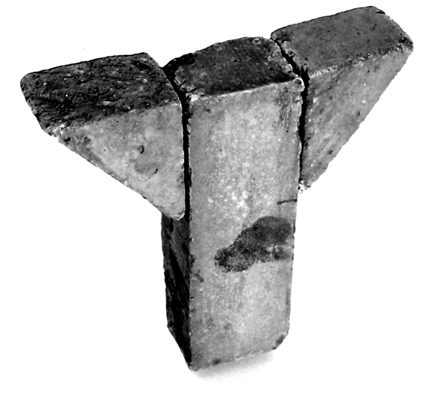
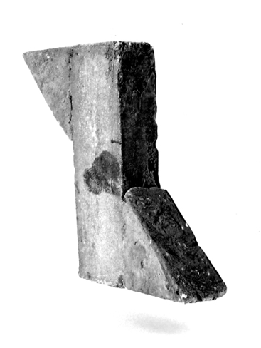
The face, inspired by the “Brutalist architecture of London, the Hayward gallery in particular,” was built out of a pre-fab style kit of conrete shapes that were cast into 14 total blocks. From there, the letterforms were assembled and photographed.
What you see below (according to McGillivray) has not been ‘shopped at all, making the results even more impressive.

Check out TNW’s Design & Dev channel for more!
Get the TNW newsletter
Get the most important tech news in your inbox each week.


