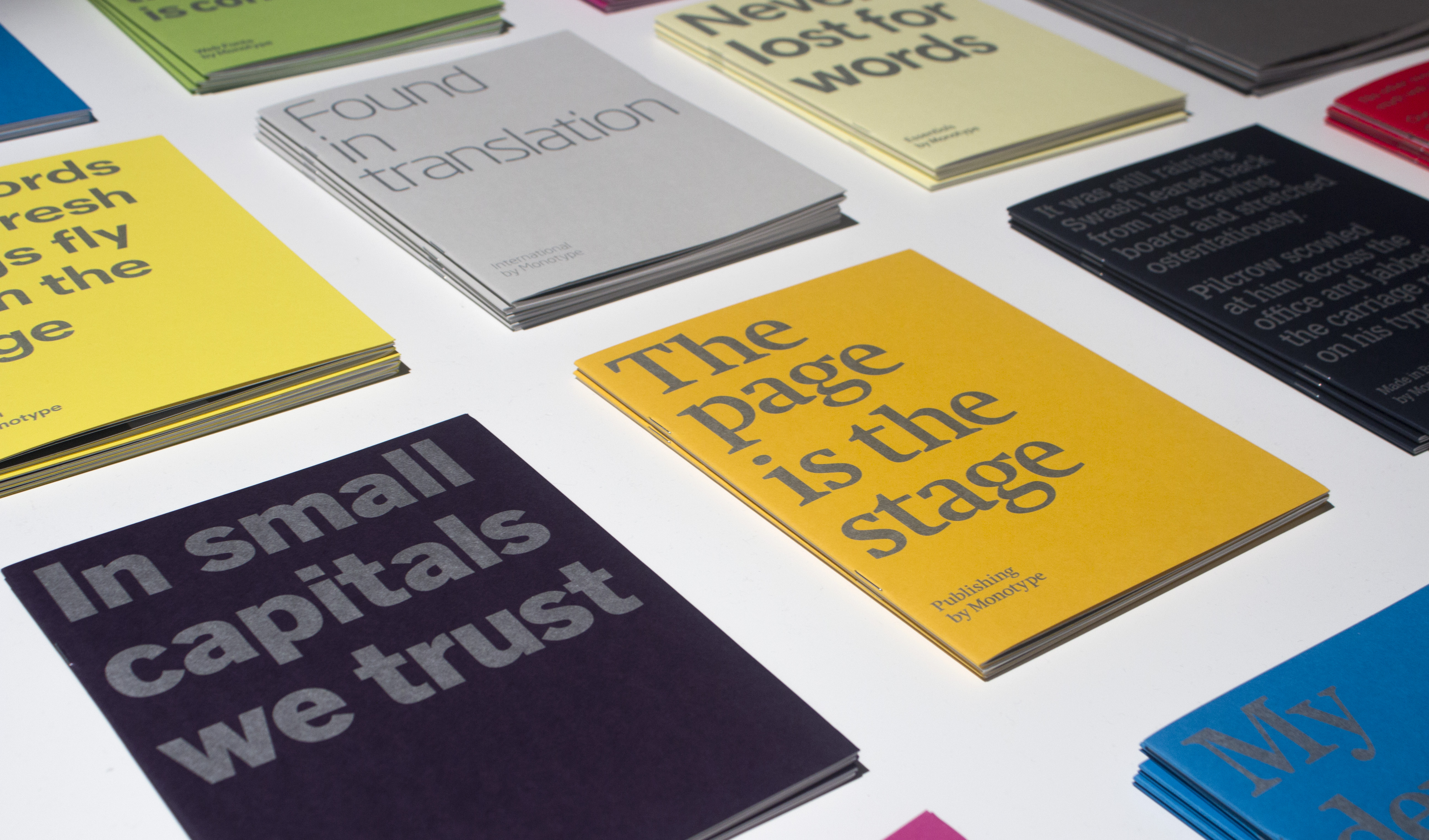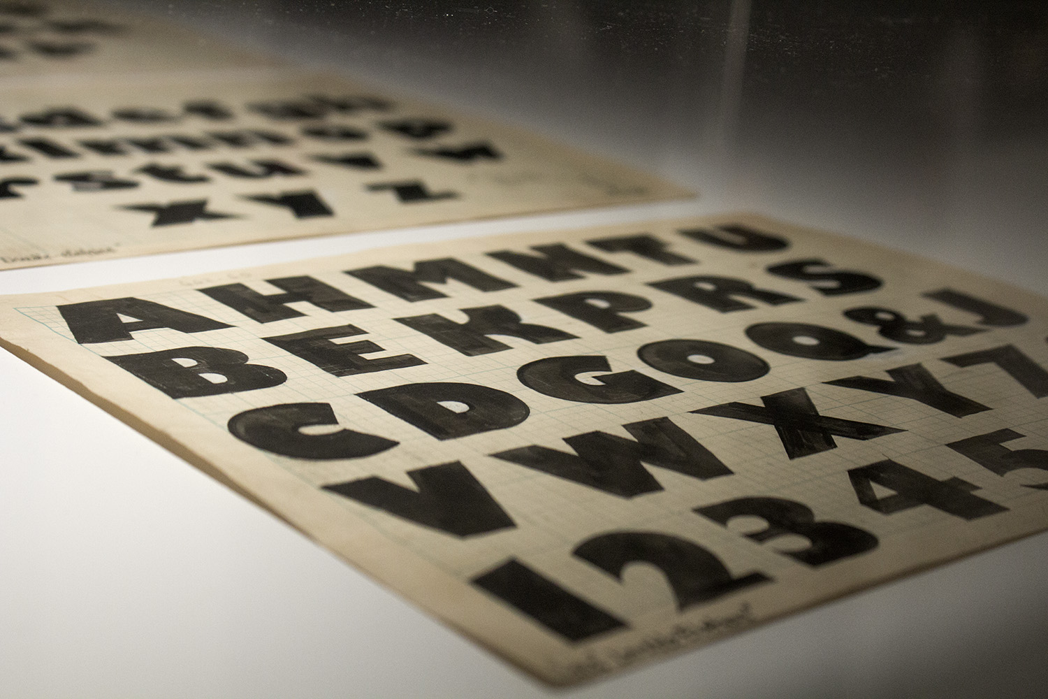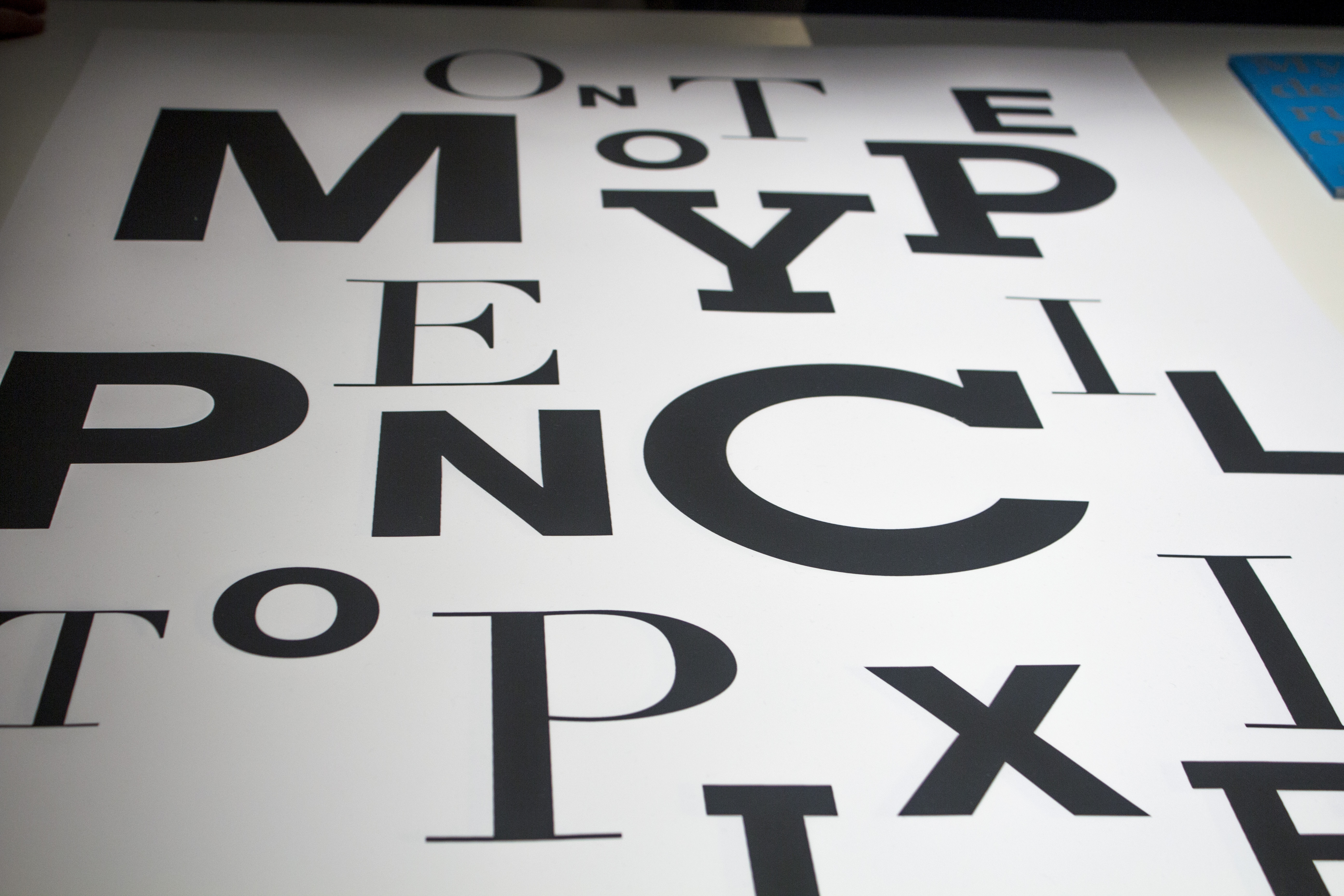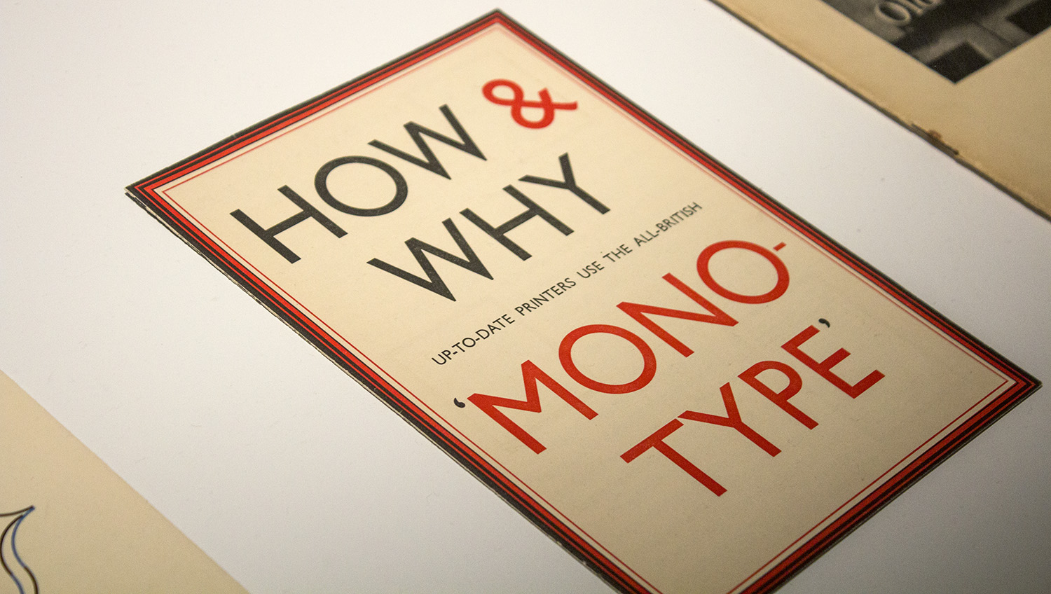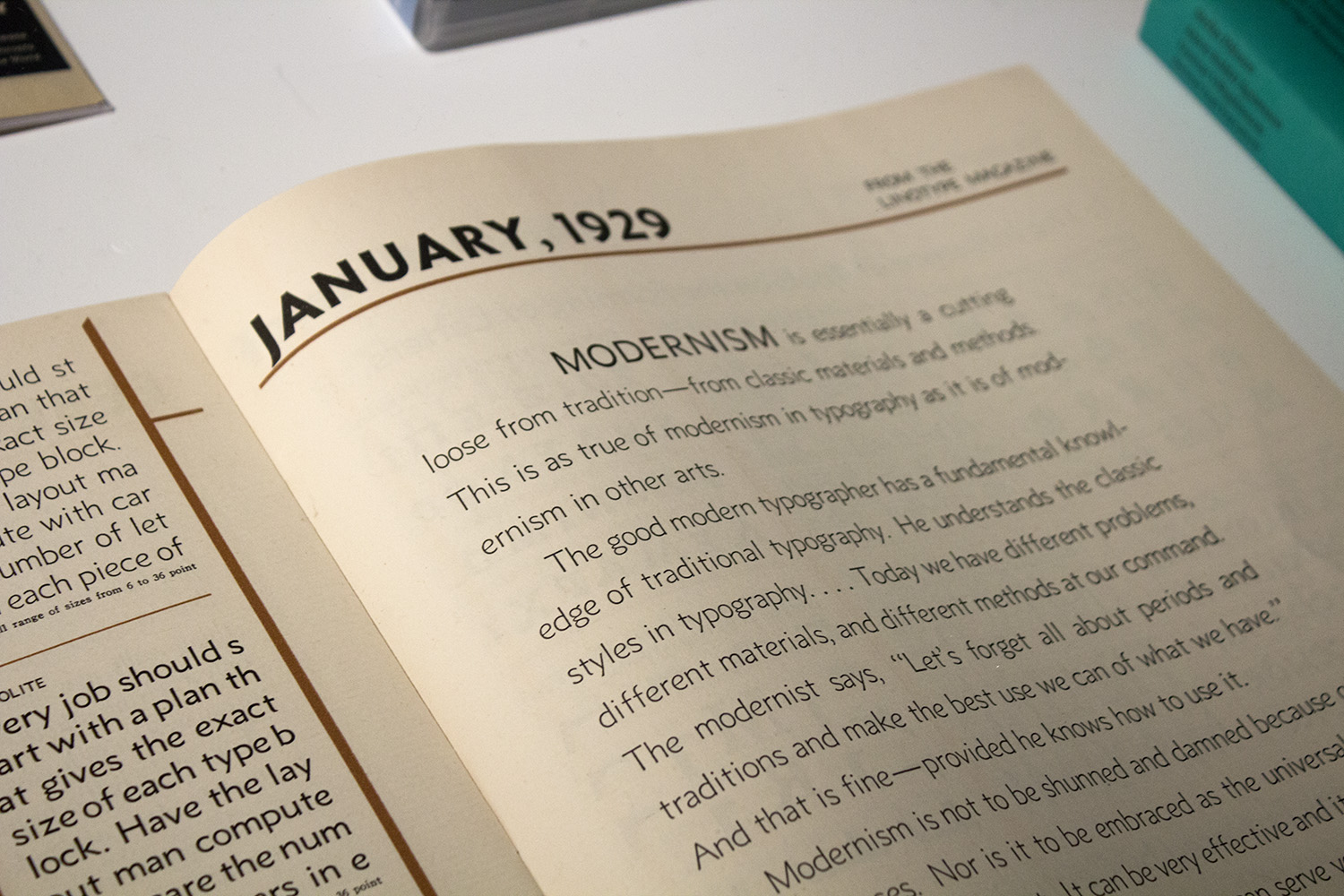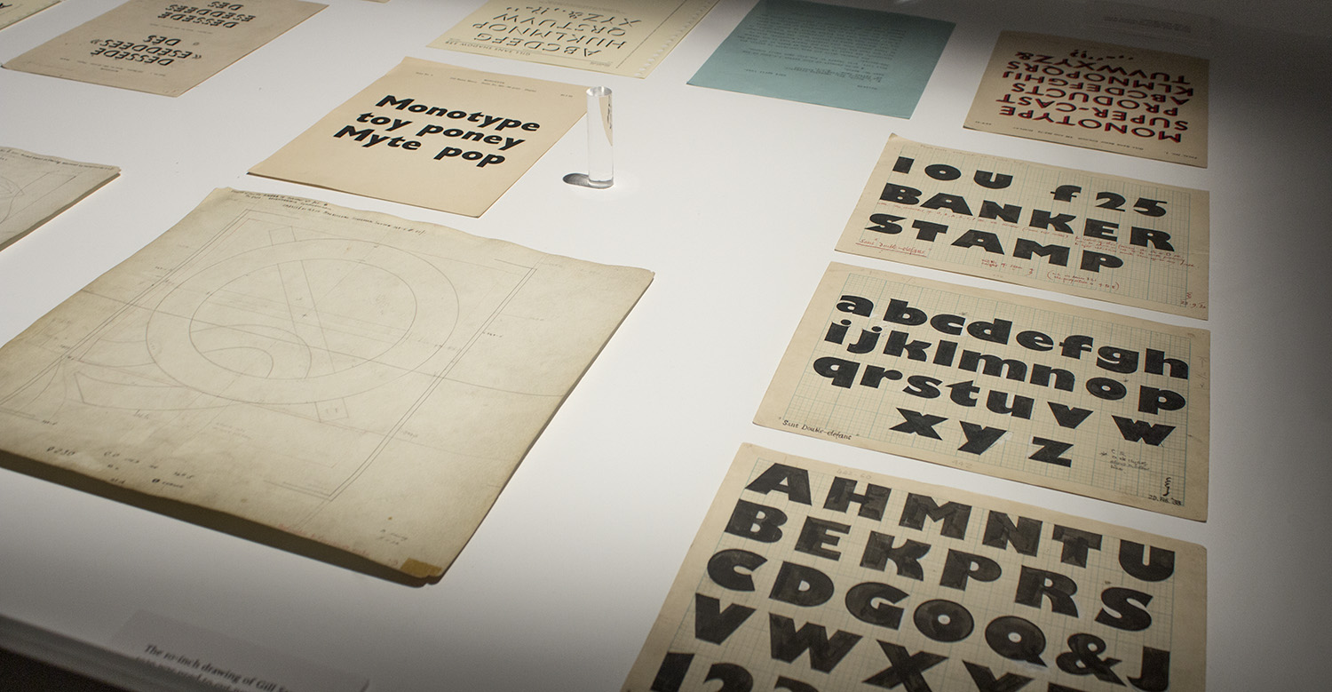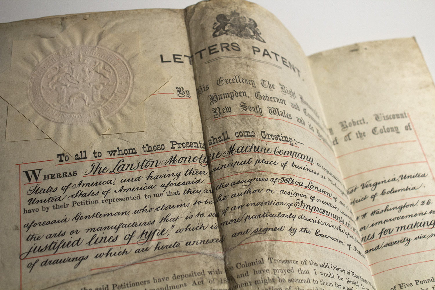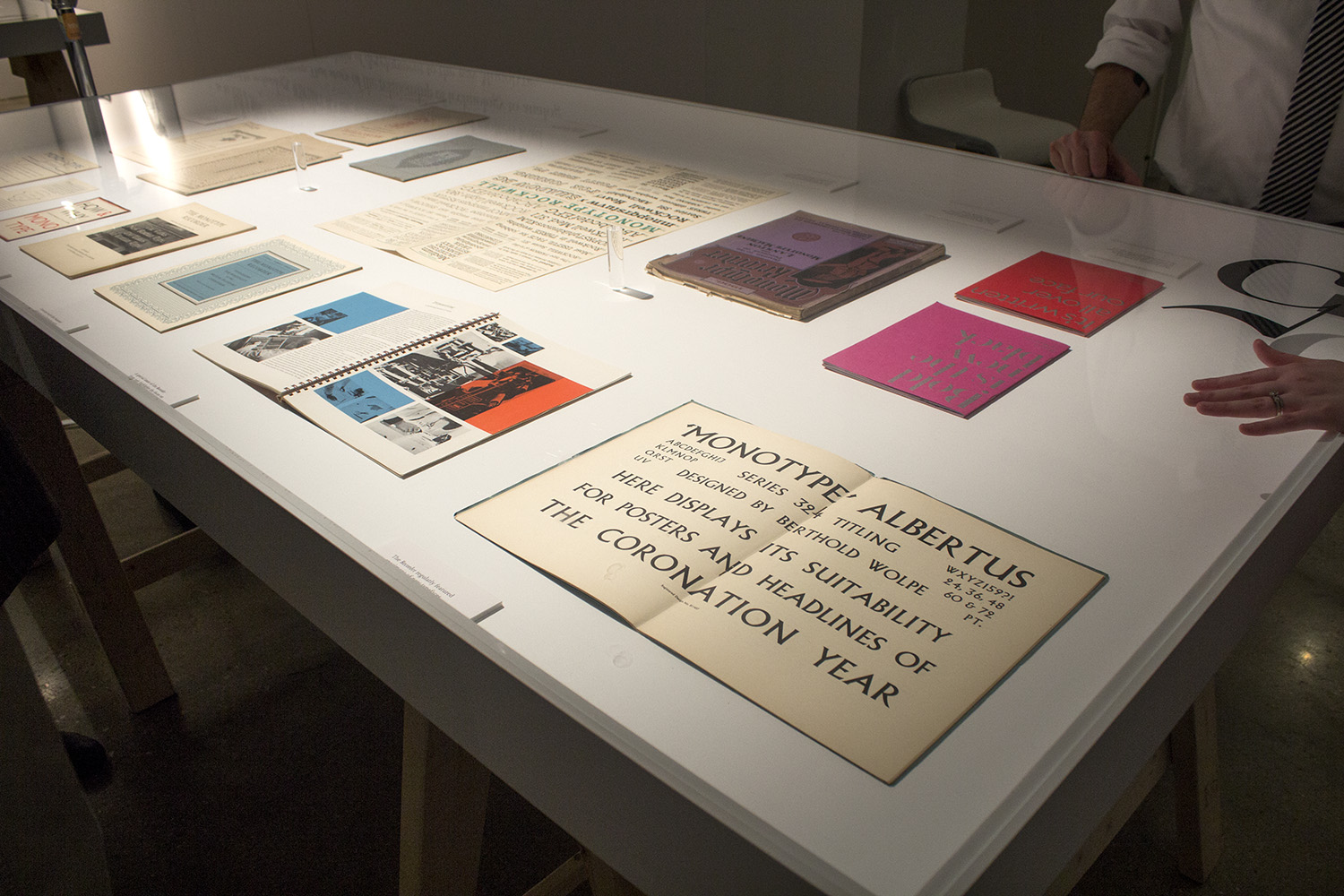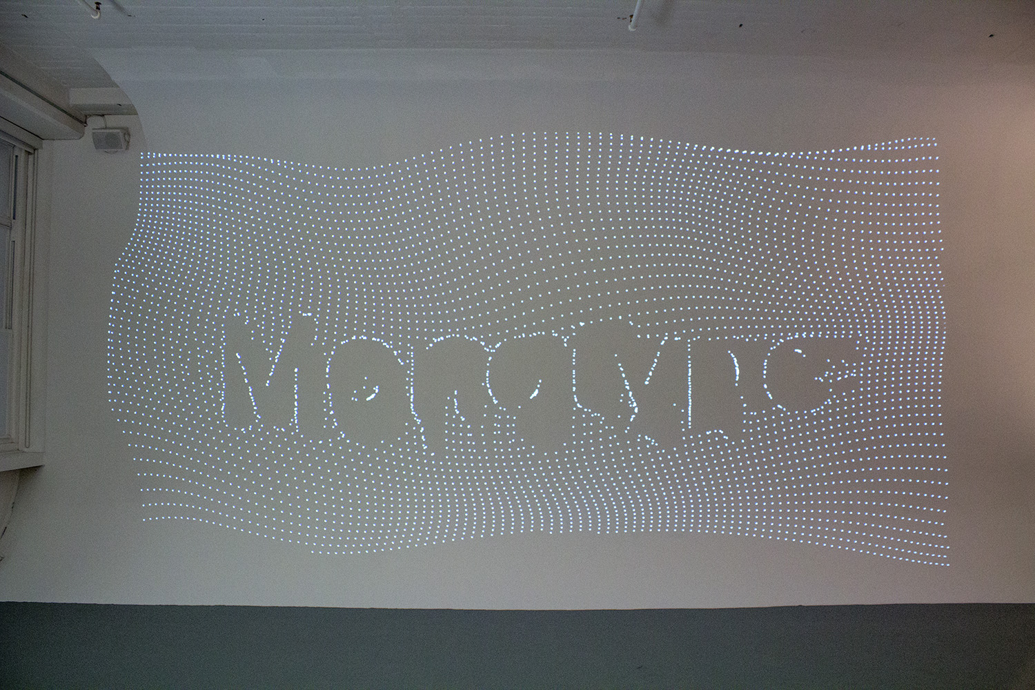
This week Monotype opened its Pencil to Pixel exhibit in New York to celebrate its unique, typographic history. The company has played a wide-reaching role in the type industry for more than a century, and is linked to the creation of wildly-popular typefaces like Times New Roman, Perpetua, Rockwell and Gill Sans.
If you’re in the mood for lusting over decades upon decades of gorgeous type designs, shift your eyes below. There’s a lot of cover, so we’ll dive right into some of our favorite pieces from the archives.
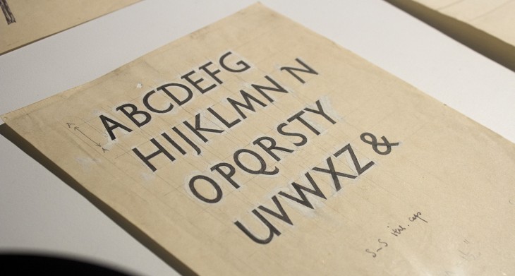
Eric Gill’s 1928 pencil and ink drawings for the Gill Sans Italic show:
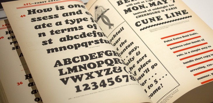
Pabst Extra Bold Italic specimen:
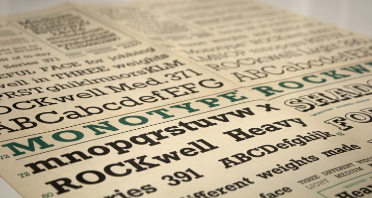
Rockwell specimens:
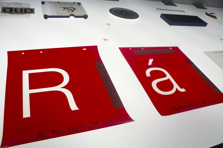
Helvetica Neue specimens:
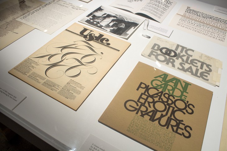
Volume 3, no.2 of U&lc magazine from July 1976, featuring lettering by Tom Carnase:
Monotype Albertus:

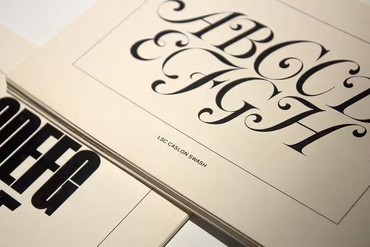
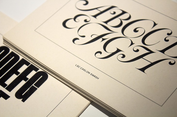
LSC Cason Swash and Lettera Fat:
Albertina, 1963: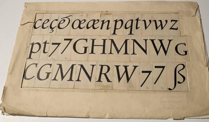
Oh yes, there’s more. Check out the gallery below, and peek at this video.
For even more, be sure to take a look at TNW’s Design & Dev channel!
Get the TNW newsletter
Get the most important tech news in your inbox each week.

