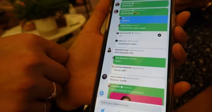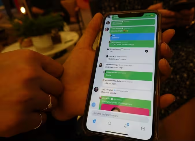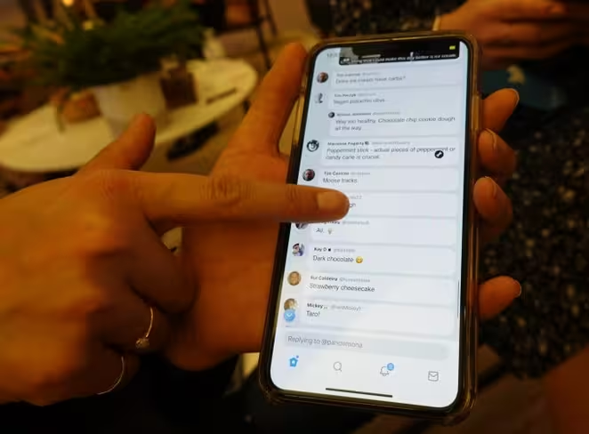
Last week, Twitter announced that it’ll launch a new beta program to test out its upcoming features to reshape how conversations take place on the platform. Now, we have our first look at the upcoming features thanks to TechCrunch, and frankly, the interface looks like a multicolor mess.
First up is Twitter‘s stacked conversation feature. The company said it’s going to color-code replies in the future to differentiate responses from the original poster of the tweet, people whom you follow, and people whom you don’t. While the screenshot below shows us very vibrant colors, Twitter‘s product head Sara Haider told TechCrunch that they’d be toned down in the final release. At this moment, the interface looks like a chat app designed for a college project.

The social network is also planning to algorithmically sort replies to make reading a thread easier. As we’ve seen in the past, algorithmically sorted posts didn’t sit well with people and Twitter had to roll out a button to switch between a chronological and algorithmic feed.
In another experiment, Twitter is testing removing engagement icons – retweet and heart – of replies to make the conversation look sleek. These icons will only show up when you’ll click on a particular post. In past, the company has considered removing the heart button entirely as well.

Twitter is also playing with some new functions like pinned tweets to start a conversation (ice-breakers) and IM-styled status messages. But there are no images available for that.
For testing out these features, Twitter will ask the approved users from the beta program to download a separate build from the main Twitter app, and roll out features for testing. A lot of these might not make the final cut, but it’ll be interesting to see how people will react to such a big change to the fundamental flow of conversations on Twitter.
Get the TNW newsletter
Get the most important tech news in your inbox each week.


