Twitter’s Moments feature has been out for a few weeks now, and it’s been doing a ton of work to amp up the tool. The Moments lightning bolt button is more prominent on Twitter’s mobile apps (pushing aside Highlights), it’s aired a few television spots, and today, it pushed this feature even more forward by swapping its placement with the notifications tab.
This is dumb.
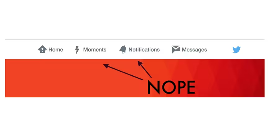
Look, I understand wanting users to experience a new feature, but this is just misleading design. Instead of convincing users to check out Moments, users feel tricked into clicking something they didn’t intend to.
hey twitter switching notifications and moments doesn’t make me more interested in moments. the opposite, in fact!
— No, really. Cats. (@aegies) December 4, 2015
Nice try, @Twitter. Go ahead and put Moments where Notifications used to be. I’m still not going to click on it. — Jody Genessy (@DJJazzyJody) December 4, 2015
.@twitter switching moments and notifications with no warning should get you banned from twitter — Dave Lozo (@davelozo) December 4, 2015
Startups (and businesses in general) should focus on building products that provide value to its users. If you can’t advertise this without misleading users into “stumbling” upon it, then news flash: it’s not interface’s fault.
Small words of plea: Please don’t undermine your users’ intelligence. We notice, and that’s not a good thing.
Get the TNW newsletter
Get the most important tech news in your inbox each week.