Twitter has expanded image previews for timelines on the Web and its Android and iOS apps. The new feature affects photos and Vine videos.
Here’s what it looks like:
Twitter is releasing updated versions of its iOS and Android apps today with the new timeline appearance. The new apps also make it easier to retweet, reply to and favorite tweets right from the timeline.
If you’re not a fan of the new image previews, you can turn them off on iOS and Android, but there doesn’t seem to be a toggle for the Web version.
The change represents a significant shift for Twitter. The company has been steadily moving away from a stream full of condensed text and toward a richer multimedia experience. However, power users that rely on Twitter to quickly scan for news are bound to be upset by the new format. Twitter faced a backlash back in August when it reworked the timeline to change the way it displayed replies to tweets.
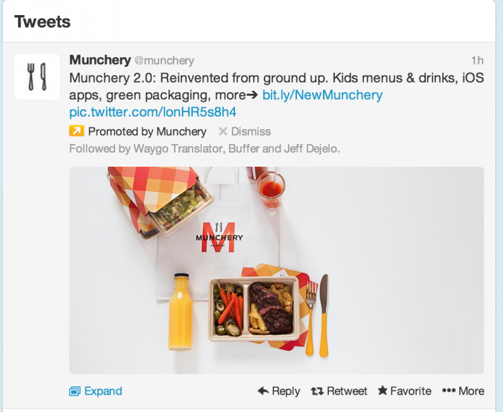
Making Twitter more visual will also help attract advertisers. When I opened up Twitter.com to check out the new look, the promoted tweet at the top of my stream was much more noticeable:

Twitter laid the groundwork for these changes with its introduction of the Cards expandable drawer feature in 2011. With the new photo and Vine previews, Twitter is throwing down on Instagram, which dropped support for Cards late last year.
➤ Twitter | Google Play | App Store
Related: This is what the future of Twitter looks like
Headline image via Leon Neal/AFP/Getty Images
Disclosure: This article contains an affiliate link. While we only ever write about products we think deserve to be on the pages of our site, The Next Web may earn a small commission if you click through and buy the product in question.
Get the TNW newsletter
Get the most important tech news in your inbox each week.


