If you are into dataporn and charts, Twitter is the company of the day for you. Twitter has announced a charting and mapping tool that allows users to sort tweets from the two main presidential candidates, tracking engagement across the United States.
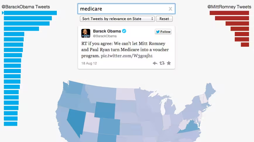
It works in the following way: first, enter an election-specific keyword:
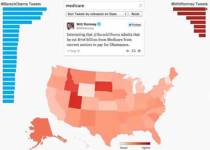
Next, select a tweet from the sidebar. Each bar chart entry under one of the candidates represents a tweet. The longer the bar, the more engagement that tweet received. We’ll snag a Romney tweet for fairness:
As you ca see, in Utah and Idaho that tweet is the bee’s knees. It flopped in California. You can enter in any sort of term, but the more common it is a theme to the election, the greater number of tweets you will be able to sort through. If you wanted to discover where certain issues resonate the most, this new tool is a great way to find out.
As a note, in TNW’s unscientific testing of the tool, it appears that Barack Obama has a far larger Twitter influence than his opponent, given that his tweets tend to enjoy more engagement.
If you find anything really neat, Twitter asks that you send it over to @Gov. Now, get researching!
Get the TNW newsletter
Get the most important tech news in your inbox each week.


