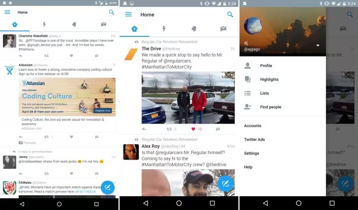
If you’re using Twitter for Android — and hate the layout — things may soon be changing. Some beta testers are noticing a new-look Twitter with a bunch of Material Design cues.
In the redesigned app, Twitter’s four main areas — feed, Moments, notifications and direct messages — are still at the top of the screen, but you can navigate between them by scrolling left or right on your screen in addition to tapping on the icons.
A new slide-out menu is also in testing, which takes much of what’s currently hidden in the ellipsis menu and makes it easily accessible. There’s also a floating tweet button, much as you’d find with Google Plus’ ‘compose’ button.
Visually, the app will look familiar, but there are some very subtle upticks that make it look cleaner and brighter. Unfortunately, we don’t know when (or if, really) the new-look Twitter for Android will roll out, so keep your fingers crossed it drops soon.
Get the TNW newsletter
Get the most important tech news in your inbox each week.


