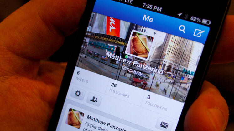
I don’t know exactly when I joined Twitter. The account that I’m using now was opened in January of 2009, but there were others before that as I was playing around with the service and not really getting it.
Trudging back through my history of tweets is like moving slowly back through learning to speak. There’s so much from the early days that is either obligatory or robotically self-promotional that it actually pains me to look at it. I am not kidding you, my first tweet was about getting lunch.
But we should all take some small solace in the fact that when Twitter launched, the way most people used it wasn’t much better. They tweeted about food, about bodily functions and about mundanity. But somewhere along the way, Twitter transformed into something else. The simple, compelling stream of real-time information became not only interesting, but indispensable.
I’ve talked about just why this kind of real-time layer is something we can’t live without before, so I won’t rehash it, you can read it there. But there’s no doubt that the first act of Twitter played out in a powerful, but unpredictable way.
But Twitter is no longer in its first act. The Twitter of today is a significantly different animal than the Twitter of seven, or even three, years ago. Unfortunately, Twitter’s formative years both inside and outside the company have been rocky ones. For a product with such an original, simple premise, there has been an inordinate amount of disagreement about how it should grow and what it should become.
The controversy about Twitter’s direction inside the organizational structure of the company has remained mostly quiet (but it’s still very much an ongoing thing). But the public debate about what Twitter was and what it has become has been vociferous, opinionated and largely carried out on Twitter, which says something. In recent years, the controversy over the way that Twitter has exerted more control over its platform by making third-party clients persona non grata has received a lot of attention, but the sound and fury of it, in the end, doesn’t match up with the way that the majority of Twitter users interact with the service. Most people don’t use third-party clients, they use the web or, increasingly, the mobile apps for iOS and Android.
I’m personally not super happy about how Twitter handled the disenfranchisement of third-party clients. But I’m still very interested in how it’s been handling its transition from a real-time messaging company to a real-time media company.
I spoke to Michael Sippey, VP of Product at Twitter, about Twitter’s new audience, and its efforts to get new users and retain them with value.
“We see in our data that there are a whole bunch of people that use Twitter every day, every week, every month…that never tweet,” Sippey says. “We think that that’s a perfectly fine use of Twitter. That’s fantastic. And I think that’s a shift from the early adopter view of the product and the way that the product has evolved since 2006.”
Back then, Sippey says, the focus of Twitter was production. If you weren’t actively sharing what was happening, then you weren’t using it right. That was a problem. “Everyone [said] ‘I don’t want to join Twitter because I don’t know what I would say’.”
That’s why I decided to take a look at Twitter with a fresh set of eyes. If Twitter wants to be a media company and a ‘global town square‘ that is completely ok with being an audience, then lets evaluate it on those merits. Rather than bringing along the baggage of what Twitter was, lets evaluate it on what it says it is, right now.
So, I started over. I fired up a new account and started using Twitter in a way that, honestly, I never had before. As a person interested in what kind of content that it could deliver. Here’s what I found.
Starting Over
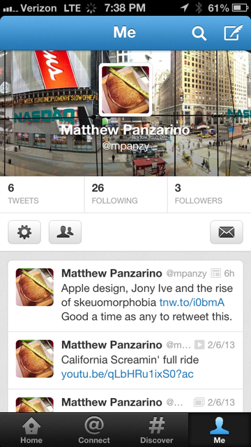
I decided to sign up for Twitter via the iPhone app. I don’t know the ratio of people signing up on Twitter via mobile or desktop, but if it hasn’t tipped over to mobile by this point then it probably will soon. Twitter has always been an inherently mobile service and, even in its new media platform incarnation, it still lends itself to use on the go. It stands to reason that the main on boarding point for people will eventually be a smartphone.
Right off the bat I ran into a weird issue. Because Twitter is integrated into iOS directly, I had to go delete my main profiles from Settings before I could get a ‘first run’ experience without them automatically logging on. That done, I fired up the app and zipped through the signup process. Until I got to choosing a handle.
In an unexpected fit of writer’s block, I couldn’t find a handle that I felt was both representative, clever and unique enough to use. I mean, it was hard. I actually stopped the signup process for almost a day because I was stymied.
I eventually picked it back up and decided on one (a decidedly less rugged version of my current Twitter name) that I had been using for years in other forums. When you look at raw searches of the main Twitter feed, which I do from time to time because I know developers, you can see that the handles are getting more and more complex and odd.
They’re moving further away from normal human names or nicknames and into some wild territory. Largely because people are having to find a small sliver of land in the increasingly crowded handle real-estate.
I don’t know how much of an issue this will be down the road, but if I’m Twitter it’s something I devote some time to thinking about.
Another side effect: the longer your handle, the less room you have for text in re-tweets. One solution would be to move the Twitter handle to metadata, no matter where it appeared in tweeets. If it’s a handle, it’s part of the sidecar of data where things like Twitter Cards now sit, rather than part of the 140 characters.
Aside from choosing the handle, though, the signup flow is quite good. No major issues and the app presents itself beautifully when it’s not signed in.
The first follows
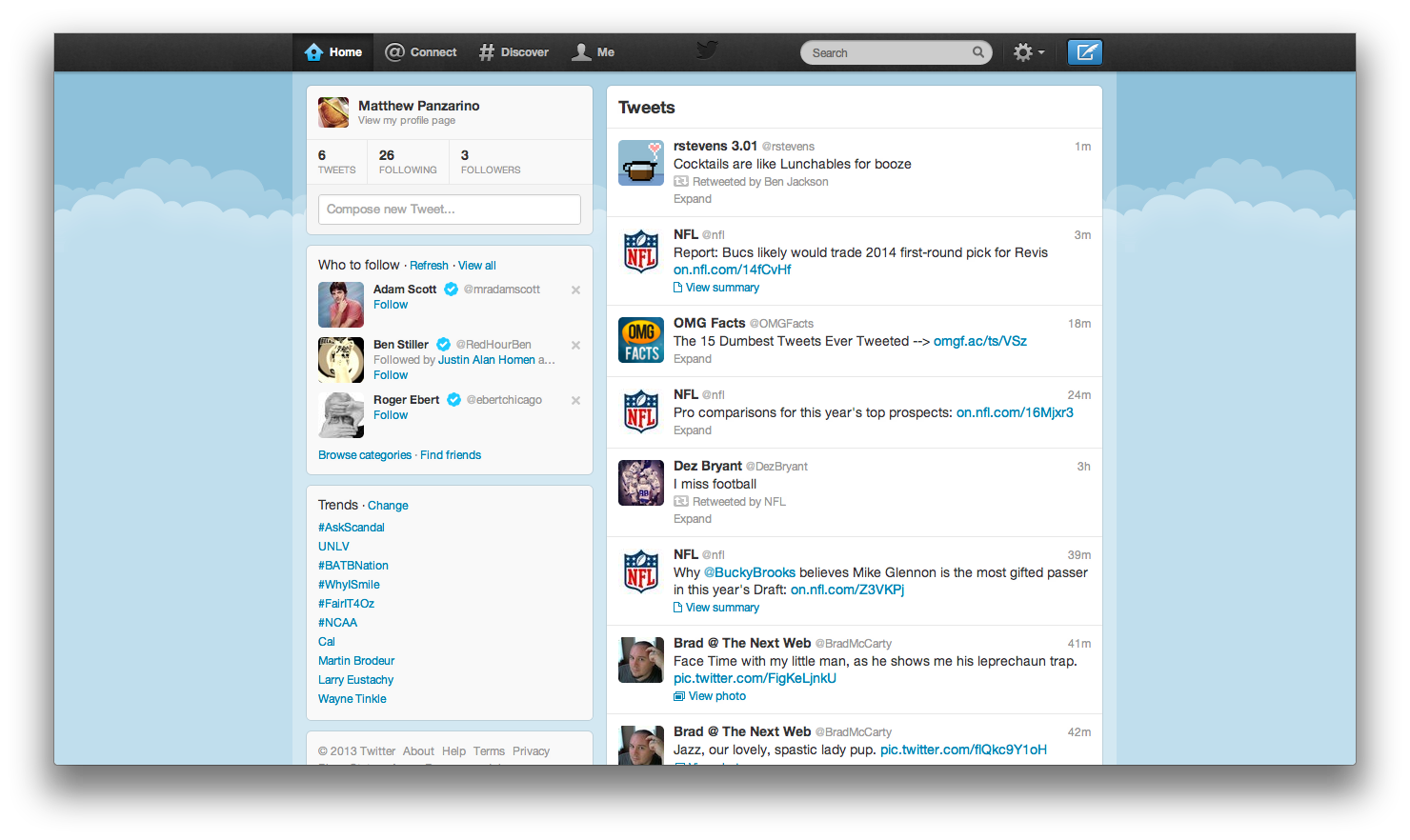
Twitter’s Search and Relevance team has also been doing a lot of work on its Who to Follow recommendations. Testing and evolving those algorithms has allowed them to offer better up-front recommendations and ongoing ones in the mobile app and on the web.
“I’m still, 6 years into using the product, finding recommendations about who to follow and saying ‘oh, of course I should be following that person I can’t believe I’m not already’,” Sippey tells me, “And that provides that…moment of delight.”
These are delivered via the Discover tab, but there will be some tweaking of that to come. The desktop app also provides more room to offer sidebars and sections.
“How do we actually give people value in the product as quickly as possible given that your home timeline, today,” he notes, “by definition doesn’t have anyone in it except for the people that you follow through the new user experience.”
When you fire up the app, you’re presented with the ability to poll your contacts for Twitter matches, but not Facebook or any other social graph. Those days are done, thanks to the info silo cold wars between the major social networks. I did find a few friends in my contacts, but there isn’t a lot of crossover for me there. 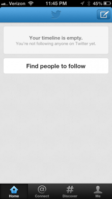
But I did end up following a few friends who already use the service, which is really the point. The ice was broken and the nightmare scenario, a completely empty timeline, was avoided.
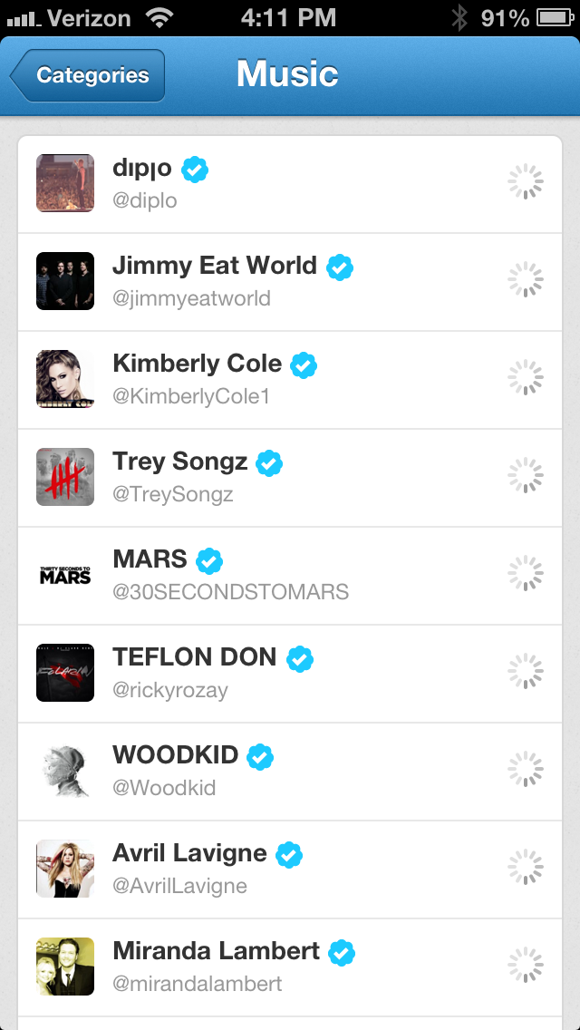
Next, you can pick from categories of users to follow from. They’re split out into things like Music, Funny, Entertainment, Fashion and more. Overall, it’s still just a list of names and tiny icons, though, so if you don’t know the name right off the bat, you’re unlikely to follow. This isn’t a place for exploration, it’s for ‘recognition follows’.
Unfortunately, after you’ve finished the initial following process, the categories become almost impossible to find. They’re buried inside Discover>Who to follow>View All Suggestions>Scroll to bottom>Browse Categories. Yes, the primary on-boarding method for new follows is likely to be organic, but once you’ve shown users what Twitter has to offer, offering them a way to binge on new follows (aka new content) seems like a good bet.
I did encounter a few bugs during the initial following, with icons not loading and my ‘who to follow’ suggestion box staying stubbornly empty. They aren’t major, but they’re potentially a big problem because the on-boarding process is the biggest hurdle for Twitter. If you don’t display value immediately, you’re screwed.
Sippey acknowledges that there are still ‘a lot of rough edges’ on the new user experience, especially on mobile. “What we’re trying to do with that first time experience is make it really easy to get started.”
I also hit him up about email. Twitter has been a bit notorious lately for the variety and volume of emails that it sends. The email setting section of your Twitter account has grown steadily over the last couple of years.
“Email is really useful,” he says, “because it gives us an opportunity to continually re-introduce Twitter to people…it’s been really successful for us.”
He does acknowledge, though, that most of a user’s ‘follow back’ actions are going to happen when they’re actually on Twitter for Web or Twitter for mobile, when they’re “in that mode of discovery.”
I make the suggestion to move the who to follow section (especially on mobile) to a more prominent location, or a more organic one. Being able to surface those suggestions subtly in context feels, to me, to be a more effective way of reminding people that there are other people out there producing content that they should see.
All he’ll say is “I really like that idea.”
Consumer
Now that I had a few follows, I trundled through my timeline a couple of times a day, reading all of my tweets. The much slower pace of my timeline allowed for less stress than I’m used to. I typically get between 20 and 30 tweets a minute at work.
Instead of that, I was able to treat Twitter as something I checked once or twice a day, and took time to read pretty much every entry. The directly tappable links, something that third-party clients have had for some time, are welcome because they eliminate a tap from between you and the content.
“We’ve seen big lifts in engagement with [Twitter Cards],” Sippey tells me. “Things, too often, are hidden behind things. They’re hidden behind a link, behind short urls, behind a tap into a tweet. And when, in a smart way, we can bring that content forward to the user it’s a better user experience.”
In what is a telltale phrase, he also says that the Cards experience is about a tweet being a ‘caption to a much richer experience’.
The transformation of the role of tweets from the sole purpose to a caption that leads users to media content is, in the end, a microcosm for the journey of Twitter as a whole
“The core product challenge that we’ve been working on over the past year is: how do we make Twitter better for the people that are essentially using it as a news source, using it to follow the things that they’re interested in and passionate about and staying in touch with the world. Frankly, we have a long way to go to fulfill that vision,” Sippey says.
And he’s right. The mobile apps are ok, but the main timeline still feels very much like a transitional animal. It hovers between the old world of tweets and the new world of the media-rich Cards. What the next move is for that I don’t know, but I have some ideas. Note that the Discover tab already features pre-expanded cards on iPad and the web and extrapolate from there.
When I say that the mobile apps are ‘ok’, I’m being a bit hard. They’re definitely better, faster and more in tune with the ‘media company’ goals of Twitter than they were a year ago. Aside from the sign-on bug and the still-annoying margins on the timeline, the iPhone app is responsive and crisp. Web content loads quickly and reliably and media is presented well when there’s a card implemented.
It says something that a tweet which links out to an external media host that doesn’t support cards feels crude and wasteful after a while. Out of all of the inventions of the ‘new Twitter’, Cards feels the most powerful and the most obvious. A good combo.
The evolution of Discover
The goal is to get people to use their social connections, ostensibly via your Contacts right off the bat, to find people that they know and might want to follow. But the best recipe for a good Twitter experience isn’t just ‘your friends’ anymore. Sippey says that Twitter has found that the most successful onboarindg experiences happen when people partake of a ‘balanced diet’ of follows.
“You want to have some humor, you want to have some interests and you want some of your friends. And if we can actually help you craft that well-balanced diet for your home timeline you’ll be a more satisfied user and a happier user.”
The key to exposing people to what Twitter can be for them, he says, is the Discover tab, which Twitter has been tweaking relentlessly over the past few months. Discover gives people a taste of the information that’s out there on Twitter and exposes them to the kind of experience that they can have in their home timeline.
This is one of those areas that becomes a blind spot for a lot of people that have been using the service since the early days. If you’re a heavy user of Twitter, you’ll likely find that the Discover tab doesn’t offer you a lot of compelling content. Now, this is definitely something that Twitter will have to address at some point, but for now that’s ok because it’s not for you. Instead, it’s for the new user, the person whose feed is light on content. It’s a calling card for what the service can offer. 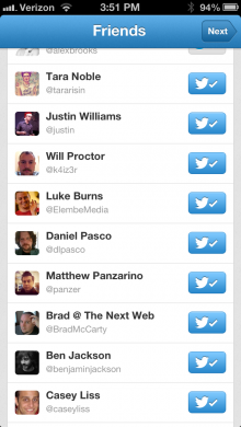
“The Discover tab as a product was essentially algorithmically picked news stories…linked right to the article,” says Sippey. “There wasn’t a ton of engagement on that part of the product, because it didn’t really fit. So we shifted discover to really be about Tweets.”
That shift allowed Twitter to show interesting Tweets based on people that the user follows, the social action and ‘velocity’ of popular tweets. This allowed more freedom over the kinds of content that Twitter was serving up in Discover. Using the Top Tweets algorithm, the rating that Twitter actually just exposed to developers recently, Twitter was able to get a huge increase in engagement on tweets in the Discover section.
Twitter found that this worked on three levels:
- Giving people better content to look at
- Giving people more accounts to follow
- Teaching users about the types of content in, and mechanics of, Twitter
Using a tweet as a calling card or ‘representative’ item increased the likelihood that people would follow an account. It seems simple, but if people like a tweet of yours, they’re more likely to follow. If you were to want to recommend a friend’s Twitter account for a follow and could only pick one tweet to ‘sell’ that follow with, which one would it be? That’s what the algorithm is about.
Converting readers to tweeters
Yes, Twitter is more comfortable about its new role as host to a small amount of producers catering to a large group of consumers, but that doesn’t mean that it shouldn’t be thinking about ways to make people a part of the conversation. To do this, Twitter is leveraging those actions that may not necessarily be creation, but aren’t completely passive either. Actions like fav’ing, retweeting and eventually replying.
“There’s an ongoing effort to make actions like…favoriting, retweeting, replying all the way up to sharing your own tweet as simple, fast and easy to use as possible,” says Sippey. Those efforts were behind the move to expose favorites more directly to users. Favorites were, for a long time, a Twitter insider thing. It was hard to check to see if you had received or given one and they had a very limited impact on the service.
The product decision, with the introduction of the Connect tab, to expose to users when they’d been favorited caused a huge leap in their adoption. You can think of a fav as an ‘interaction light’. It’s the gateway drug to becoming an active user of Twitter.
That’s why other tweaks have been made to make retweeting and replying as simple and fast as possible. Recently, for example, a change was made to the browsing windows in the Twitter app for iOS that allowed for a direct fav or RT even while you’re viewing the content.
And that interaction ramps up from faves, to retweets to creation incentives like Photo Filters and, eventually, whatever video service that Twitter adopts as its own. Whether that will be some sort of built-in version of Vine or something different likely depends on how successful Vine is on its own, but there will be something.
It’s likely that Twitter will always have a much larger audience consumers than it does creators, just as with TV (a model for Twitter) but the service will need to grow that number if it wants to keep its data set, and therefore its appeal to advertisers, robust.
Twitter Now
At this point, we’re long past the period where people dismiss Twitter as something that is a complete waste of time. Just like anything else, it may waste time in some hands, but it also facilitates an exchange of information and ideas at a worldwide rate that’s completely new to humans. That may sound hyperbolic, but it’s true. In a way, Twitter feels like the Internet’s version of the Internet. The Web connected us together, but Twitter has lowered the friction of that connection to near-zero, which is a powerful thing.
I owe my job to Twitter, I have friends who met their wives on Twitter. I have dear meatspace friends that I would never have without having met them first on Twitter. The impact of Twitter’s first act has been felt, it’s a done deal.
The question now becomes whether Twitter will be able to maintain that impact and power, even as it tries to reach the next stage of its evolution. It faces a philosophical quandry as it attempts to grow the platform to serve advertisers, but also use that growth to serve users. Yes, Twitter Cards are better for ads, but they’re also better for serving up audio and video content within Twitter itself. Twitter managed to lower the friction of sharing text and links to near zero on a worldwide scale. Can it manage to do the same for images, video, eventually music and more?
Right now, Twitter is a product in transition. Onboarding new users is still a work in progress, retaining those users is a moving target, and making sure that the experience is as friendly as possible to media content is an unfinished job. But there are glimmers of brilliance here, and signs that the transition to a strong second act might actually work.
You can follow me on Twitter here.
Get the TNW newsletter
Get the most important tech news in your inbox each week.
