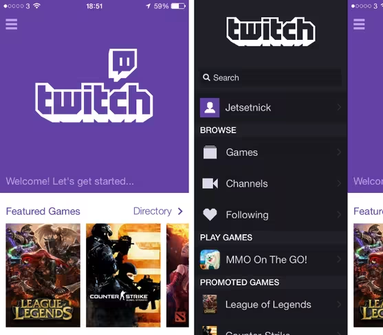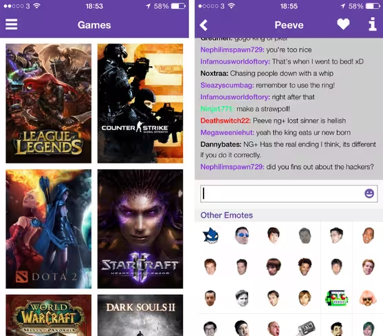
Twitch released a new version of its iPhone and iPad app today with an iOS 7-inspired redesign and a few new features, including offline channel search, an improved chat experience and broadcaster profiles.
The interface now has a flat, clean aesthetic, with a number of horizontal carousels on the home screen for featured games, channels and popular streams. If you’re looking for some inspiration, this is a good place to start.
The navigation menu slides out from the left-hand side of the screen with shortcuts for your profile, game and channel directories, and following list. Underneath is a series of promoted channels and games, which sounds obtrusive but actually points to content you’ll probably want to watch. League of Legends, Dark Souls II and Dota 2? That’s fine with me.
Twitch has updated the chat system too, with new moderation and emoticon options. The latter is a fairly basic set of icons – especially in comparison to most modern chat apps – but they’re welcome nonetheless. The expanded search options, which now cover people, individual games and offline channels, also makes for a more powerful and useful discovery experience.
Read Next: This is how Twitch streaming will work on the Xbox One / Twitch’s new SDK to support live broadcasting, capturing and archiving in mobile games
➤ Twitch | App Store
Get the TNW newsletter
Get the most important tech news in your inbox each week.


