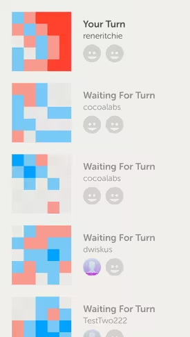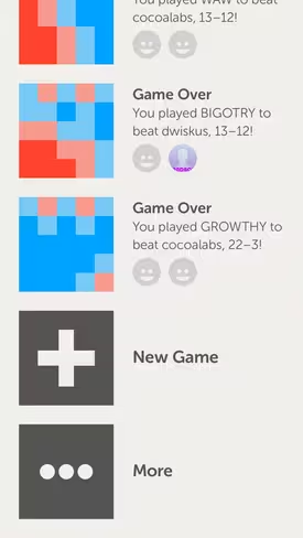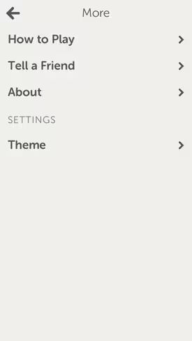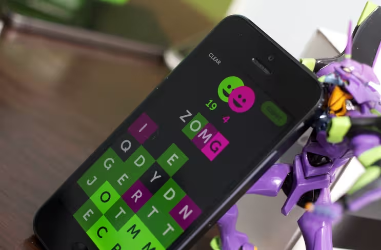
A new game called Letterpress is out on the App Store today. It’s a deceptively simple and visually striking word game from developer Loren Brichter, the creator of the Tweetie Twitter client. I’ve been playing with it for a while and it’s fantastic.
Sometimes you create an iconic app. Then that app is acquired by an enormous software company to retool as its own client. You work there a while, then leave once you feel you’ve done what you came to do. And then what?
For Loren Brichter of Atebits, that scenario is a description of his last few years as a developer of iOS and Mac software. As the creator of the much-loved Tweetie for Mac, Brichter was up by Twitter and worked for a while to integrate his apps with the service, where they eventually became Twitter for Mac and iPhone. Since then, Brichter has left the company and it has gone very much its own way with its apps.
When Brichter left Twitter late last year, he said that he was “taking some time to figure out what’s next”. We had a chance to talk to Brichter about the release of his next iOS app, a game called Letterpress, under the new Atebits 2.0 banner.
Once he left Twitter, Brichter says that he “jumped right into a backlog of old ideas that I hadn’t had time to mess with since Tweetie took over my time. Most of them will likely never see the light of day, but some of them – like Letterpress, and some of the core tech behind it – might surface slowly.”
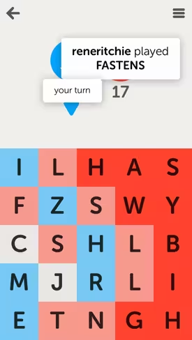
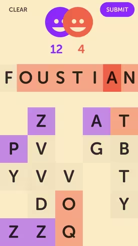
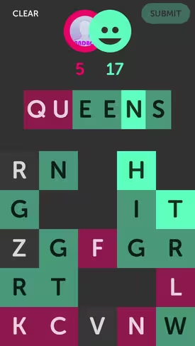
Letterpress is, on its face, a word game that may feel similar to others like Words With Friends, but has DNA that feels more compatible with Scrabble or Connect 4 in its simplicity and friendly design. The rules are simple, tap letters on the board to form words, coloring those letters as you submit your entry. Each letter is worth a point and you can steal letters as long as they are not ‘blocked’ or bounded on all sides by letters of the opponent’s color.
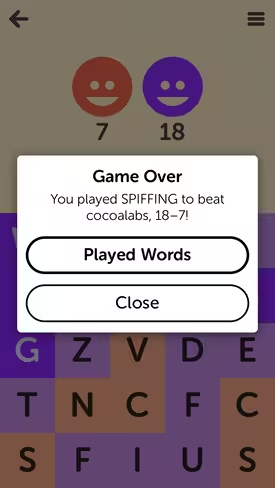
There are only two conditions for ending the game, either each opponent passes their turn, or every letter on the board is painted with a color. The person with the most points when either of those happen is the winner.
I’ve played probably two dozen or more games to completion at this point, some of them over days and some in single rapid-fire sessions. Because the gameplay is asynchronous, the pace of each battle is determined by the opponents. This means that it’s equally good for those that like to snag a few minutes during a lunch break and others that have the time to dedicate throughout the day.
So, why a game for his next project after the Twitter adventure? “It sort of just happened. I like that it’s in a totally different category than the things I did before,” Brichter told us. “And it certainly doesn’t hurt that games have cemented themselves as the most popular category on the App Store (by a long-shot). I figured it would be a nice change of pace, and I’d learn something about a market that I’m completely unexperienced in, whatever the ultimate success of the app.”
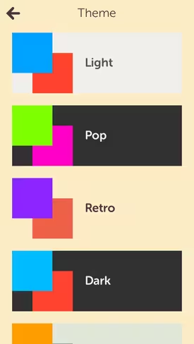
The game displays typically delightful design from Brichter, with an interface stripped of inessential elements and bathed in bright primary colors. There are seven themes to choose from, one of which should suit your tastes. Two tones for each player, and a board color.
Those colors were part of the game from the first, says Brichter. “I came up with this idea for a “color war” word game, and as far as I knew nothing quite like it had been done.”
The fact that it can only really be played easily in digital form was also interesting to him. “It’s the kind of game that would be hard to play in real life, keeping track of tile neighbors and “protected” tiles and the constantly changing score,” he told me. “It’s a new game and takes advantage of technology, it’s not just an old game “ported” from the physical world.”
The game uses Game Center only for its matchmaking. You can play a random Game Center opponent or one of your friends, and Brichter says that having Apple’s framework offered a genuine benefit when he went to make a multiplayer game. “Game Center offered a great deal. Building out a backend that scales to who-knows-how-many players is non-trivial,” he says. “And potentially a great waste of time if the app doesn’t stick. I likely would have built the game anyway, but it would have taken longer.”
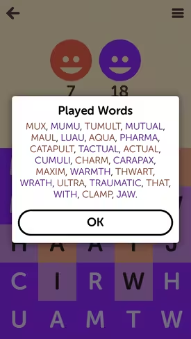
Letterpress is a free app, with a single $0.99c in-app purchase. That unlocks the ability to play more than two games at once, the ability to see all previously played words in a game and several themes like the ones you see in this post.
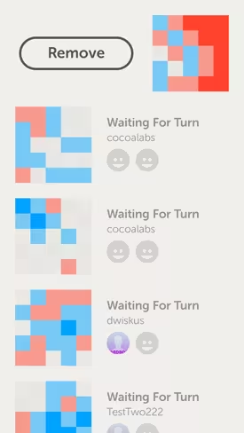
The interface is packed with delightful interaction elements at every turn. The clever animation of the board’s tiles, for instance, tilts them one way or another depending on how you pick them up. The board shatters on removal of a game, with the bits raining downwards on the screen. The close button on the in-game menu drops the pane off the screen, but does so in a random way, causing it to fall a different way each time. And the sounds are all friendly, but not annoying, blips and pops that match the tactile nature of the game well.
We asked Brichter whether the way that the game worked and looked was informed by the theme.
“The style embodies my own personal aesthetic, it’s minimal and modern, but not totally stark. There is the occasional rounded corner and subtle shadow. Little things like that, and the bit of randomness in the physics and animations make it more human and touchable,” said Brichter. “The sounds are mostly me making odd noises into a microphone.”
There are lots of little things to love about the way the game feels to play that we’ll likely see crop up in other apps and games, much in the way that Tweetie’s ‘pull to refresh’ ended up doing. The modal popups that animate and overlap when you tap on your opponent to see the last thing they’ve played is one that springs to mind, as is the repurposing of the menu button to mean ‘show me a menu from the top’ rather than ‘slide a pane in from the side’.
The way that the buttons at the top swap in to reflect their current functions when you choose letters is also great, as it eliminates two additional buttons from the interface that would have had to be there otherwise. The two player icons also jump together and overlap, keeping their size and purpose but making room.
The app is packed with small, kinetic animations. Everything feels reactive to the touch, bouncing subtly or retracting with a snap. There are no jackbooted default animations or behaviors left to intrude on the app’s sure handed polish. The parts have all been disassembled, cleaned and oiled and polished to a mirror shine.
As I commented earlier this month with the launch of Marco Arment’s The Magazine, a simple app is often like a bold stroke on an empty page. Any flaws or rough edges are immediately visible. And, aside from a mildly irritating Game Center error when submitting turns now and then (which Brichter is aware of and working to quash), Letterpress is a well-pulled stroke indeed.
Get the TNW newsletter
Get the most important tech news in your inbox each week.
