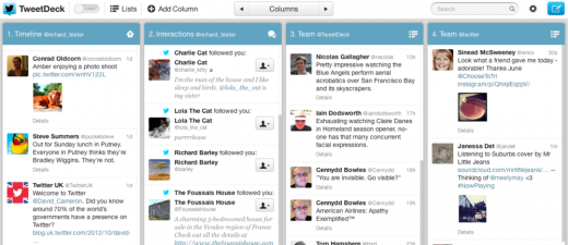
Twitter-owned Tweetdeck has announced a redesign that features a cleaner default design, as well as two themes, one dark and one light. The update is rolling out today for all platforms including web, Chrome, Mac and Windows.
The update brings a theme toggle between light and dark for users that prefer lower contrast looks. The toggle sits right in the toolbar. It also adds HiDPI support for the Retina MacBook Pro.
The new look does add some of that oft-touted consistency that Twitter has been talking about, as it looks a lot like the official web client. Or, at least the way it used to look. Tweetdeck still doesn’t feature expandable tweets heavily.
The new version also features new fond sizing options, which were never an option in Tweetdeck previously. Under Settings>General, you can select small, medium or large font sizes.
Tweetdeck, which was purchased by Twitter for over $40M in 2011, has been updating the client on the web and natively with small updates over the last several months. In March, it got a huge update that brought media previews and more. In July it got better user profiles, in August it got an update to the Chrome client which added speed.
You can see the new design in Tweetdeck for web, Chrome, Mac and Windows.
Get the TNW newsletter
Get the most important tech news in your inbox each week.


