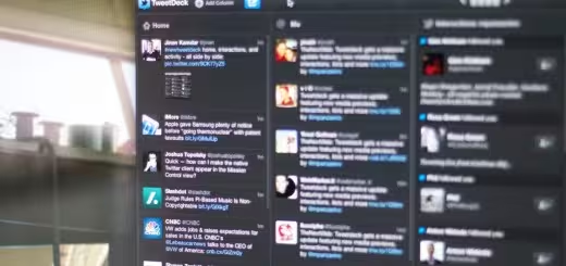
A new Tweetdeck, version 1.5, is now available, and it brings faster navigation between columns. This comes in the form of a redesigned column browse button, sideways scroll bar and gesture support.
There’s also now a new icon on each tweet that gives you access to an actions menu that allows you to do a variety of different things for each tweet. Clicking on the timestamp of any given tweet now brings you to its page on Twitter.com.
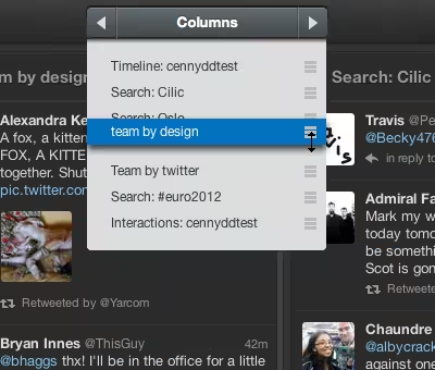
The changes to Tweetdeck mean that the columns are all arranged side-by-side, allowing you to use the scrollbar along the bottom to smoothly browse through them. The redesigned Columns button at the top allows you to pick a column by clicking and choosing it from a dropdown, or by clicking the arrow buttons to either side. This will jump you through several at once. The new button also allows you to organize your columns easier by grabbing the handles on the right and dragging them up and down.
There’s also a brand new action button attached to tweets that lets you reply, follow, send a DM, manage list memberships, grab a link, email the tweet or delete it. This is similar to the menu found in many other third-party apps of late, so it’s nice to see it come to one of Twitters own apps.
The updated version of Tweetdeck are available now for Windows, as a Chrome app and on the web. The new version will be available in the Mac App Store soon.
Get the TNW newsletter
Get the most important tech news in your inbox each week.


