The long wait for the popular Twitter client Tweetbot to arrive on the iPad is over. The robot-themed app has a definite reputation to live up to as it has become one of the de-facto alternatives to Twitter’s increasingly newbie focused official clients.
This release follows today’s earlier launch of Tweetbot 2.0 for iPhone, an app which we reviewed here and quite liked.
We’ve been using Tweetbot for iPad for several weeks now and have had time to acclimate to using one of our favorite apps on the larger screen. It has been redesigned from the ground up to take full advantage of the larger screen real-estate offered by the iPad. There are some features here that you’ll find carry over well from the iPhone, along with a host of iPad-specific gestures and layout tricks.
If you want a straight answer about how good it is, I can tell you right up front that it joins the ranks of the very best Twitter clients available for iPad from any developer, including Twitter itself.
Tweetbot has always been one of those apps that is an acquired taste. Some people love it and some hate it, but rarely does anyone not have an opinion about it. Now, I’ve always liked the app, both for its personality as well as its expansive set of features. Rarely have I found anything I’d like it to do that it doesn’t.
But, somehow, it feels even better on the iPad. It’s as if the gestures, animations and industrial styling that Tapbots apps have always been known for finally have room to breathe.
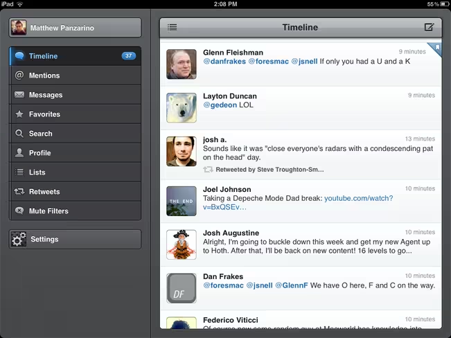
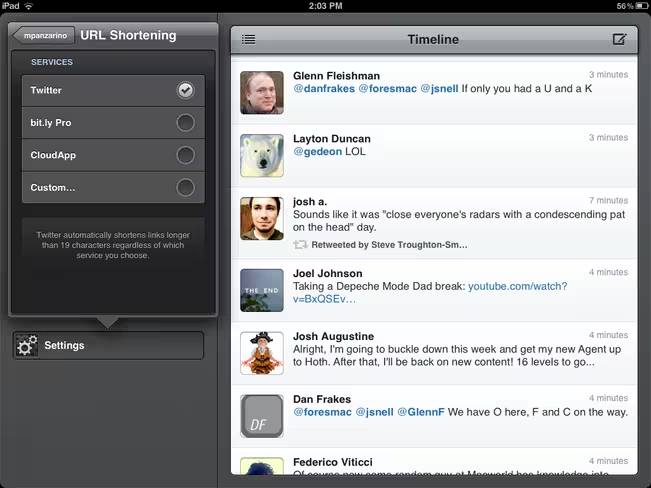
When you launch the app, you’re given an expansive and well spaced timeline. On average, on the default font setting, you’re presented about 9 Tweets at a time in the continuously scrolling list. This feels like more than enough, but it is supplemented greatly by the fact that Tweetbot for iPad caches a huge amount of Tweets, allowing you to scroll back through your archive freely.
The timeline has some new tricks that have made their way to the iPad version as well, including links that are directly tappable, rather than having to select a tweet first and gorgeous inline image previews. When you tap one of those previews, you get a nice lightboxed display of the image instead of being transported into another viewing window.
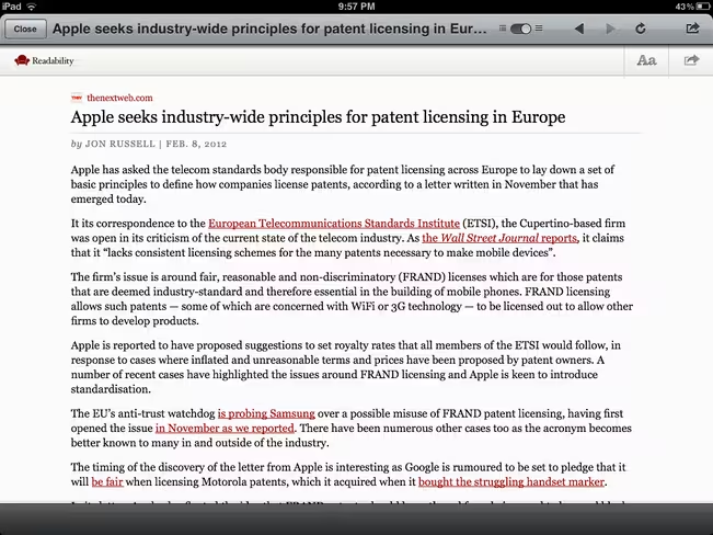
Tapping on a link brings up a standard browsing window with only one menu bar, which maximized screen real-estate. There is also a convenient Readability toggle which reformats the page into plain, nicely formatted text using the web service.
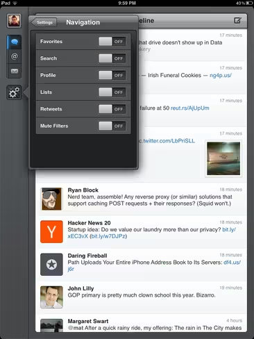
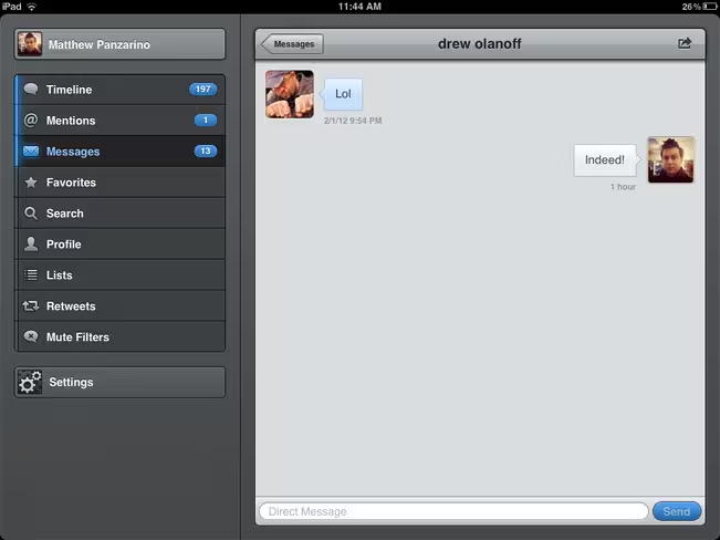
In the portrait view, your customizable menu bar displays as icons for your timeline, replies, messages, favorites, profile and more. If you rotate the app into its horizontal mode, the extra space available allows these menu items to expand outward to show their labels. You can configure this bar to have as few as the three basic sections: timeline, replies and direct messages.
When new Tweets are loaded above your field of view, you’re notified with a classy transparent counter bar which will roll the count down as you scroll, so you always know where you are in your timeline.
As with Tweetbot for iPhone you can choose to display any of your lists as your timeline, or swap between accounts to display. There is now a handy dropdown for doing this.
Tweetbot’s notifications, external services and navigation options remain some of the most configurable of any Twitter client. A two-finger swipe on any screen deeper than your timeline will bring you back up one level, a three-finger swipe will jump you right back up to the timeline from wherever you are. Tapping and holding on the contextual “back” button in the upper left corner will do the same. Double tapping the profile button will bring up your Favstar profile.
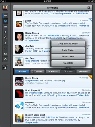
Tripple-tapping a tweet does one of several configurable actions including: reply, retweet, favorite, translate and view in Favstar. My favorite of these is the ‘favorite’ option, as it allows me to quickly tag Tweets that I approve of or want to save for later reference. The action bar, revealed when you single tap a tweet, provides you with the rest of your standard options for handling a Tweet.
Direct messages have also gotten the Tweetbot 2.0 makeover, gaining a conversational view that makes tracking DM conversations much easier.
The Mute Filter section is now more visible as you don’t have to expand one of the toolbar menus to see it. This should encourage people to use them more. These are excellent for filtering certain hashtags, like those of a sporting event, out of your stream.
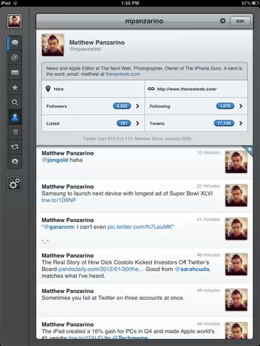
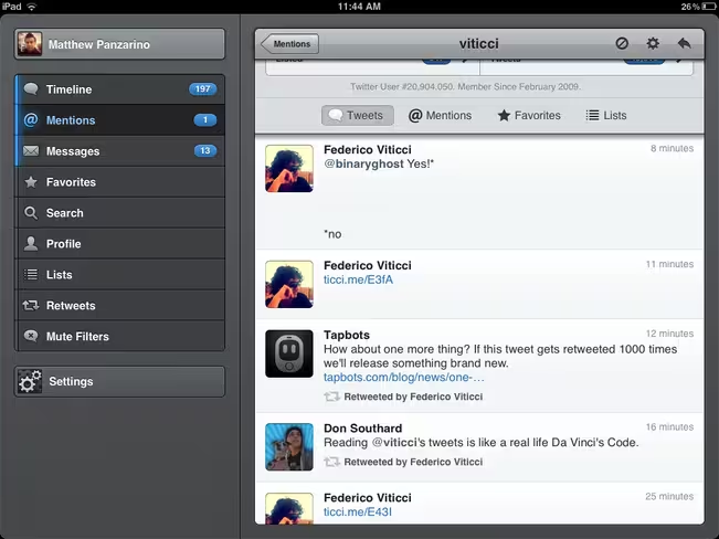
The profile view is nicely feature-rich as well, giving you instant access to your stats as well as a scrollable list of your recent tweets. You can also edit your profile directly from this screen. One great deail is that, when you visit the profile of someone else, the statistics portion of the display slides away when you scroll their timeline, allowing you to see more of their tweets at once, while still navigating between tweets, mentions, favorites and lists, very slick.
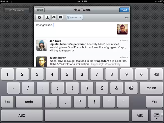
The compose screen gives you a nicely generous writing space that, at first glance, may appear too large. But when you launch a reply to a series of Tweets you’ll notice that these are brought along in a scrollable list, allowing you to navigate the conversation for reference. Drafts are made easily accessible off to the left side.
Tweetbot for iPad actually ends up occupying a significantly different spot on in the market than it does on the iPhone. Compared to Twitter.app’s fancy Origami-esque flying cards, Tweetbot feels almost staid, with its simple sliding panes and structured columns. Remember, Twitter is a service that was born with almost no rules beyond the famous character limit. Core ideas that we take for granted, such as retweets, didn’t exist until early Twitter users felt that they needed to and created them.
Twitter has been steadily moving away from those long-time tweeters in order to position itself to continue growing and onboarding newer and more casual users and changes to its official apps have reflected that. The new Twitter app for iPhone has certainly shown itself to be geared specifically towards these newer users, with its new Connect and Discover features. And if you think those features aren’t going to make their way to the iPad version of the official app, then you’re kidding yourself.
Honestly, this makes Tweetbot for iPad, somewhat ironically, your best candidate for a ‘classic’ Twitter experience. All of the things that power users of the service love are here and they’re implemented in a way that feels more focused and precise than the existing Twitter.app. Once the changes wrought by ‘new new Twitter’ make their way to the official apps, this will likely be even more evident.
But even aside from ‘power user’ or ‘new user’ status, Tweetbot for iPad stands on its own as a prime example of one of the best apps out there for iPad, regardless of service. It’s attention to detail, precisely tuned graphical style and abundance of easy to access features make it easily the best Twitter client on any iOS device.
Yes, it is a separate purchase from the iPhone version of Tweetbot and at $2.99 it’s definitely more expensive than the standard app’s $0 price tag. But if you spend any amount of time in Twitter, you’ll find yourself doing it more efficiently and enjoying it more with Tweetbot.
Get the TNW newsletter
Get the most important tech news in your inbox each week.

