Sandi MacPherson is the Editor-in-Chief at Quibb.
Product roadmaps typically focus on building up a product, adding features as the product evolves and grows. While that’s great, in my experience building Quibb, I’ve found that removing features is also an important aspect of product design and management.
There’s not much guidance on making products more simple, crisp and less bloated. In making decisions to remove various features, I’ve seen how more mature companies do the same — identifying and weighing tradeoffs to make tough decisions, working toward the goal of building a better product.
Your users vs. The company
In reviewing an existing feature that’s on the chopping block, it’s important to separate the impacts that feature has on both users of the product and those making the product. While oftentimes the goals of users and the company are aligned, that’s not always the case.
Quora encountered this situation a few years ago with their Direct Question feature. The feature allowed you to ask another Quora member a question directly from their profile.
This feature probably created a lower barrier, allowing you to directly ask the exact person you wanted to answer a question. It was removed as the company found that if people answered those questions directly, that valuable information wouldn’t end up on the main question page on the site
While this feature enabled a behavior that users find useful, it diminishes the valuable content the company is building.
Current vs. ‘Ideal’ users
Users you’ve identified as your ‘target market’ aren’t always the ones who use your product at the start. You probably have a detailed understanding of what this user looks like, and have good reasons for why you’d like more of your users to be like them.
Products have natural life cycles of users (i.e. early through to late adopters), but it’s important to not let the uniqueness of those early groups affect how you build and create features for your target audience. Weighing exactly which features you need to keep that early group interested but will still work for your later target audience is hard.
Building too many features in that way can mean you’ll have to remove them later.
Move vs. Remove
There’s a recent trend that’s making the tradeoff issue more palpable for established tech companies. Instead of completely remove a feature , developers move the functionality into a new product.
Dropbox has done this with its photo-sharing product Carousel, Facebook has done this with Messenger and Foursquare has also done this with Swarm. While most of us aren’t able to directly replicate this strategy, it can shine some light on the importance of keeping products crisp and focused, especially on mobile devices.
Recently, I’ve had several conversations with smart entrepreneurs as they try to adjust their Web-first product for a mobile experience. It’s a completely different way of interacting with a product, so the mobile version often looks and acts differently from the Web version.
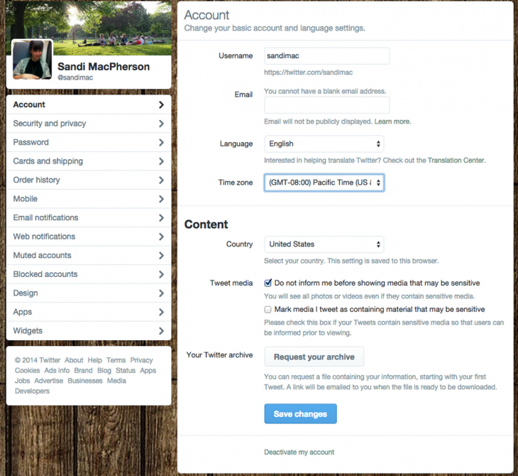
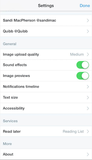
Deciding which features to remove from mobile is another tough product design decision. Twitter has done a great job at this. Its Web app Settings are extensive, with a whopping 13 sub-menus.
Recognizing that all of these settings would be overwhelming on mobile, Twitter made the decision to strip down which Settings features are accessible on mobile.
The tradeoffs for removing features on one platform is always difficult as you try to maintain a simple yet comparable experience across all versions of your product.
…then there are the technical challenges
All of these tradeoffs and decision criteria are important to think about as you launch and remove feature. There’s also the actual technical limitations and requirements of a feature.
Whenever you build a new feature, you’re entering into a contract to keep that code up-to-date and compatible with all other features you’ll choose to add in the future. By adding just a few features to a simple product, dependencies go up quickly and can be difficult for a small, resource-strapped team to manage.
Supporting OS versions, load times, legacy costs, scaling… the list is long! Sometimes, the value in removing a technically complex, low performing feature can free up a much larger proportion of resources to be devoted to an existing, more popular and higher leverage feature.
An early Quibb feature involved parsing Twitter bios of the people who weren’t yet a member, but that an existing Quibb member followed. If I could match up their company’s name, I could assume that they were coworkers and therefore that person was an ideal candidate for them to invite.
Over time, I realized the feature was causing many problems. Members complained that their feeds were slow to load. After weighing the tradeoffs, I removed the feature as I didn’t have the resources to make it work well within the technological constraints of the product at the time, and could make much better use of the resources elsewhere.
Simplicity over time and at scale is one of the more difficult tasks any product designer has.
The inspiration for this post came after reading a line in Ben Horowitz’s Good Product Manager, Bad Product Manager, where he writes: “Good product managers crisply define the target.”
Read next: Practical tips for Web and mobile usability tests
Get the TNW newsletter
Get the most important tech news in your inbox each week.


