This article is an excerpt from TNW’s full review of OS X 10.8 Mountain Lion.
Over the history of OS X, Apple has come up with various ways to allow an app to communicate with the user when it was not being actively used. The light that appears below an app on the dock, for instance, tells a user that it is running. There are also provisions made for apps to place an icon in the status bar at the top of the screen, which can also deliver information. Apple uses this for its Time Machine service, as well as Bluetooth connectivity.
Another good example of this is the ‘bounce’ animation that an app on the dock can perform if it needs the attention of the user. Most of the time, this bounce mechanism is accompanied by a dialog or indicator inside the app itself, telling the user exactly what’s up and what needs their attention.
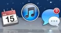
Then, along came the iPhone, and Apple had to find another way to indicate that there was something new waiting inside an app, like Mail for instance. The method they came up with was badges, a small red circular icon with a number on it, indicating the amount of new items inside. This badge system had been in use for some time on OSX and is used in Lion for with several Apple apps including the Mac App Store and the open beta of Messages.
But there are issues with both of these methods. With the bounce, there is no indication of how urgent the need is to check the app, so most developers associate it with only the most important of issues, normally a complete interruption of the app or the finish of a task. For the app that just needs to inform a user at a glance that there are new items inside, the badge is a much less obtrusive method and it gives the user an additional piece of information by telling them how many new items there are. But this still doesn’t give you information like the contents of a message or the subject lines of the emails, you have to open the app to see it or leave it open if you’d like to scan those for important topics.
Now, Apple has given apps a new method for telling the user about ‘new’ stuff that expands this system further. These are notifications in two basic types: Alerts and Banners.
Banners
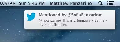
These notifications are very similar to the ones that you’ll see pop down from the status bar on an iPhone or any other iOS device. They appear briefly, carry a couple of pieces of information like a sender’s name and their message, or a snippet of body text, or the contents of a scheduled reminder. They also disappear on their own, with no additional action needed by the user. They’re meant to be a tap on the shoulder and a whisper in the ear. They don’t force you to take any action, though they can be tapped on to take you directly to the app that issued them.
Apple has set a location for these banners to appear, the top right corner of your primary monitor. They rotate down from off the top of your screen and fade in, stopping for 5 seconds before sliding off to the right and fading out. The sliding to the right is an important bit of animation, because it tells you that the notification can be viewed in the Notification Center, something we’ll talk about in just a bit.
These passive type banners require no interaction, so they’re best for passive alerts of new content. That’s why Apple uses these types by default for Apps lime Messages, Safari, FaceTime and Game Center.
Alerts
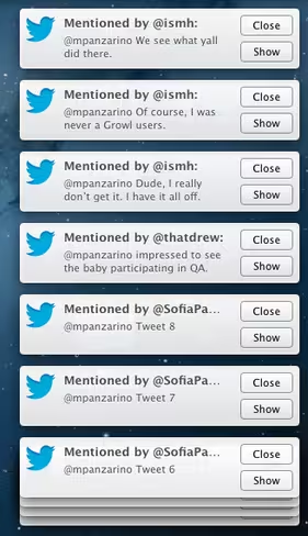
The second type of notification is called an Alert. These require an action from a user, a click on either the ‘Show’ or ‘Close’ button. This is used, for the kinds of alerts that you’d probably like to take action on right away. Like an appointment come due, or an email that you’d like to reply to. By default, Apple sets Calendar, Email and Reminders to these kinds of notifications, although you can change them.

Alerts appear in the same place as banners on your desktop and stay until an action is taken. Because this kind of notification will not go away until the system knows you’ve seen it, it will not be seen in the Notification Center once it has been dismissed. If you open the pane before dismissing it, the alert will be there.
The system allows for a maximum of 7 Alert style notifications to be displayed at once, before it will start stacking them under one another, at least on a MacBook Air. This could be a function of monitor height, we’ll have to run further tests to be sure. Either way, at a certain point, your notifications will start getting stacked, rather than displayed under one another.
Notification Center
As mentioned, your Alert style notifications are meant to be viewed and cleared immediately. But the Banner style versions will appear then go away, without knowing if you’ve seen them. This means that there has to be a place to collect all of these various notices, and that’s Notification Center.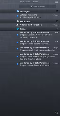
The Notification Center is accessed by clicking on its icon in the top right corner of your primary monitor. It can alternately be triggered by swiping two fingers from off of the right side of your trackpad onto it in a smooth motion. This is easy to do on a MacBook, where there is a flat transition from the wrist pad to the trackpad, but more difficult on a Magic Trackpad.
Once Notification Center is open, you’ll see a pane of linen that adheres to Apple’s modern philosophy that ‘behind’ everything is linen. The Notification Center in iOS 5 breaks this, but that’s another story.
Listed will be all of your uncleared notifications, broken up by originating application. By default, the order is manual and can be controlled in Preferences, though you can set it up by time as well. The list of apps whose notifications appear in the Notification Center are as follows:
- Safari
- Messages
- Calendar
- Reminders
- FaceTime
- Game Center
- Mac App Store
- Third-party apps
Any app that doesn’t have the functionality specifically enabled will not show up in Notification Center. As of the writing of this article, few third-party apps have enabled it, but the Sparrow email app is a good example.
Note that apps must be offered via the Mac App Store in order to use Apple’s new notifications, those offered outside must use another system like Growl.
Applications can have custom action text on their Alert style notifications. You can see this in action on a Reminder notification, which has ‘Snooze’, rather than ‘View’. Snoozing a Reminder will push back its notification by another 20 minutes.
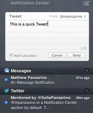
By default, you will see up to 5 recent notifications in each section at a time, though this can be altered to 1, 5, 10 or 20 using the Notifications pane in System Preferences. You cannot clear a single notification at a time, unless you click on it directly. You can clear a whole section at once by clicking the small ‘x’ in the title bar of that section.
As is the case with iOS, there is no ‘clear all’ function in Notification Center. Why this is, I have no idea. It has to be an aesthetic choice, as adding another button would clutter the interface further, but it’s still a terrible decision. People have been after a clear all function in iOS since the Notification Center was introduced and they’ve been right the whole time. It’s completely silly for there not to be an option to wipe the slate clean altogether, and even more so for there not to be one on OS X, with its larger screen targets.
There is already even a perfect place for it, as there is a small ‘gear’ icon in the bottom right corner that takes you to the Notifications prefs pane. Another small button with a clear all function would be welcome right alongside that one. It’s the only blight on what is otherwise a nicely implemented feature.
If you’d prefer to leave your notifications set up the way that they are, but toggle them off for a time in order to get some work done, you’re in luck.
Scrolling up past the top of the Notification Center displays a ‘Show Alerts and Banners’ toggle that lets you do just that. Notifications will keep coming in, but they’ll go to the pane without showing banners until you turn the toggle back on. This switch is automatically turned to the off position when you connect your MacBook to an external monitor or projector and mirror it, or when you’re using Keynote to play a slide deck. That way your audience doesn’t see your lunch reminders or Tweets.
Preferences and HTML 5 Notifications
The preferences for Notification Center are located in System Preferences, but can be accessed via that small button in the Notification Center as well.
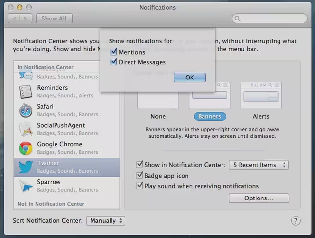
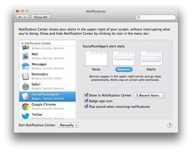
The pane displays a list of icons to the left that show not only which apps can display notifications, but also which order they do it in. By default, the order is manual, but you can change it to be by time as well. To re-order the apps, just drag them up and down in the list.
For each app, you’ll get the choice of having Banner style or Alerts style notifications, or none at all. You can also choose whether the notifications just pop up, but do not get put into the actual Notification Center at all, which is a cool tweak. Note that any apps that have this option unticked will move to the ‘Not in Notification Center section in the left sidebar. You can also turn off the red badge we mentioned earlier, as well as the app-specific sound that plays when you get a notification.
Third-party developers will have access to frameworks that allow them to give users more options on top of those basics. An example of this is the Twitter section, which allows you to choose whether you get an alert for every Twitter mention, or just for Direct Messages. I’d imagine that we’ll see these options for more apps as they integrate the feature.
There is also an option here to set up the ‘Share’ section of the Notification Center. This appears at the very top of the drawer and currently only supports Twitter, but will also support Facebook this fall. Tapping on the button will launch a standard ‘Tweet sheet’ that allows you to jam off a quick message without having to even launch a Twitter client.
There is, currently, an interesting entry in this list called SocialPushAgent, that can have its alert settings changed like any other app. There is no icon, it uses a default graphic, and it’s unclear exactly what it does. From the information that we’ve gathered, it appears to control the alerts of the other networks in Messages that are not iMessage.
This includes Google Talk, Bonjour, Yahoo and AIM. This would allow granular control over whether you see iMessage alerts only, or also ones from Google Talk. Since there is no icon and it has an incredibly awkward name, it’s a possibility that this will disappear in the shipping version of Mountain Lion.
You’ll notice that Safari is in that list of applications that can send notifications. In fact, Safari can send either Banner or Alert style notification and it’s not just system notifications. Safari 6.0 actually adopts the HTML 5 standard for web notifications and sends those to the system. This means that web developers who adopt the standard can then ask a user permission to send alerts to OS X from a webpage. Once granted, they can shoot the alerts out to the notification system and they will then be displayed in whatever style you have set up in Notifications Preferences for Safari.
If you’d like to see the HTML5 notifications at work, you can try them out at this site. If you’re a developer who would like to know more, you can see how to implement the standard here. This should be a boon to developers who work on rich web applications, because it allows for a more seamless notification system that fits right in with native apps on OS X. This functionality, by the way, works on Chrome Firefox or Safari 6.0, all of which have adopted the standard. The notifications appear with the icon of the browser by default, but the standard allows for the app to place its own icon there.
Notification Center and the disenfranchising of Growl
Every time a new version of OS X is released, there is one application or another that gets what we call a thorough Sherlocking. This term refers to the practice Apple has of adopting popular features of third-party apps and integrating them into its operating systems. Much in the way that the Sherlock utility (which later became Spotlight) emulated the features of popular universal search tool Watson.
With OS X 10.8, the likeliest target for this discussion will be Growl, the universal notification system that has been all but ubiquitous on the Mac. Though Growl is also available on the PC, it’s become synonymous with informative and customizable notifications on the Mac, where it is integrated into a wide variety of apps. There stands a fairly good chance that many apps, at least those that offer their wares inside of Apple’s Mac App Store system, will replace Growl integration with Apple’s notifications functionality.
There are, however, many apps outside of the Mac App Store that will likely still have a need for the service. It just may not be as much of a ‘default choice’ as it once was. That being said, Growl still offers some nice additional features that are not included in the typically stripped-down functionality of Notification Center.
Growl’s alerts are highly customizable visually, and can be made to fit in with the theme of an app, rather than with the OS as a whole. They also feature support for email and SMS notifications, as well as the standard push. So, while Growl is definitely in the path of Apple’s progress this time around, it’s likely that the options it offers to users will keep it around for some time yet.
The Notification Center, and the alerts system as a whole, seems to be a nicely streamlined implementation of what has come before. Some may find no use for them on a desktop, preferring to rely on badges or ‘the bounce’ to see what apps need their attention. There is also the distraction factor, as the alerts could reach a tempo that prevented you from ignoring them, though there is always the Show Alerts and Banners ‘mute’ switch for that.
As a heavy user of Growl notifications through apps like Chrome and Sparrow, I welcome a sleeker, native implementation of the system. Especially for Chrome, as the current frameworks that extension makers use are widely varied in looks and reliability.
For more on OS X Mountain Lion, read TNW’s full review here.
Image Credit: Chris Phan
Get the TNW newsletter
Get the most important tech news in your inbox each week.
