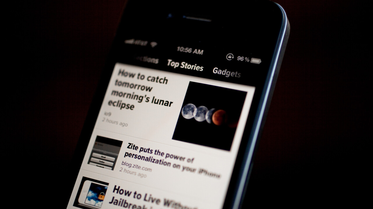
If you’re using your smartphone or your tablet to read magazines, chances are you favorite aggregator had news for you this week.
It’s not a hard assumption to make, the past few days were perhaps the busiest ever in the increasingly crowded news aggregator space.
Not only did existing apps expand their reach, but new, potentially game-changing players entered the field. Let’s take a look back at what happened.
1. Flipboard, now available on the iPhone
Flipboard is one of the most popular digital magazine apps. We’ve learned this week that its iOS tablet version has been downloaded 4.5 million times – meaning it is now installed on a whopping one in ten iPads. Yet, Flipboard wasn’t available on Apple’s smartphones until a few days ago. When it finally released its long-awaited iPhone app, the anticipation was such that the service crashed for a few hours (see our post).

However, it seems it was well worth the wait and trouble. Flipboard is known for its beautiful and unique user experience, and this is something its iPhone app captures very well. Yet, it’s not a mere copy of the iPad version, and makes the most of the smartphone’s screen size.
As you can imagine, being available across multiple devices is only one part of Flipboard’s product strategy. While it may have gone almost unnoticed in such a busy week, the startup also introduced a new section alongside its iPhone app. Called Cover Stories, this section will display content tailored for each reader’s taste (see our post). While it will still aggregate content from different sources, Flipboard will work on sorting articles out and hiding duplicates. In other words, Flipboard is very close to becoming a curated magazine of its own.
2. Pulse, about to piggyback Kindle Fire’s sales
If you were impressed by Flipboard’s user base, it’s worth noting it’s not the only mobile news reader which has million users. So does Pulse, which should reach 10 million users by the end of the year, up from 1 million in January (see our story).
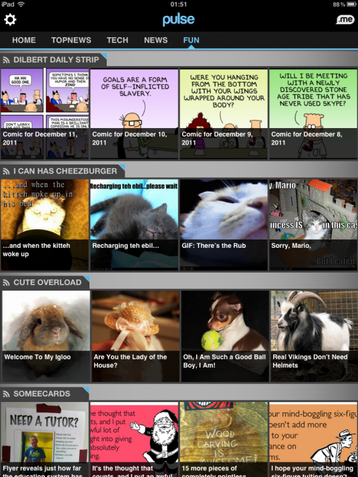
Besides this ten-fold growth, Pulse has also expanded to other devices, and its app was one of the three lucky ones to be pre-loaded on Amazon’s Kindle Fire. As we’ve learned this week, even Pulse’s founders were surprised to see their app featured on Amazon’s tablet’s home screen.
Yet, it’s not that surprising when you think of all what Pulse gets right, starting from its availability across the world on multiple platforms.
Another interesting Pulse’s feature is its integration with other apps such as Evernote, Instapaper and Read It Later. While it isn’t an absolute necessity since offline reading is available on Pulse, this is certainly a nice feature to have. Its impact actually goes beyond what you may think; for instance, Read It Later now has no less than 4 million users, and many of them use it to save content they like.
In this context, syncing with read-it-later apps can only add to Pulse’s user satisfaction, which is already sky-high. Perhaps the most telling numbers about Pulse’s popularity? As we reported, the app has 5 stars out of out of 2,500 ratings and is one of only 50 apps in the Apple App Store Hall of Fame.
3. Zite launching its first iPhone app
Flipboard isn’t the only news reader who debuted an iPhone app this week: so did Zite, one of its competitors (see our post). While Zite and Flipboard share several characteristics, there’s one element which is unique to Zite’s algorithm: its ability to listen from direct input from the app’s users.
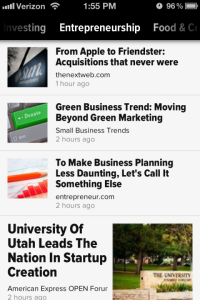 The way Zite gets this feedback? It’s simply by asking for it, by letting users click on ‘thumbs-up” and “thumbs-down” icons. Combined with passive feedback, this feature is essential to Zite’s efficiency as a news curation tool.
As an essential aspect of Zite’s identity and performance, this feature obviously made it to its iPhone app. This isn’t the case of many other features. Like Flipboard, the startup understood the necessity for its interface to be much simpler on a smartphone than on a tablet, and got rid of many unnecessary design elements. If you like simple design, spot-on personalization and dead-easy navigation, Zite may be the right news reading app for you.
4. Twitter Discover
When we first reported on Twitter Discover, we called it “a game-changer” (see our post). That’s not journalistic hyperbole; more than a new feature, Discover marks Twitter’s official entry into curated news. The new section is part of Twitter’s redesign, and will give users a chance to “discover” content produced outside of their contact circles.
The content Twitter displays in that section will be personalized – either because this user will search for a specific keyword, or via geo-location, since Twitter is able to display geo-aware trends and tweets. Twitter’s curation algorithm will improve over time as it learns from each user, but in a passive way (unlike Zite’s, which can also learn from input).
If you don’t have access to the latest version of Twitter yet (or “new new Twitter” as people call it), here’s what Discover looks like:
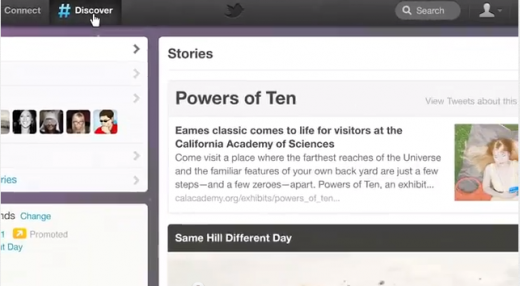
The Stories’ subsection is particularly interesting, as it shows how much Twitter has evolved over the last months. While its previous redesign already let us see images directly in the right column without leaving the platform, we can now read external content on Twitter itself. In other words, you can say goodbye to Twitter as a simple list of links, and welcome Twitter as a news destination.
5. Google Currents
Another player entered the mobile news reading space this week, and a huge one: Google. Its new app, Google Currents, is available in the US on Android and iOS (see our post). As soon as it was announced, comparisons with Flipboard mushroomed. Similarities are hard to deny: Google Currents aggregates content from different sources and makes it easy to read on a mobile device.
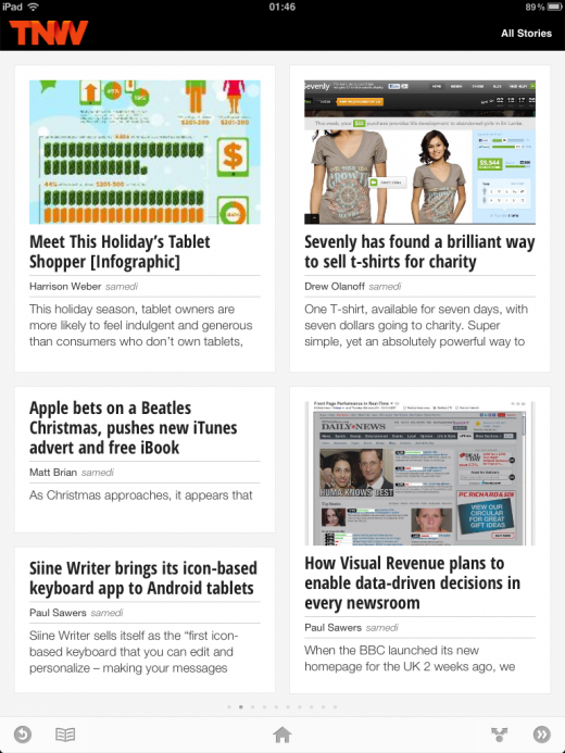 In terms of content, Google has partnered with 150 media outlets and websites, including The Next Web, which all offer full-length content on the app.
Yet, each reader’s experience will also be customized: besides choosing which sites to add, each user is able to integrate RSS feeds and public Google+’s streams to the app’s output.
Beyond aggregation and personalization, Google Currents also includes curation, as the app lets users follow personalized trends and read about breaking news in real time – albeit these won’t be geo-aware, something Twitter is the only player to offer at the moment.
If you’re not in the US, chances are you weren’t able to download the app yet, so here’s my personal take to give you an idea of what to expect. While Currents is still very new in my daily routine, I decided minutes after testing it that it deserved a place on my home screen. It sits there along the apps I use the most, and I have to confess Flipboard isn’t one of them. While I use Flipboard from time to time and enjoy its gorgeous looks, I tend to prefer Google’s fast, no-frills interface.
As a matter of fact, I like Google Currents so much that could very soon become a personal favorite of mine – although it’s worth noting I have been playing with it on an iPad. From the feedback we’ve collected, it makes a huge difference in terms of user satisfaction, and we’ve heard Google Currents isn’t as good on the iPhone, due to a lack of adaptation in its design.
If this is true, Google would likely have gained from approaching the smartphone the same way Flipboard did: as a completely different use case. We don’t use our phones like we use tablets, not do they look the same, and it’s something any outstanding reading application should take into account. This is undoubtedly a mistake, which we hope Google Currents’ next version will fix.
Which ones of these apps are you using? What’s your favorite one so far? Share your impressions in the comments.
Get the TNW newsletter
Get the most important tech news in your inbox each week.


