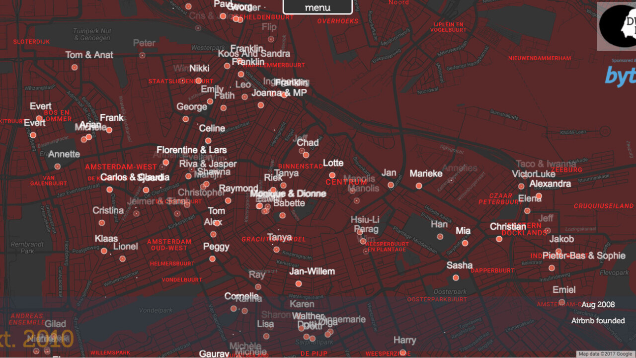
Since the launch of Airbnb, the city of Amsterdam has pretty much flip-flopped on its position towards the home sharing platform and the so-called sharing economy. This shocking visualization makes it very clear why.
The Silicon Valley unicorn was welcomed with open arms when it started its Dutch language site in March 2012. The municipality welcomed the platform as an exciting opportunity and initially allowed anyone to rent out their rooms and apartments for short periods of time.
But in the past year or so, that stance has completely reversed – and thanks to this visualization by Dutch data visualizer and animator Kor Dwarshuis, it’s not hard to see why.
Using data gathered from Inside Airbnb, a non-commercial data set “that allows you to explore how Airbnb is really being used in cities around the world,” Dwarshuis plotted the spread of Airbnb listings across Amsterdam across time.
Even as someone who’s heard all the stories about neighborhoods being taken over by suitcase-wheeling tourists, the visualization is pretty shocking. Not only in the number of new listings added, but also in the number of listings added by single users in one go. Sometimes the map lights up with between 5 and 15 listings added in one go by a single name, which surely wasn’t the intended use of Airbnb.
Public broadcaster NOS reports that Airbnb listed 25,721 properties in Amsterdam in 2016, and accommodated 1.7 million guests throughout the year. For a city with a population of less than a million, you can imagine that might become an imposition.
The city of Amsterdam has taken steps to curb Airbnb’s growth in the city, but shows no signs of slowing down in 2017. Rentals via Airbnb are up 34% in the first quarter.
Get the TNW newsletter
Get the most important tech news in your inbox each week.


