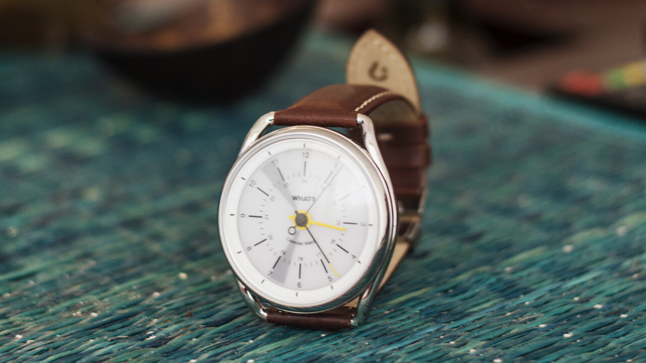
While smartwatches based on Google and Apple’s wearable platforms attempt to pack in plenty of features, the Calendar Watch from Vienna-based brand What? goes in the other direction and does just one thing: help you keep an eye on your schedule through the day.
That’s a bold move for the company, and perhaps an incredibly smart one. Instead of competing with every other hardware maker on the planet, it’s carving a niche for itself by creating timepieces that are great watches first and foremost, and mix in a bit of futuristic functionality without compromising on wearability.
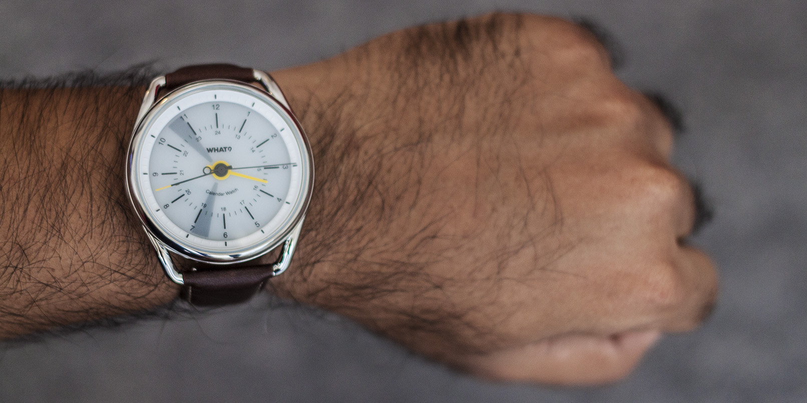
So what’s it like wearing a one-app smartwatch? I strapped on the Calendar Watch three weeks ago to find out.
Utility
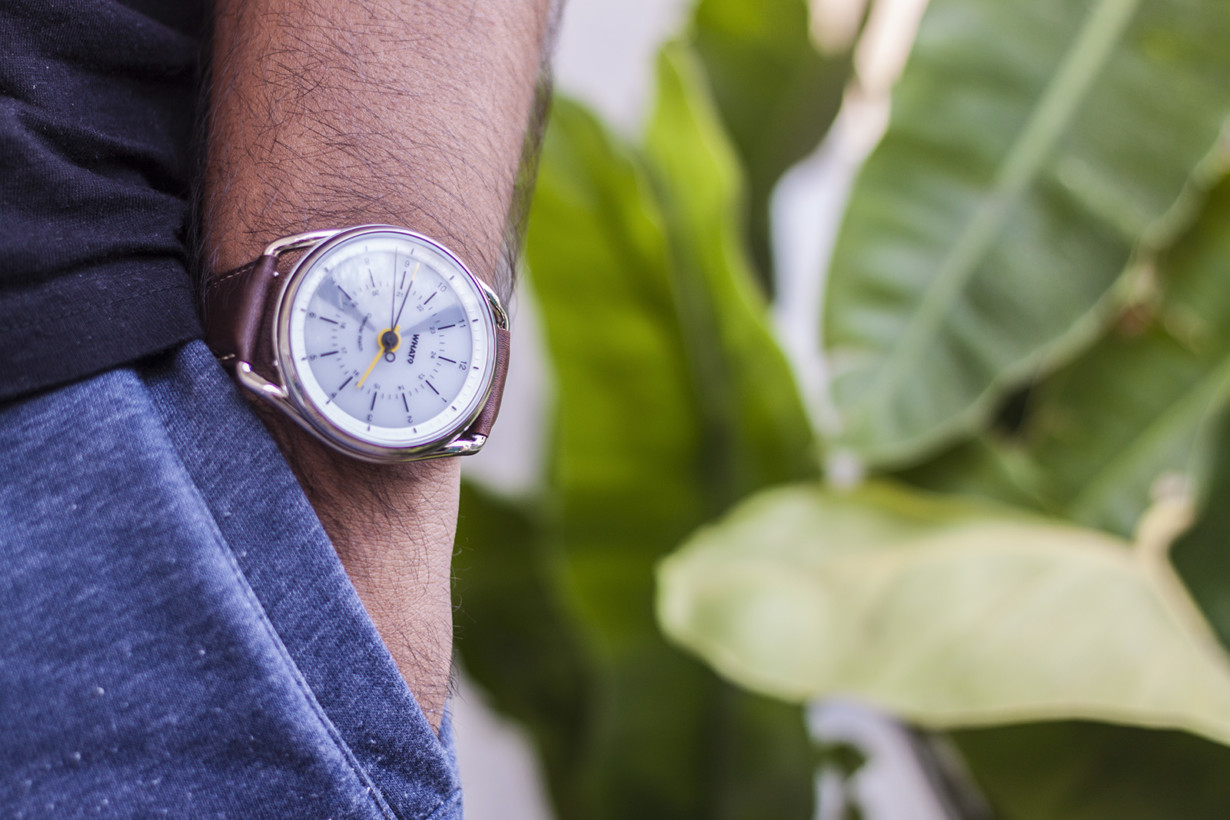
Let’s talk about the Calendar bit first. The watch has an e-paper display on the dial that fills up in segments to represent the time slots during which you have events scheduled on your calendar. It gets this information by syncing with the calendar app on your phone over Bluetooth, and you can double-tap on the glass to see your appointments for the next 12 hours.
That’s basically it. The simple visual representation system makes it easy to figure out when you’ll be busy next – there’s no text display to tell you what your appointment is about or where it’ll take place.
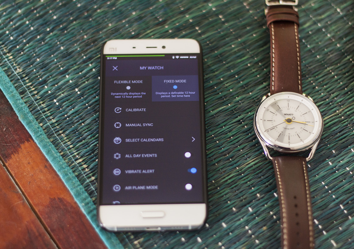
I found this to work well enough, as I only really need to know at a glance if i’ve got time for a call about a story, whether i can finish an article before i need to head out for a meeting or take a shower before a dinner date (protip: always shower before a dinner date).
Opting to only include this basic functionality allows What? to design a watch that looks as much like a traditional timepiece as possible, so it offers utility without looking like a child’s toy. Plus, it doesn’t do notifications – and as I wrote last year, that’s a good thing.
You see, one of the main purposes of a smartwatch is to help you avoid whipping out your phone and dropping out of whatever’s going on in your life. But when you allow your Android Wear or watchOS watch to buzz you with notifications on your wrist, you end up getting distracted in any case – and you’re left trying to fiddle with a tiny screen to type out a reply or dismiss an alert. That’s a textbook example of defeating the purpose.

There’s another benefit to What?’s minimalist approach with the Calendar Watch: it can go for up to eight weeks on a single charge. I haven’t had my review unit that long, but it hasn’t needed time in its charging cradle since I first got it.
Design
Now for the best part: the Calendar Watch is a stunning accessory. Its elegant case comes in at a formidable 47mm diameter and doesn’t have a crown (because the watch sets itself when you pair it with your phone – it’s really cool to look at).
The removable lugs are distinctively designed and cradle the case beautifully, breaking up the 14.5mm case thickness. The dial features simple numerals and indices for hour markers that pair well with the avant garde stick-style hands. The accent shade on the hour hand lends a pop of color and rounds out the package nicely.
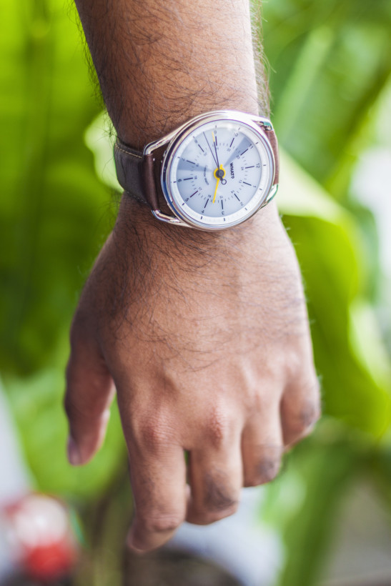
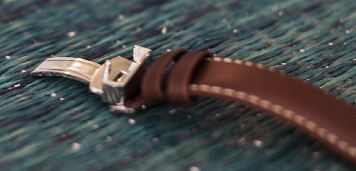
It’s nicely appointed too, as you’d expect from a $300 watch. The quick-release strap features a deployant clasp with an etched buckle and fits perfectly at the lugs. It also has contrast stitching to add to the overall look of the timepiece, and the build quality and finish are commendable.
Having said that, the Calendar Watch can wear a little large on your wrist, and it’s a pity that it isn’t available in a smaller size. I’m fine wearing 42mm pieces like the Citizen Nighthawk and the Orient Flight, and the Calendar’s 47mm case is certainly at the upper limit of what I can pull off on my 6.5-inch wrist. If you’re not comfortable sporting a large watch, this may not be a great choice for you.
Should you buy the Calendar Watch?
I’ve said before that while I enjoy the added convenience of certain smartwatch features, I don’t find it essential to wear one. A good test for whether you should get a smartwatch is to see if you miss it when you don’t have it on you – and the Calendar Watch got more than a passing grade.
The calendar system is easy to get used to, and made it easy to figure out when I could make time for the gym or schedule an interview without burdening me with too much information at once. And the fact that it doesn’t need to be charged every night (I just dropped it into its cradle about once a week, not that I had to) means that you don’t have to worry about it dying on your wrist every so often.
If I had to find fault with the Calendar Watch, I’d point to the lack of a backlight. Sure, it’s not an essential feature, but the lack of any kind of lighting or lume feels like a missed opportunity for the watch to shine (pun intended).
So yes, I’d certainly recommend the Calendar Watch if you don’t mind the large case size and can pull it off. There are multiple colorways available, starting at $299 and going up to $330. You can also pre-order additional lug-and-buckle sets to change up the look for $44.
Find the Calendar Watch on What?’s site, as well as on Amazon US and Best Buy. If you choose to purchase it through the company’s site, use the offer code tnw20 to get 20 percent off your order.
This post is not sponsored, but it includes affiliate links to products that you can buy online. If you purchase them through our links, we get a small cut of the revenue.
Get the TNW newsletter
Get the most important tech news in your inbox each week.

