A recent Reddit post details the danger of using a popular built-in tool in the iOS image editing menu. The tool, commonly referred to as the highlighter (it’s actually a chisel-shaped marker, don’t @ me) is often used to cover sensitive information in screenshots or photographs — such as credit card numbers or the address on a drivers license.
The problem is in the default opacity of the tool. It’s meant to be used as a highlighter, not a tool to censor sensitive details, and as such it’s set with an opacity value under 100. That is to say, it’s semi-transparent. The lower the opacity value, the more see-through the markings become.
But even with an opacity near 100, a few quick photo editing tricks will reveal the information underneath.
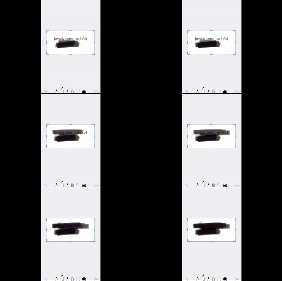
Redditor u/M1ghty_boy, the thread’s original poster, first colored over the text using the highlight tool from the default toolset — a pen, pencil, and marker/highlighter. After a few passes, it appears that the text is properly censored and unreadable. The user then opens the image in the default iOS photo editor and adjust settings like exposure, highlights, shadows, and contrast until the image again comes into view.
Here is why you shouldn’t censor sensitive info with the black highlighter on iOS, this video shows just how easy it is to reveal sensitive info censored with the black highlighter from r/ios
If you’re looking for a better way to censor information, we’ve got you covered. The easiest way would be just to use the same highlighter tool, but to turn the opacity to 100, meaning it’s fully opaque and no longer see-through.
Or, if you want a more foolproof method (in case you forget to adjust the opacity before covering the information), use a color-filled shape — the rectangle tool, for example (found in the + menu) — instead.
Get the TNW newsletter
Get the most important tech news in your inbox each week.


