We’ve all gotten used to how Wikipedia looks, but a Berlin-based interface designer recently dreamed up a whole new look for the trusty online encyclopedia. The redesign concept first appeared on George Kvasnikov‘s Behance page in April but hasn’t received that much attention yet, till it was spotted by PSFK today.
Kvasnikov first carried out some research to figure out what users are looking for in Wikipedia and how they use it, and subsequently went on to create wireframes and prototypes to come up with the simplest way to navigate through articles. “Our intention was to create a more user-friendly Wikipedia with more legible typography to improve the user experience,” he said.
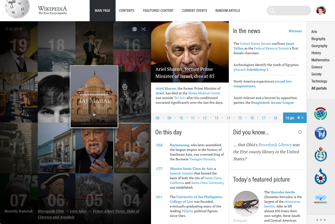
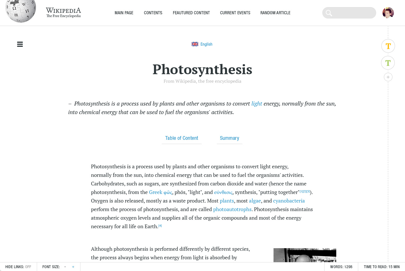
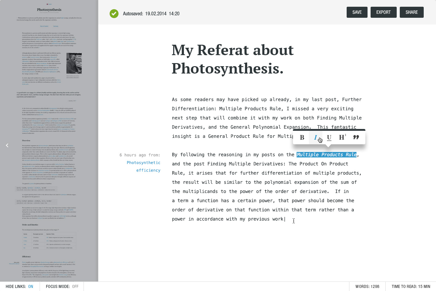
Other than the entire Flipboard-like look of the Wikipedia that Kvasnikov has envisioned, he also revamped the reading experience with a new font and a universal grid for text, pictures, formulas, tables and more. There are added controls over the font size at the bottom of each article, and you can also see how many words are in the article and how long you’ll take to finish reading it.
Scrolling through Wikipedia has also gone through a major overhaul in this redesign concept. “Now the articles are displayed as pieces of paper, which you can easily organize, sort and navigate between them,” Kvasnikov writes.
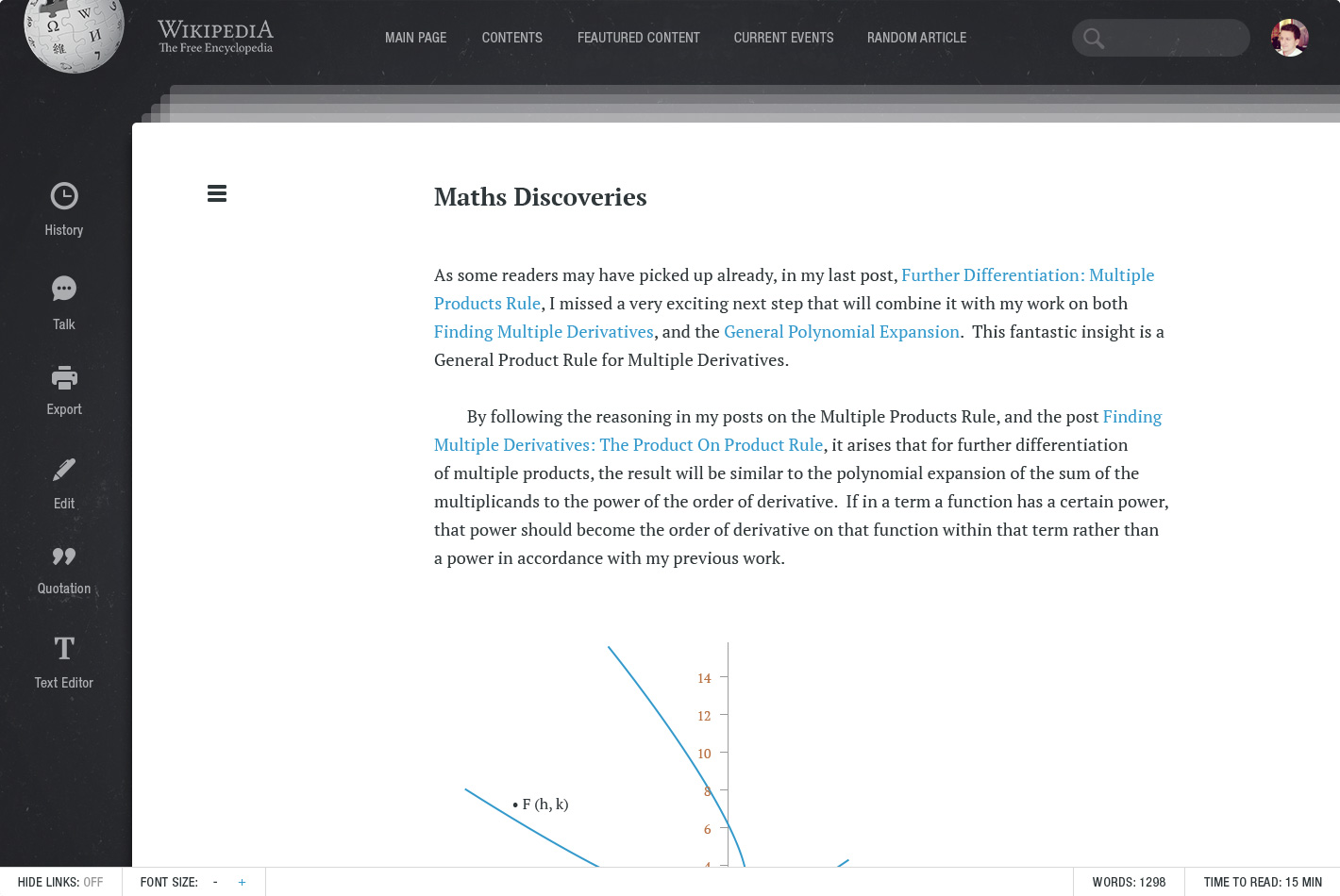 The design concept also introduces an integrated text editor to let you write papers more efficiently right within the browser. Kvasnikov envisions a cloud-based system for creating documents, which means you can edit them on the go and publish whenever they are done, while the bibliography is also created automatically.
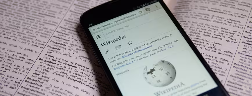
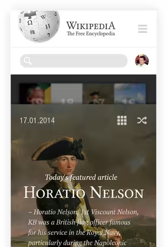
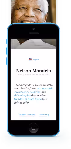
The design concept also extends from the desktop to mobile, so Wikipedia looks equally beautiful on a smaller screen. The grid guidance is also clearly evident on the mobile design, which has a much more visual emphasis.
Of course, given that Wikipedia caters to emerging markets as well with its focus on the Wikipedia Zero program, which gives free access (i.e. no data charges) to Wikipedia in some of the poorer countries around the world, such a strong visual design may not serve its audience all that well. However, it is a beautiful new look indeed, and Wikimedia could just take some tips from Kvasnikov when it’s eventually time for a design overhaul.
➤ Wikipedia Redesign Concept
Get the TNW newsletter
Get the most important tech news in your inbox each week.