We’re all armchair quarterbacks when it comes to technology and apps that we love. There’s nothing wrong with that, since the feedback that we provide is sometimes turned into action.
You’ve probably used Wikipedia, and it’s safe to say that you’d agree with the statement “It ain’t pretty.” Yes, Wikipedia is all about content and not so pleasing on the eye. What if it was a bit prettier, and more usable? A creative agency named New! has taken it upon themselves to “what if?” this scenario.
On a site called Wikipedia Redefined, the team from New! goes through an exercise where the final result is quite impressive:
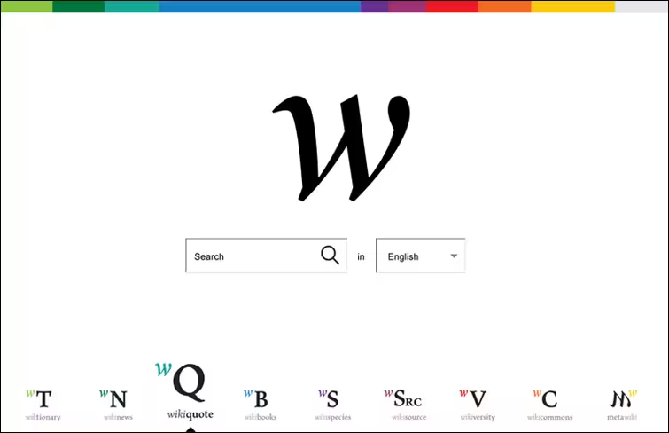
Apparently, this project took the team a few months and find Wikipedia to be a useful source, like the rest of us:
That’s why we decided to spend two spring months on this project, looking for the ways how to make it better, reader or editor friendlier, clearer and aesthetically satisfying.
You owe it to yourself to scroll through the site, understanding exactly what the thoughts are behind all of these drastic “proposed” changes. Some of the TNW writers never even visit the Wikipedia homepage, so a design like this wouldn’t really make much of a difference.
However, check out this suggested change for a page:
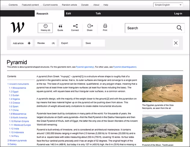
Not a bad advertisement for the agency.
I’m a fan, how about you? Let us know in the comments.
Get the TNW newsletter
Get the most important tech news in your inbox each week.

