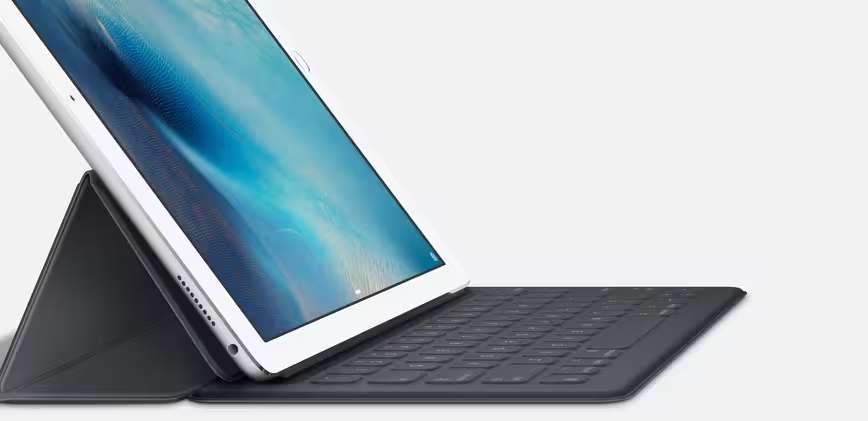
Apple trotted out its gargantuan new iPad at its September event: it’s a 12.9″ monster that resembles Microsoft’s Surface Pro, but runs iOS.
I actually like the look of the iPad Pro — I could legitimately work off that full time with the new split-screen apps and Apple’s keyboard attachment — but there’s one thing that’s really disappointing: the homescreen.
How is it that we have devices with wildly varying screen sizes forced to used the same, dull homescreen? A sea of icons on my iPhone is fine, because it’s much smaller, but on the iPad Pro it’s a waste of space and a missed opportunity. Behold, this picture from The Verge’s coverage:
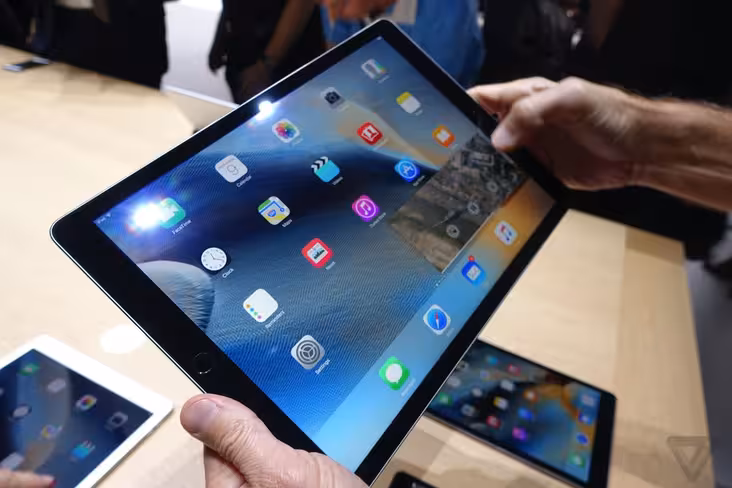
It feels like a missed opportunity to do so much more with iOS. We finally got features like split screen multitasking and the ability to do picture in picture video, but Apple has neglected the place where we all start out. At 12 inches it looks ridiculous, with a maximum of 25 icons all spaced out and no way to fill in the gaps.
Microsoft’s live tiles are attractive because they can surface information right there on the homescreen to draw you into an app. Your next calendar appointment, the leaderboard of a game or just the latest headline — it takes advantage of the space available to put it to work.
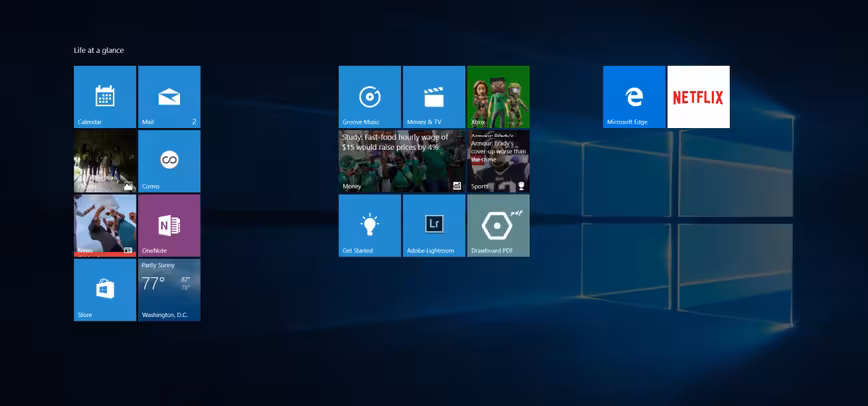
I don’t like Windows’ layout very much because it feels messy and overwhelming at times, but it works better than a sea of icons on large devices.
3D touch on the iPhone made a fundamental change to the homescreen — basically adding right click — so it’s a little disappointing Apple didn’t go further with thinking about it differently for its new, larger devices.
I’m fairly sure the iPad Pro will be popular from day one amongst business people, but I’m also fairly sure those same people would like to see the latest information at a glance if it’s going to be the device they use all day long.
I’m hopeful that as iOS clicks over to version 10 next year we’ll see the first major changes to the iOS homescreen, allowing developers to do something interesting with it rather than just showing a smattering of icons everywhere.
Get the TNW newsletter
Get the most important tech news in your inbox each week.