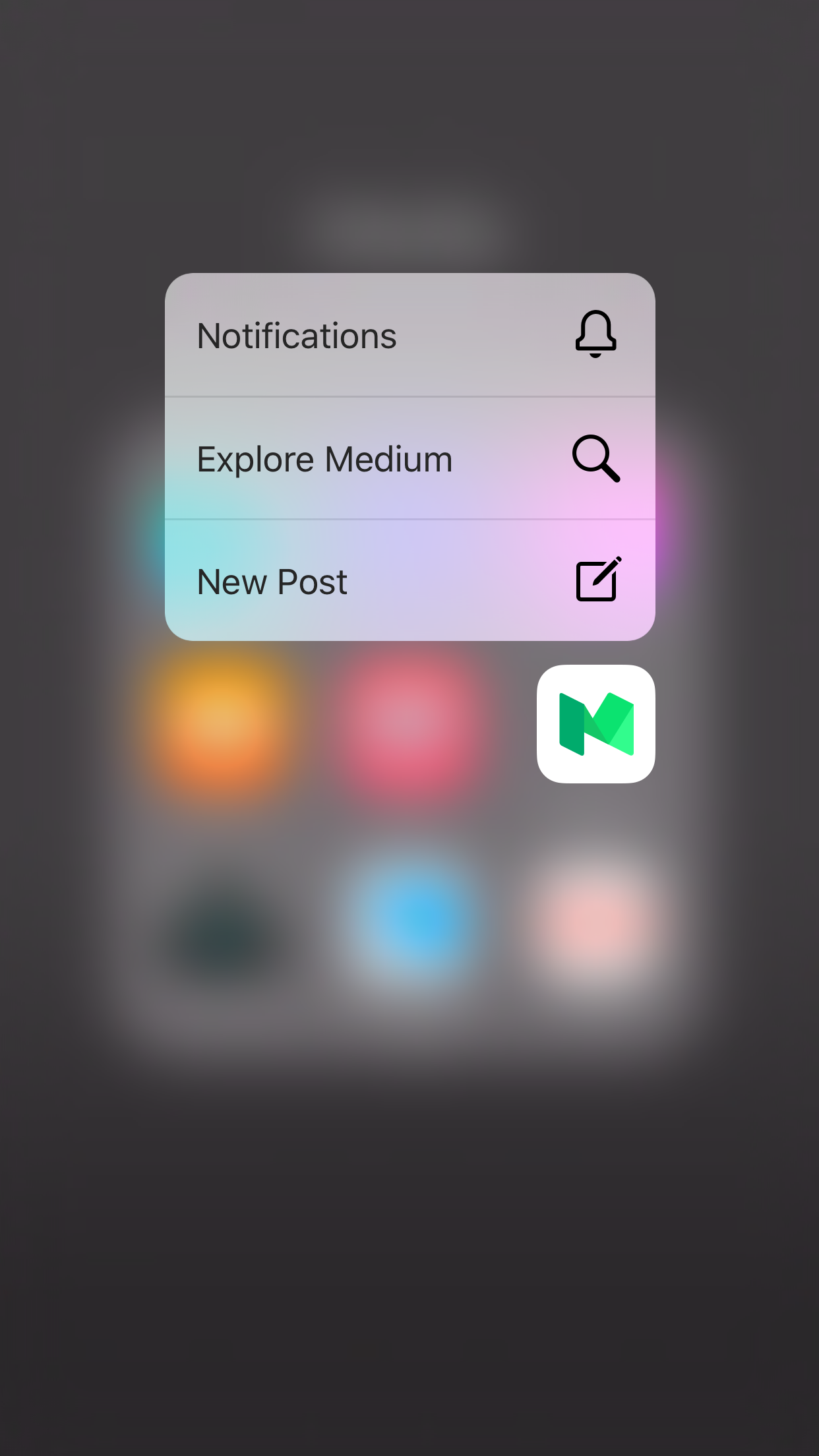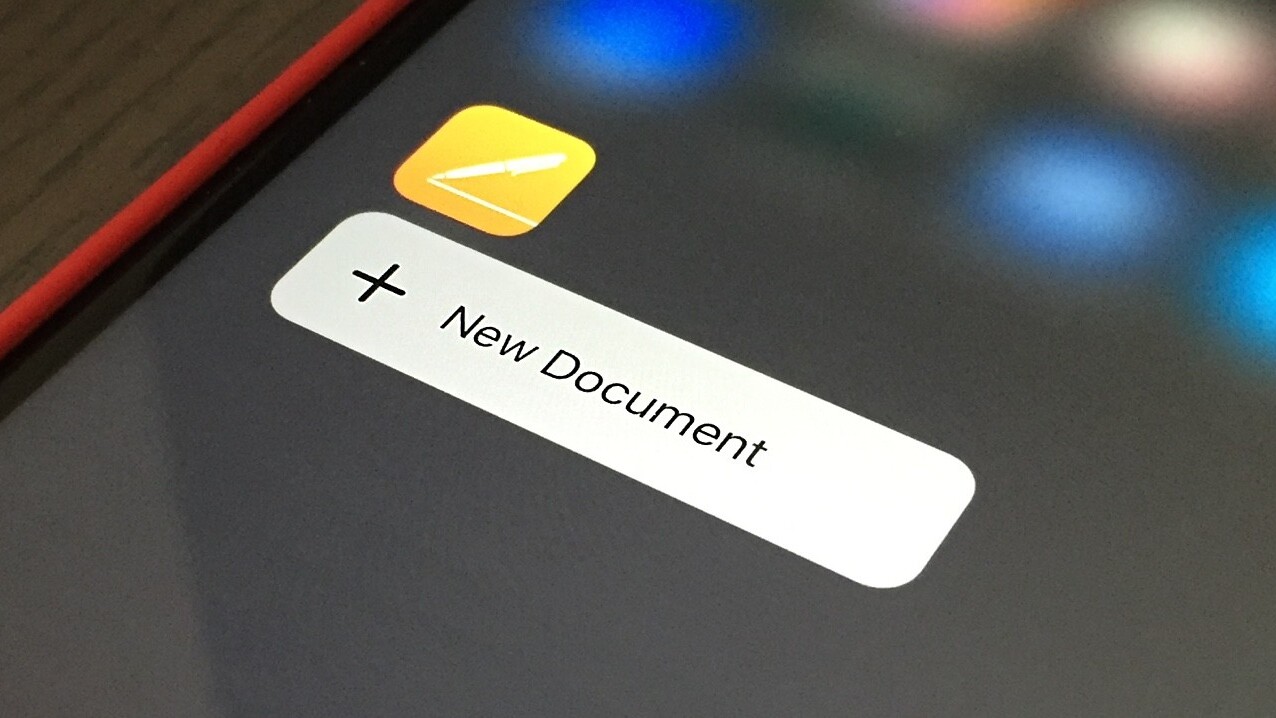
Apple’s new iPhones feature 3D Touch, which seems gimmicky until you use it. In allowing us to press a bit harder on the screen to get info or launch actions quickly, a new depth to the UI opens up.
The problem is, not many developers and designers know what they’re doing with 3D Touch yet, if they’re using it at all.
For actionable events, 3D Touch should be used to quickly launch features we use often, but aren’t quickly available in-app. That’s the ‘pop’ feature; the ‘peek’ opens up files in a preview pane, which strikes me as a time saver more than a new way to interact with apps.
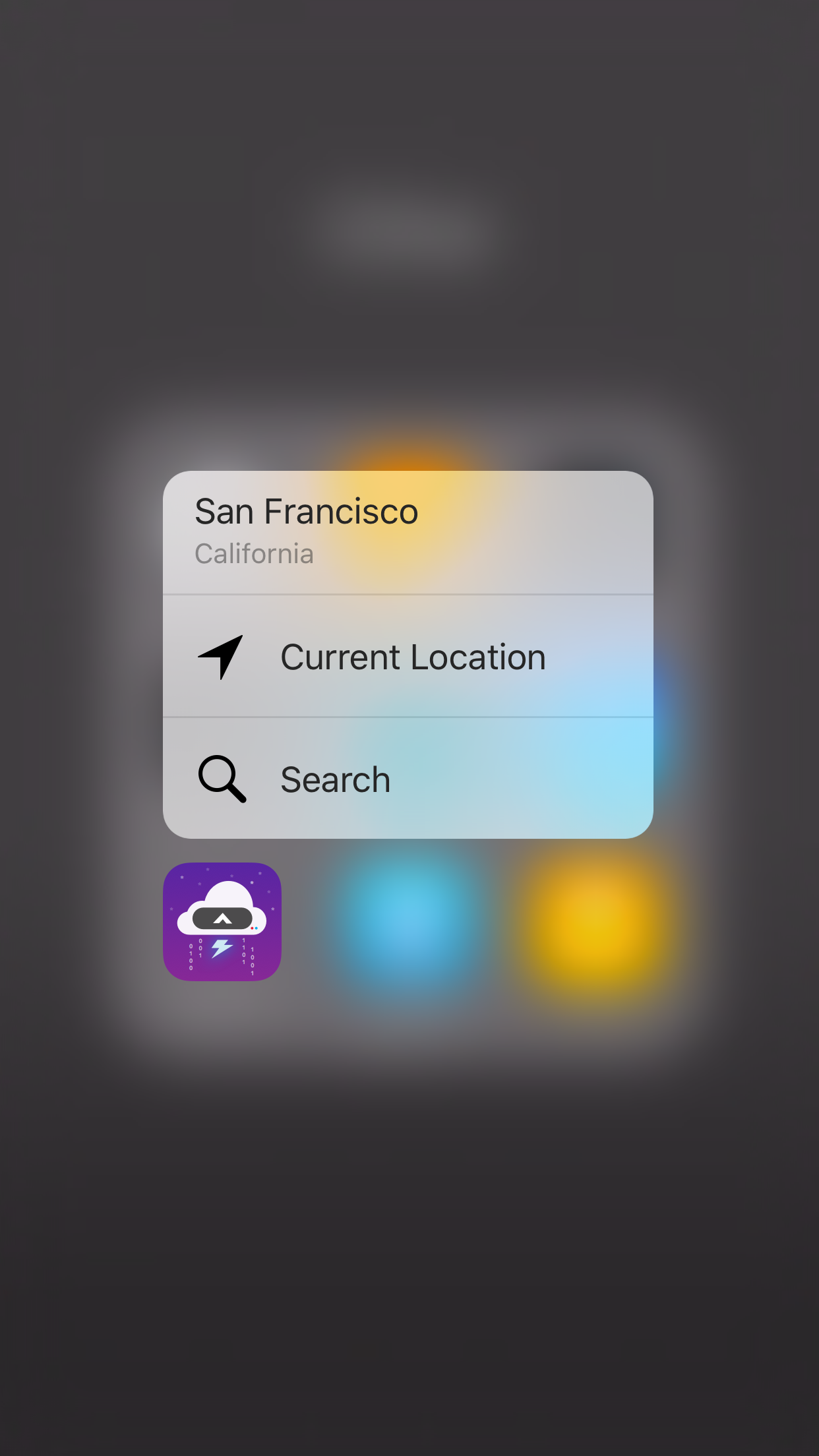
There are some great examples of actionable 3D Touch. CARROT Weather offers up your saved locations in addition to your current location. Here in Portland, I could quickly check up on San Francisco, or my immediate surroundings.
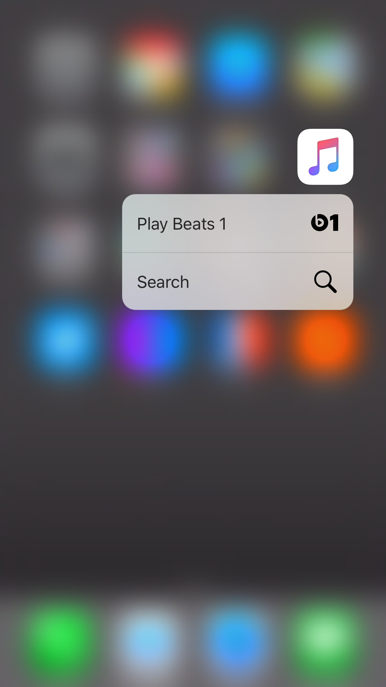
Apple Music also gets it right, offering up Beats 1 in addition to search. The App Store lets me directly redeem gift cards, saving me from opening the app and scrolling to the bottom.
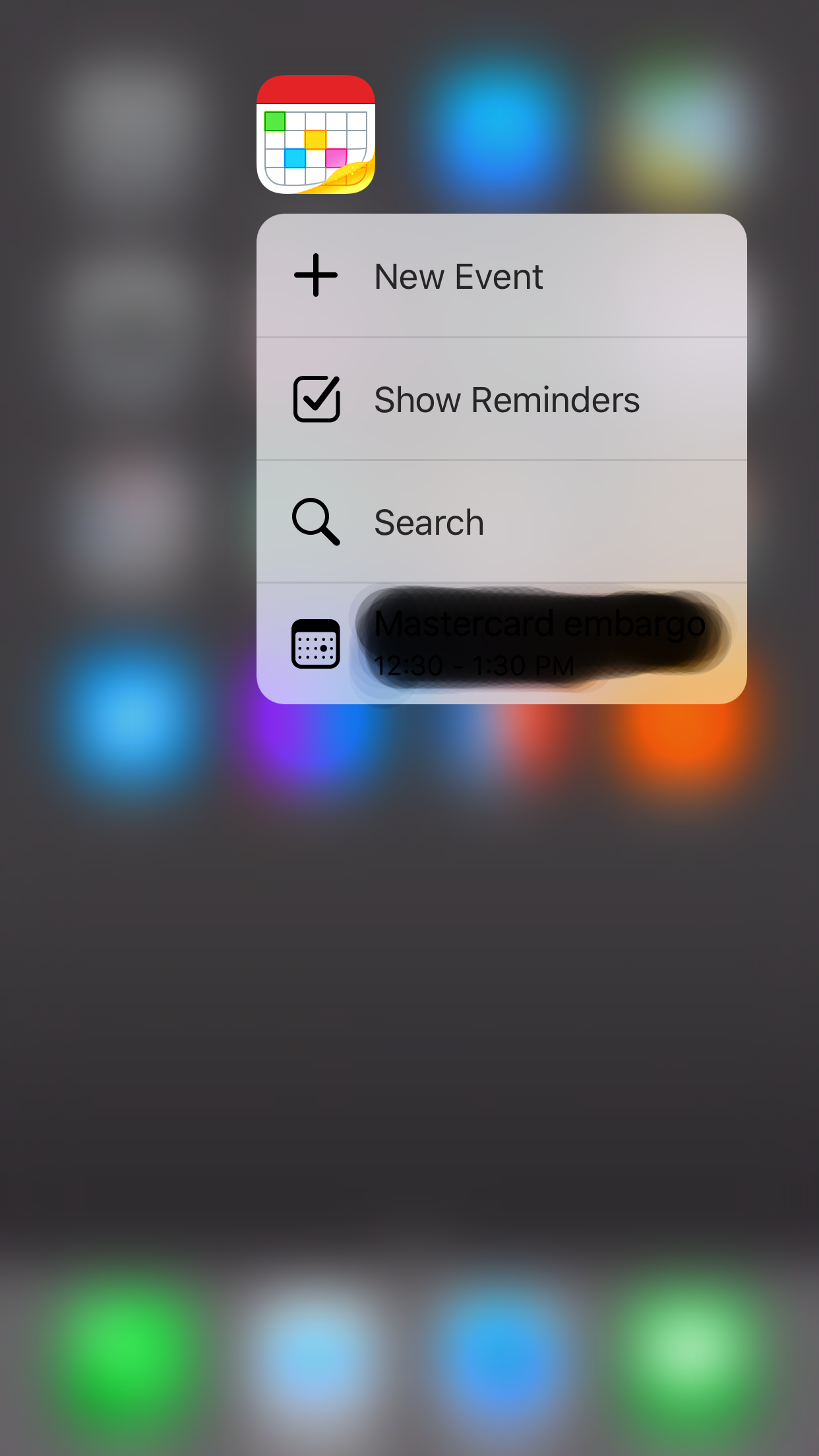
Fantastical is similarly clever with 3D Touch. Creating an event is at the top of the list, with reminders, search and events in tow.
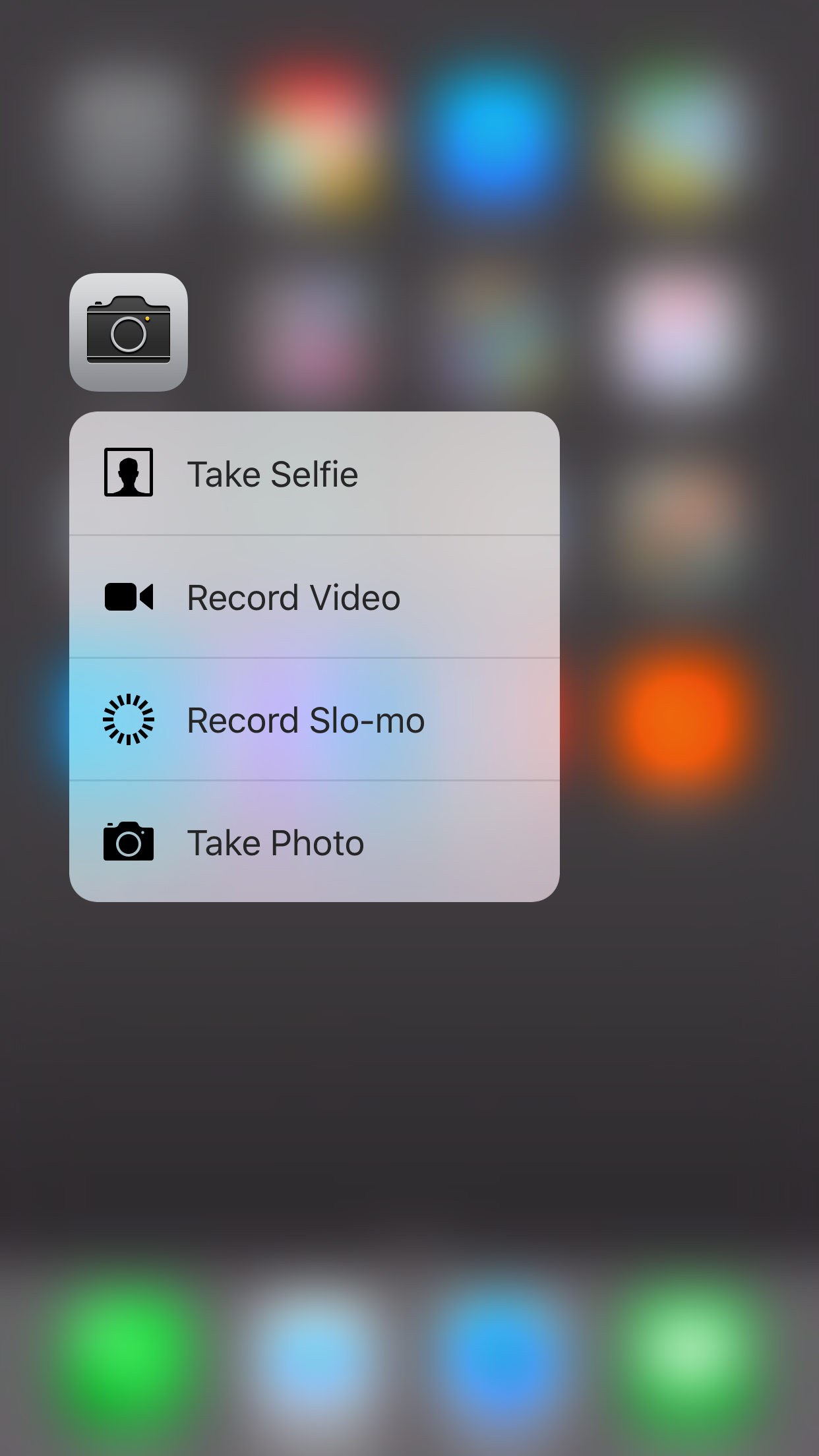
Some apps get 3D Touch wrong, though. The stock camera app offers up selfies and video, which is great — but why do I need the option to take a photo? That’s typically just pressing on the app icon itself, unless you’re in the minority that leaves the camera in slow motion or square mode.
Apple has a dedicated portal for apps with 3D Touch, and there are quite a few — but there’s no way to know what they do. It’s a crapshoot; will it offer great functionality, or unnecessary clutter?
I downloaded Instacart to see what it could offer via 3D Touch. All it has is ‘search’ and ‘my cart.’ There was no option to add to a list, much less view one.

Perhaps more troubling than the misguided use cases some apps have for 3D Touch is its slow uptake. Most apps I have don’t offer 3D Touch, and some of them absolutely should.
Starbucks wants you to order and pay in-app, but doesn’t yet offer a 3D Touch shortcut to get you there.
Slack can’t even take you to a feed, which would be handy for those subscribed to multiple rooms. You can’t even view your files.
While Twitter makes good use of 3D Touch, Periscope and Vine do nothing. Something as simple as ‘start stream’ or ‘create new Vine’ would be welcome.
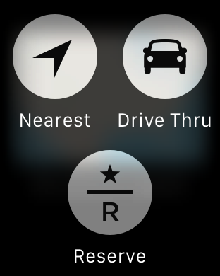
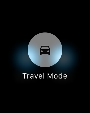
I’ll pick on Starbucks for a minute, and note its Apple Watch app uses Force Touch. It actually uses all the quick-action features I’d like 3D Touch to have, too.
The same can be said for a few other apps I have. Google Maps is probably the most notable offender, taking slight advantage of Force Touch while 3D Touch is left alone. Apple Maps is actually making Google Maps look silly, here.
I’m sure there are more users with an iPhone 6s or 6s Plus than there are Apple Watch owners, too.
Some apps are getting 3D Touch very right, and some just seem lost. That’s subjective, of course, but what’s worse than misusing it is not having it at all.
I think 3D Touch represents a sea change in how we interact with apps (it’s even being toyed with for Android). Whether it’s peek or pop, 3D Touch has the ability to bring context and dimension to our home screens and apps in a new way.
Avoiding or dismissing it is bad form for developers; it’s not even difficult to implement. Apple also clearly defines what developers should be doing with 3D Touch, and it provided access to 3D Touch APIs on September 9. There has been plenty of time to work them in.
Apple isn’t going to move away from 3D Touch. It’s here to stay, and developers need to start working into the app experience. Not having it is making apps look old and tired, which will only exacerbate when the iPhone 7 lands next year.
Luckily, developers have time to implement 3D Touch before apps look really bad for not including it. Those 10 months or so will go by quickly, though.
Get the TNW newsletter
Get the most important tech news in your inbox each week.

