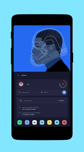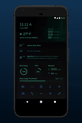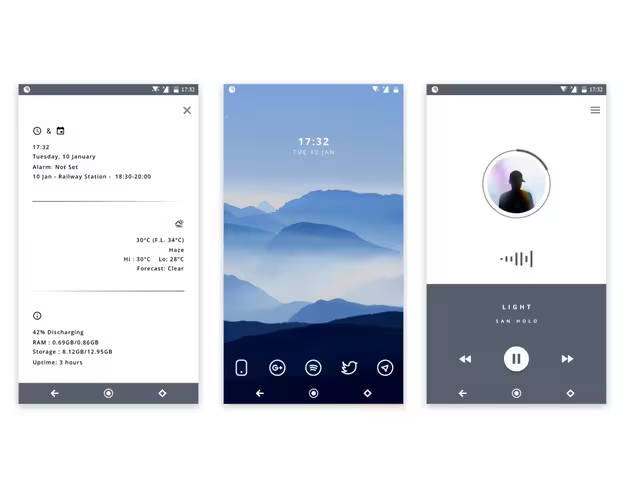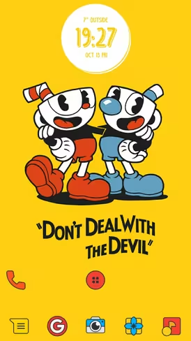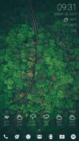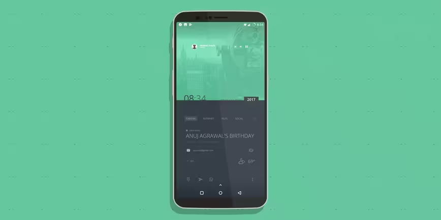
One of the best things about Android is how flexible its interface is: customizing your home screen to suit your usage habits and preferences only takes a few taps, and the possibilities are endless. Here are just a few choice examples of custom home screens from the Android theming community on Reddit:
How are these setups created? It’s usually a combination of carefully paired elements, and most of them are easily available from Google Play. Let’s look at all the things you can do to pretty up your Android interface with little to no effort.
Wallpapers
You probably knew this already: you can switch up the background of your home screen by using just about any image stored on your device. The easiest way to do so is to find it in your gallery, whether that’s a wallpaper you downloaded or a photo from your camera, tap the options button, and choose ‘Set as…’
Some versions of Android will let you set the image as either your home screen or lock screen; if you don’t see an option, it’ll default to your home screen. For best results, you’ll want to use images that are of the same or higher resolution than your screen. It’s worth noting that you don’t have to restrict yourself to portrait-orientation images; if you use a landscape-orientation image, you can scroll through its length as you move between home screens.
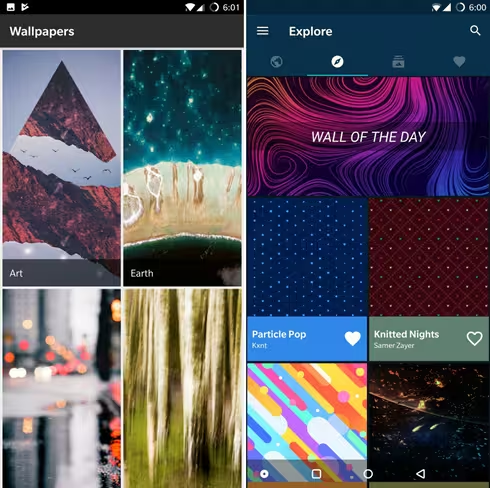
Wondering where to find beautiful wallpapers? Google Play has a ton of wallpaper apps that include hundreds of backgrounds – often for free – in a simple interface with categories and a shortcut to apply them. You’ll want to start with either Google’s own Wallpapers app – which includes a handy background rotation function – or Backdrops, which comes with a fantastic selection of wallpapers that you won’t find anywhere else.
You can also look for wallpapers on Reddit: the community at r/androidthemes frequently shares quality backgrounds. Alternatively, search Google Images with a generic keyword and the exact resolution of your screen: here’s what you get when you look for backgrounds for a 1080p device.
Android also supports live wallpapers, which are animated or respond to your touches and swipes. While there are loads of these available on Google Play, you’ll want to check their reviews to be sure that they don’t consume too much battery life. I prefer live wallpapers that feature subtle animations or visual effects. Here are some of my favorites:
- Pixelscapes: scrolling pixel-art backgrounds that change depending on the time of day
- Zero (beta): a collection of backgrounds with a neat 3D parallax effect
- Material Islands: unique art depicting floating islands that show subtle changes through the day
- Chrooma: clean, colorful geometric shapes that gently undulate in layers across your screen
- Minima: even more soothing shifting shapes and colors
- Google Pixel 2: there are a few gorgeous wallpapers with overhead views of Monument Valley, hills in Hawaii, and a beautiful coastline that come with Google’s new flagship. If you don’t have a Pixel 2, you’ll need to download the Wallpapers app, sideload this APK, and then find them in the Live Wallpapers section on your phone.
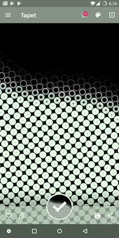
If you’d like to generate your own wallpapers, give Tapet a go. It lets you browse through a wide range of patterns and apply various color schemes to them, with just a swipe. Once you’re happy with your creation, you can save and set the background as your wallpaper, or share it with a friend. The free version should keep you plenty busy, but you might want to pay and unlock the additional patterns available with the Premium tier.
Finally, there’s Muzei, a fantastic app that pulls in backgrounds from sources like Reddit and Unsplash and displays them with a bit of blur; double-tap the home screen and it’ll clear right up for you to get a better look. Of course, you can choose to disable that effect if you like, but the blur does help your home screen icons and widgets stand out a bit more.
Icons
One of the things you’ll notice in some of the best Android home screen setups is the consistency across the look of the backgrounds, widgets, and icons. The last bit is usually fairly easy to achieve, thanks to icon packs which generally follow a theme or visual style, and can be applied to all your apps at once.
There are plenty of high-quality icon packs available on Google Play either for free or a reasonable fee, and many of them come with thousands of icons to cover a wide range of apps. Whether you’re looking for minimalist monochrome icons or a splashy Material Design-inspired set, the Play store will leave you spoilt for choice.
Where should you start with icons? I personally prefer simple ones with a unified design language so as to keep my home screen nice and tidy, so I usually go with Lines, Min, Flight Lite, or TwoPixel.
For a more vibrant look, I’ve taken a liking to Frozy, Perfect, Crispy, Phix, Darkmatter, Minimale, and Material Cards.
Pro tip: Many of these icon packs frequently go on sale or or are on offer for free for limited periods: you can track them by following the r/googleplaydeals subreddit.
Oh, and most of the better packs come with bundled wallpapers, so you don’t need to go scurrying around to find suitable backgrounds for your new icons. If you need more control over how your icons look, try Icon Pack Studio, which lets you create custom icons with your choice of colors, shape effects, and filters. There’s also MicoPacks, which helps you manage your icon packs all in one place, and even set them to change according to the time of day with Tasker.
It’s worth noting that icon packs work with launcher apps in order to be applied. Thankfully, most of them work with a wide range of launchers, so you don’t really have to worry about which one you choose to use. Which brings us to…
Launchers
Launchers control your home screen’s behavior, allowing you to add icons, multiple ‘pages’, widgets, and so on. They’re the backbone of your Android’s interface, and there are loads to choose from. Of course, you might already be happy with the one that came with your phone, but it’s likely that it won’t be able to do some fun stuff, like apply icon packs.
That’s why it makes sense to consider installing a third-party launcher. Arguably the best ones on the market right now are Nova Launcher, and Action Launcher. While both offer plenty of functionality and flexibility, I’m partial to Nova mostly because I’ve used it for ages and know its ins and outs – but feel free to try the others available on Google Play, including the simpler Evie Launcher, and the information-packed Microsoft Launcher.
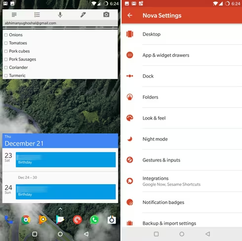
Setting up your launcher will require a bit of work depending on how finicky you are. Finicky’s my middle name, and so I usually head into Nova’s settings, add more pages and spaces to the dock so I can fit about 21 app shortcuts to that bottom row of icons on my screen, set the app drawer to display with just an upward swipe, and fiddle with all the color and transparency settings for the app drawer.
There’s plenty more you can do, such as customizing the grid size on your home screen so you can place icons closer together, configure how folders of icons are displayed, and adjust the animations for actions like opening the app drawer and scrolling through multiple pages on your home screen.
I like my setup to be clean and fuss-free, and I enjoy being able to see my wallpaper, so my setup only features icons on the dock. I’ve also installed the Nova Google Companion so I can bring up the Google feed and search by swiping right, and I’ve got another page on which I’ve got my Google Keep notes and Google Calendar events widgets within easy reach.
I’ve also configured a few gestures in Nova, so I can simply swipe down with two fingers to begin a voice recording with Easy Voice Recorder Pro, and swipe up to begin identifying a song with Shazam – no additional icons necessary.
Widgets
Here’s where you can really have some fun: most apps come with widgets that bring handy shortcuts and content from them right to your home screen (for example, Google’s note-taking service, Keep, lets you create different kinds of notes, and view your most recent ones without having to open the app).
Those are useful in their own right, but you can take things a step further to customize the look of your home screen with decorative widgets. There are loads of standalone widgets available in the Play store, but you might want to look into widget engines that not only support a huge variety of designs, but also let you customize them to suit your needs, and even create your own.
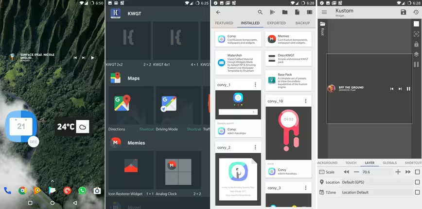
Of the lot of them, Kustom Widget Maker, aka KWGT, is the most popular widget engine available right now. It lets you load up widgets that you can download from Google Play, and allow you to import graphics, create shapes, and set actions for buttons and areas in which to display information from other apps like calendars and music players. In the image above, you can see three widgets on my home screen (a music player controller, a calendar, and a weather display), as well as Nova Launcher’s widget picker screen, followed by KWGT’s list of widgets, and its widget configuration screen.
To apply any widget, simply long-press on the home screen, head to the Widgets section, and choose a widget from any app you like. You’ll need to press and hold on the widget before you can drop it somewhere on your home screen. Once you’ve placed it, you can long-press on it again to resize, move or remove it.
Widget engines work a bit differently: you’ll need to first drop in an empty widget on your home screen, and then tap that space to load up its contents. Let’s take Kustom as an example. Once you’ve placed a KWGT widget on your homescreen (I usually go with 4×2 or 4×1 sizes), tap it to reveal the pre-installed widgets available, as well as those from third-party widgets (they’re automatically added to the list within KWGT’s engine).
Tap on one of them to bring it into the widget customization screen; if you’re happy with how it looks and scales within the widget area, hit the Save icon at the top of the screen, and you’re good
to go. You can tweak things like the information that’s displayed, or which app opens when you tap on the widget, but that might be a bit much for this piece. I’d recommend heading here for in-depth tutorials instead.
One more thing…
If you’re keen on even deeper customization, you can also try Kustom Live Wallpaper Maker, aka KLWP. The paid Pro version lets you load full-blown wallpaper-widget combos that completely overhaul your home screen with a functional background. That means that you don’t have to place widgets yourself; simply find a KLWP app or file, load it up through the engine, and you’ll be treated to a whole new look and feel. Here’s an example I’m enjoying a lot right now:
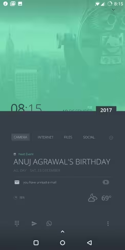
It’s worth noting that this works with any launcher, but you’ll want to hide your icons and widgets so they don’t overlay on top of the live wallpaper and ruin the look of your new home screen.
That’s a wrap, folks! You now know about all the different tools you need to customize your Android interface just so. For inspiration, tips, and downloads, head over to the r/androidthemes subreddit, where people post their own setups and share the necessary files you’ll need to recreate the look on your own device.
We’d love to see your setups too! Share your creations on Instagram and Twitter by posting them with #TNWAndroid, and we’ll publish our favorites in January 2018.
Pro tip: Use an app like Screener, AppWrap, or Google’s Device Art Generator to frame your screenshot with a phone surround for best results.
Happy theming!
Get the TNW newsletter
Get the most important tech news in your inbox each week.
