The arrival of Apple Music brought an update for iTunes on the desktop and while the iOS Music app has plenty of UI/UX quirks that need to be ironed out, it’s the old war horse that’s really struggling.
It’s hardly a new complaint, but the reality is iTunes sucks. It’s the most embarrassing part of Apple’s software suite, a roach motel for half-thought out features, a Hotel California for your media library.
Where iOS has separate apps for music, video and podcasts, iTunes persists in trying to serve all of those mediums well, while also acting as a storefront and hub for your devices.
Rather than write a lengthy essay on all the problems with iTunes, I’ve made this GIF guide to the biggest issues:
1. The ‘hotdog’ menu
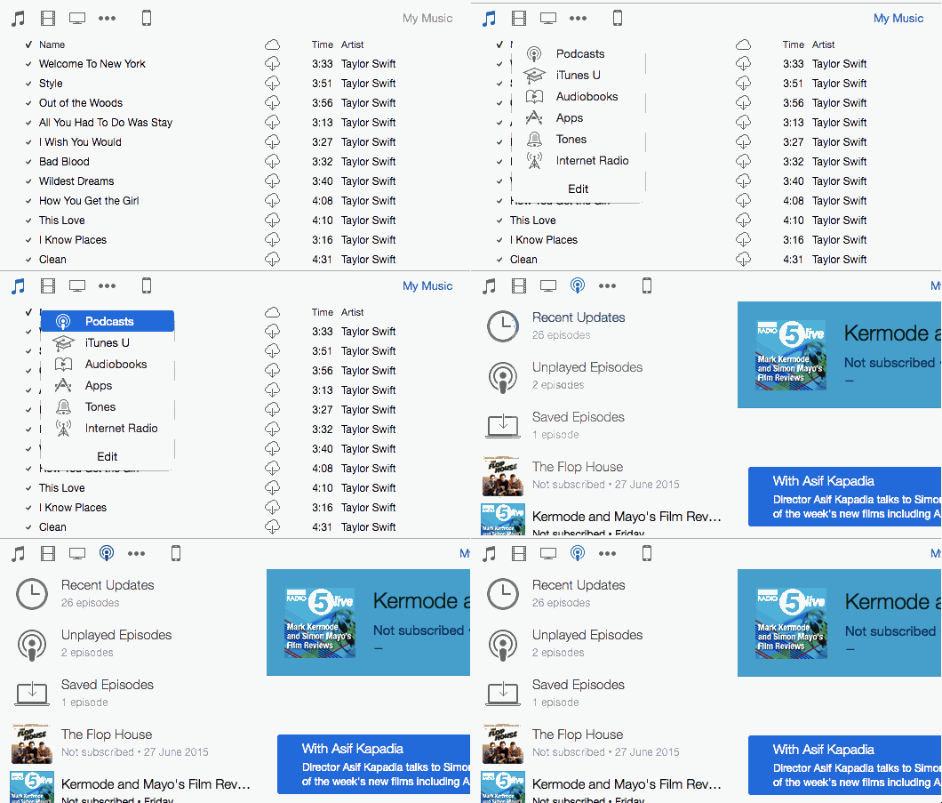
Lots of apps use the ‘hamburger’ menu, iTunes has what I like to think of as the ‘hotdog’ menu, the row of three dots which Apple has tried to stuff with far too many toppings.
Podcasts, iTunes U, Audiobooks, Apps, Tones and Internet Radio used to have their own space in the left hand column. Now they’re relegated to the ‘hotdog’, turning one click into three.
With podcasts growing in popularity, it seems antithetical for Apple to hide them away in iTunes. Especially as it gives them lots of space in the iTunes Store. Meanwhile, Internet Radio should be folded into the new ‘Radio’ section.
The many faces of your music

iTunes can’t decide how to show your music library, so it gives you a handful of different options, each of them with a different layout. It’s just one of many parts of the software that could be simplified.
The status of songs and albums in your collection isn’t well presented either. Occasionally you’ll come across songs that are in the cloud and greyed out, but iTunes doesn’t tell you why that is or what you can do about it.
Everything about Connect

Connect is like a vestigial tail, theoretically useful but ultimately just there for decoration. Like Ping before it, it’s Apple’s attempt to implant a social network into iTunes. It’s unlikely to be any more successful.
Despite getting its own top menu item, Connect feels like an afterthought. The number of shares and likes on posts by big artists suggests users feel the same way. Loren Kramar probably digs it though.
If you actually want to share a post on Twitter or Facebook, what Apple actually delivers is a hunk of unappealing garbage:
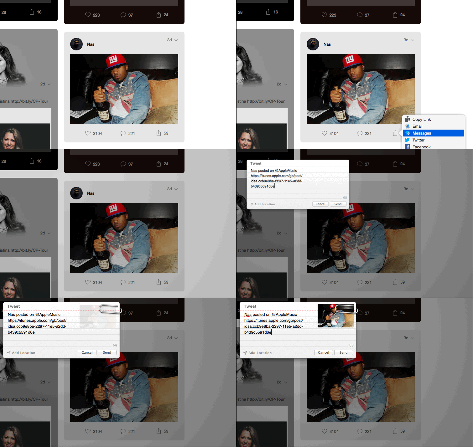
When musicians already have extensive followings on Instagram, Facebook, Twitter and beyond, it remains hard to see why they or their fans would bother with Connect.
@brokenbottleboy @MartinSFP The only useful thing I can add to this is that if you go to Prefs > Parental you can disable Connect
— Peter Robinson (@Popjustice) July 8, 2015
Playlists are a mess
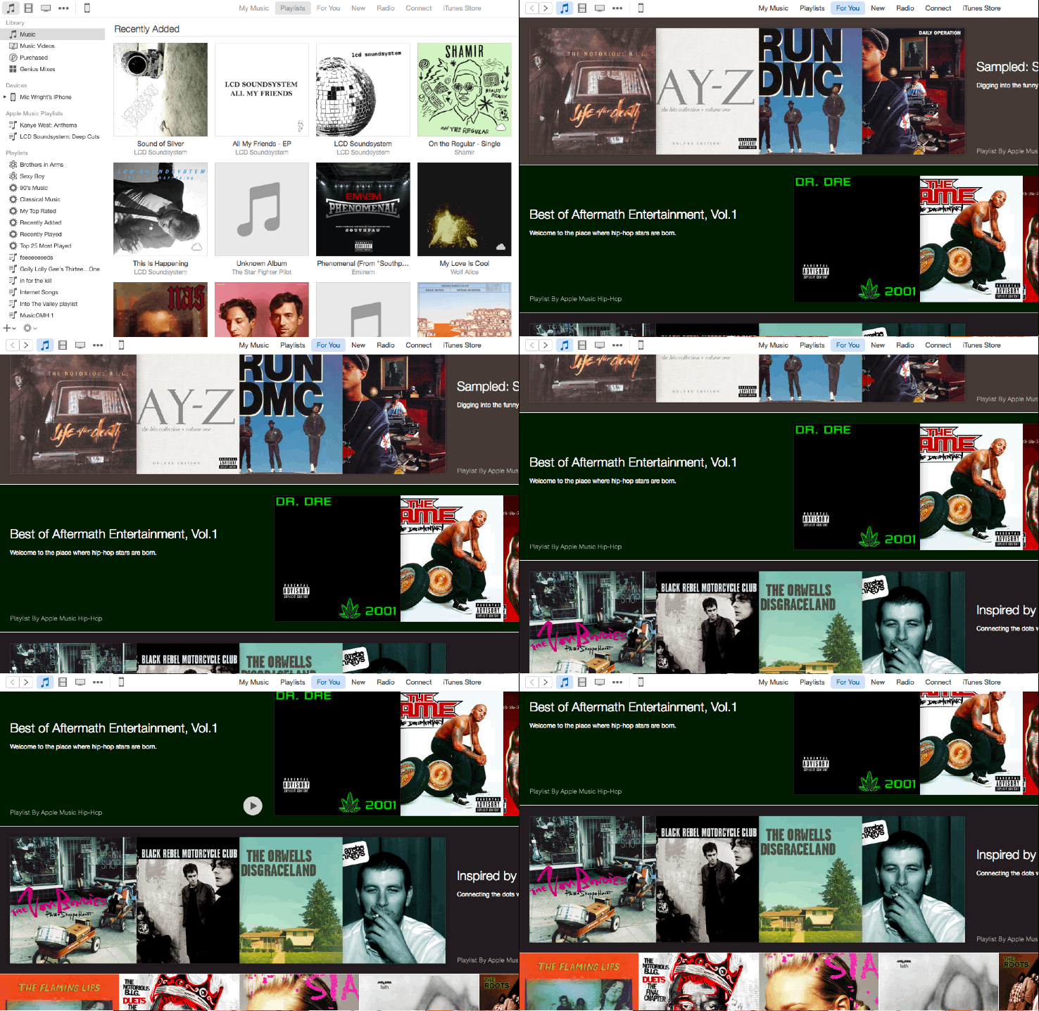
In Apple Music, your personal playlists and the ones recommended to you by Apple live in the same place. That makes sense. In iTunes, they’re split between two separate menu items with distinct visual styles.
You’ll also find more ‘curated’ playlists hidden below the fold in the ‘New’ section.
The entire execution is clumsy and highlights the app’s biggest problem: Every feature is either replicated or over-complicated. Nothing “just works.”
Now we have ‘New’, what is the iTunes Store for?

If you’re an Apple Music subscriber, the existence of the iTunes Store tab in the app is going to become more and more irrelevant. With so much music available to stream integrated fairly seamlessly into your library, buying songs becomes even less appealing than it was before.
Tracks that aren’t available to stream on Apple Music could be shown to purchase in the ‘New’ screen which Apple has added to iTunes. For users who don’t subscribe to the streaming service, that tab could serve in place of the current iTunes Store.
Of course, Movies and TV still need that iTunes Store tie-in, but I’d argue that they should exist in their own, separate and fully redesigned app.
Similarly, the App Store should have a desktop home just as the Mac App Store does – perhaps part of a new app combining the two.
Oh, and I left the slow transition between the ‘New’ and ‘iTunes Store’ tabs in the GIF above to illustrate another issue with iTunes: It’s so goddamn slow.
Details, details, details
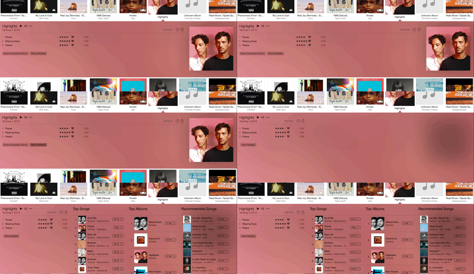
iTunes is just not smart enough. A button like “show related” should offer up other songs in your library that are like the album you’re currently looking at, not simply serve up more songs you can buy.
Apple Music’s recommendations are excellent, but right now they’re best delivered on the mobile app. On iTunes, they don’t feel well-integrated at all.
Similarly, thinks like starring songs to rate how much you enjoy them or the new ‘heart’ function are unclear for users. How do they affect what tracks get served up to you by shuffle or Genius? Hearts from iOS don’t transfer to iTunes with any consistency either.
This is all without getting into the potential for iCloud Music Library to entirely screw up your carefully tagged and edited music library or how managing the music on your phone or iPad has become progressively harder.
I like Apple Music a lot and have found Beats 1 to be a really good station that throws up plenty of new music I want to hear again. iTunes looks even more embarrassing in that context. It’s dragging the good work down.
I know I’ve missed a lot of things that don’t work well in iTunes. Let me know your biggest bugbears in the comments and I’ll add the best of the worst to this guide.
Read next: Confused by Apple Music? Read this
Get the TNW newsletter
Get the most important tech news in your inbox each week.

