Research has shown that the vast majority of mobile users who are looking to download an app already have a good idea of what they want. We know this because according to Nielsen, Forrester and even those who run the store at Google, searches inside the App Store and Google Play make up for a “vast majority of the installs.”
This means that the success of an app comes from understanding how your app stacks up in the search listings versus the actual search intent for all of those important keywords.
It also means fundamentally understanding what users see when they search and how they are pushed from merely browsing to downloading an app.
Understanding search intention and using the right data
When it comes to search intention in the App Store and Google Play, just like any other platform, users are looking for specific features or solutions to a problem. What’s important, however, is that the type of features that users want on their mobile device are vastly different from what is important on a desktop computer.
In essence, search intention is different.
A good way to decode search intention is to look at related queries in both the App Store and Google Play. This kind of data gives you some granular hints into what people actually hope to find when they are searching.
In general, users look for apps that help them with a given problem or provide entertainment. That’s why the games category is flourishing within the App Store. Although it may be counterintuitive, advertising within a gaming app, if it is done subtly and tastefully, is not a disturbance. If anything, it actually helps users discover more relevant apps. However, when its entertainment they are searching for, timing is everything.
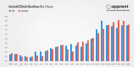
 According to Appnext’s research (see image above), the peak discovery time for iOS is 6-11:30pm. In contrast, for Google Play, 7-10pm is most ideal. Interestingly, data shows that in regards to late conversions, users tend to be most open to re-targeting and re-engagement campaigns between 7-9pm when they are using apps in the utility, personalization, and casual games categories.
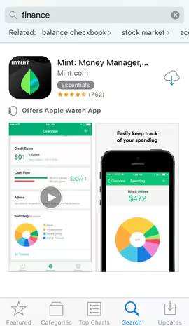
In more specific, instructional categories, users behave a bit differently. Looking at the finance category based on App Store and Play Store search data provided by Gummicube’s App Store Optimization platform from March 2016, it is clear that the types of features users are searching for relate to spending trackers, personal budgeting and ways to save money.

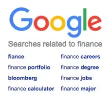
Here’s an example of “related” web data resulting from the exact same search query and timeframe.
 You’ll find that the words users are predominantly looking for pertain to career development. The only real overlap between the mobile data and web data has to do with managing stock portfolios and checking the markets — which is exactly what many people do on their mobile devices.
Conversion optimization at the point of discovery
With so many people talking about “page conversion” (the number of users who visit an app page and then download), it seems that the critical metric of the click-through-rate in a search listing is almost forgotten. Understanding search intention, as we discussed earlier, is necessary because it dictates how to create a search listing that users will select.
Since a clear majority of downloads originate from a search query, search click-through-rate is actually the most important top of the funnel metric that marketers must pay attention to.
There is no coincidence that the top search results in Apple’s App Store carry through the specific keywords and themes that users are actively searching for in the store.
This practice helps them have instant relevance for a user who might spend less than 5 seconds looking at their app listing before deciding whether to click or to pass.
For brands like Intuit, consumers may understand what the app is about just from brand recognition. For newer apps, however, communicating clearly what your app is all about with a smart icon, title and initial screenshot is critical for success.
Too many innovative apps fail because their developers choose to have simple letters or images on their icon that are unrecognizable to end users. This practice, paired with a title that doesn’t quickly describe the most important features of an app, can be the kiss of app death.
It is also important to understand that the structure of an app listing influences app selection.
In the case of Apple’s App Store marketers must focus on the creative displayed in the listing. On the other hand, Google search results are more contextual, featuring a short text description. These two user experiences are very different and you shouldn’t conclude from only one and assume it will work for both stores.

Now that you have read this far, you are probably thinking “this sounds like building a user acquisition funnel” — and that is absolutely correct! However, to be successful, this funnel needs to use mobile data and testing strategies specifically for both the App Store and Google Play.
Summary
Let’s recap the most important points in understanding what users are looking for when choosing an app:
- Understand what users are searching for and use mobile data, not web data
- Be sure that your app features overlap with what users are downloading
- Focus on click-through-rate optimization, not just page conversion optimization
- Creative is important — design communicates what your app is about even before the user reads anything
- The sum of your icon, title and screenshots must be consistent and targeted
Think about this — if you have a travel app that is advertising ski packages in the middle of summer, there is something wrong with your user acquisition funnel.
Needless to say, people are looking for summer vacations at that time. Use this same logic to cater to what users are looking for in relation to your specific app and within the category. Test and update your creative frequently, and think beyond simple page conversion.
Get the TNW newsletter
Get the most important tech news in your inbox each week.


