The inimitable Paul Thurrott today reported two images that detail key features of the coming ‘Blue’ update to Windows 8: the return of the Start Button, and the unification of the Start Screen and desktop interfaces.
I wrote some time back that simply adding Start button to Windows 8 sans other changes would be a bit meaningless. I wasn’t very polite in my views:
The return of the Start button appears to be nothing else than a simple mollification of grousing users: here, have your damn button back. The joke is on the unhappy user, however, as the new Start button will simply send them to the interface that replaced what they had wanted to begin with.
However, Microsoft has made a subtle change in Windows 8.1 that at once answers my criticism, will better quell user angst, and drive more usage of the Start Screen in general: the updated Start Screen will feature the same wallpaper background as the regular desktop interface.
I’m getting a bid ahead here, actually. As Thurrott notes: “However, [the feature] is off by default and needs to be enabled.” If it remains an enable-required option, I will personally key Microsoft’s cars.
Why does the sharing of a background matter? It brings the Start Screen into the user’s mental fold; by sharing a background, the transition from desktop to Start Screen is far less jarring, and, critically, it makes more sense. The desktop wallpaper of a user is usually set by them, making it a familiar sight. Superimposing the Start Screen onto it therefore makes that interface less alien; ah, they user will think, it’s my desktop, but with this new stuff on it.
That’s far better than hitting the Windows key and watching everything you know disappear into the mist as a new interface clunks down onto your display. Windows users know desktop, and by making the Start Screen “more desktop” Microsoft can better bridge the gap between the user interfaces of Windows 7 and 8.
And it’s going to look better, to boot. Here are two clips, again via Thurrott, that show off the new button, and interface:
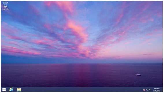
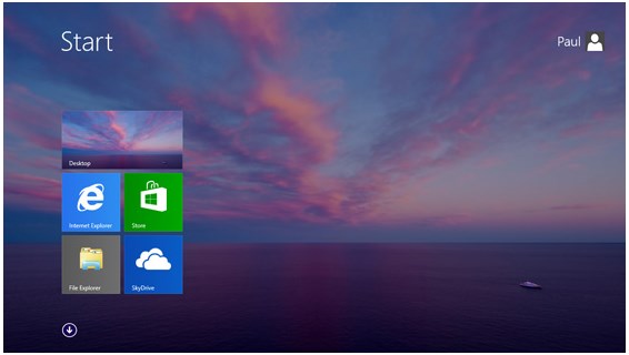
The Start button’s return now matters, as it will help new Windows 8 users better understand a now less-foreign operating system. Yes, Charms need quite a bit more work, but we should see activity at Build in June.
To make all this plainer, let me attempt a summary: Microsoft is bringing the Start button back at the same time as it is better unifying the Start Screen and desktop interfaces. This means that its return will coincide with the possibility of it being useful; had Microsoft not better connected the two interfaces, the Start button’s resurfacing would have simply made users even less happy.
Final thought: If Microsoft makes the Start Screen easier to access, and a more comfortable experience – precisely what the above two changes will accomplish – it will increase user interaction with both the Windows Store and applications that come preloaded. Microsoft must improve engagement with both if it wants to become a real mobile player.
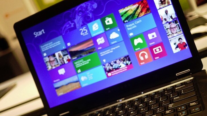
Top Image Credit: Dell Inc.
Get the TNW newsletter
Get the most important tech news in your inbox each week.
