Last week, Twitter introduced a significant update to its service with the launch of an Activity tab that is aimed at helping its users to share information.
There is no doubt that, with hundreds of million of users on the service, every person using Twitter could benefit from a feature that allowed them to find interesting content from those they follow, however it remains to be seen if the Activity tab will catch on for a number of reasons.
What is it?
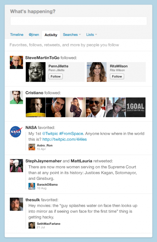
The new tab — added alongside a change to user mentions, which now includes notifications when a users’ tweets are retweeted or new followers are added — sits next to the @mentions one. It is designed to help users find content and information from the people they follow on the service, as Twitter explained on its blog:
It provides a rich new source of discovery by highlighting the latest Favorites, Retweets, and Follows from the people you follow on Twitter – all in one place. It’s easier than ever to explore Twitter, connect with people, and discover what’s happening around the world.
It is a data dump of information and activity from your friends and is reminiscent of Facebook’s news ticker feature. That it is simply a dumb pipe is one of the reasons that I’m not impressed by it, and it is not likely to be a feature that I’ll use, despite the fact that Twitter is my social network of choice.

Yet more information
I follow almost 700 people on Twitter, compared to around 200 on Google+ (many of whom are inactive) and 150 or so on Facebook, which makes it my busiest social network by far. Even though I’m online for roughly eight hours for work each day (and countless more outside of my job), I suspect that I’m not the only person who simply can’t keep up with all the tweets on my timeline.
So the idea that users are going to follow another trail of activity, much of which is irrelevant to them (so what if someone just followed another person?), is just not going to work.
Not personal enough
The tab would do well to emulate Twitter’s ‘similar to’ feature, which appears on the right hand side of the screen when looking at Twitter users’ profiles, which does a good job of matching related users. If you’re looking at the profile of someone who is interesting, this feature gives me a few other people to look at who you may want to follow.
The new Activity tab is just a data dump with no filtering or intelligence added other than the fact that its content is drawn from those I follow, which includes a diverse range of people.
Of course, as with all things Twitter, the innovation could come from outside of the company if a developer or company is able to ‘make sense’ of the Activity tab feed for individual users. But for now, its lack of sophistication makes it easy to forget.
Not detailed enough
Another problem for me is that the level of detail that is shown in the Activity tab is too low to be able to judge whether a user that pops up on it is actually worth following or not.
Unlike the similar followers feature, which shows each users bio, the tab just shows the name of user’s whose content by interacted with those I follow, but not a thing more. That means a lot of clicking through to visit the profile of each user that comes up in the tab, in order to assess whether they are worth following or not. That, or you could follow them all, but that approach isn’t for me as I try to keep my timeline in some kind of order.
Chaotic
While it can be good for finding new content, the Activity tab bundles together retweets, favourites and follows, despite them being somewhat uncomfortable bedfellows. Then there is the issue that certain pieces of content, such as profile pictures, take up a lot of screen space compared to tweets and other content.
It really isn’t easy on the eye, but it could be somewhat fixed if it allowed a user to filter between showing retweets, favourited tweets or new user follows.
Here’s what I really want
I absolutely agree that Twitter could do more to help its users glean information from each other — the average experience is not unlike what it was 4 years ago — but a more tailored, intelligent approach is needed if it is to get my usage.
Like many others, I miss a heck of a lot of tweets, much of which is probably unnecessary, but a significant few messages could be very useful. While there are ways of following specific accounts closely, a feature that could show tweets of significance — perhaps based on click-through rates, RTs, replies, favourites or key words relating to my own tweets, profile, etc. — that users had missed would be universally welcomed.
Short of going back through my timeline, keeping an eye on replies or striking lucky via search, there is no way to see those tweets that are missed because from being busy, on the phone or away making a coffee.
Bringing users back to Twitter.com
With Twitter competing against any number of third party applications to drive users to Twitter.com, a compelling feature, along the lines of what I’ve listed above, could make a real difference.
Twitter.com doesn’t have the columns or on-screen search options of apps — although the company does, of course, own TweetDeck — but, in the opinion of this Twitter bar stool regular, it really needs to bring something more intelligent to the game if it is going to increase usage of its website.
Get the TNW newsletter
Get the most important tech news in your inbox each week.


