Whitney Hess is the cat’s meow in the web design world. She’s an independent user experience designer, consultant and prolific web logger based in New York City. Today, at the Future of Web Design, Hess took the stage to share a universally applicable set of experience design principles that designers should all strive to follow to take a site or product to the next level.
Hess defines guiding principles as the broad philosophy or fundamental beliefs that steer an organization, team or individual’s decision making, irrespective of the project goals, constraints, or resources. She first laid out the visual principles of design including harmony, unity, contrast, emphasis, variety, balance, proportion, repetition, movement and texture. But, she says, creating a good design doesn’t automatically mean creating a good experience.
Hess’s principles can be applied to both online and offline worlds. While you and I might see a normal bathroom door on an airplane, Hess sees smart design. Not only does the bathroom door lock close the door, but it controls the inside light and illuminates the occupied sign. It’s her observant eye and careful thought process that makes her set of principles remarkable. Whether you are dabbling with wireframes, personas, site maps or scenarios, be sure to give Hess’ 10-step philosophy a read here:
1. Stay out of people’s way. “Pave the road for an easy ride,” she says. “Your designs should have intentional and obvious paths.” Hess features Tumblr’s home page as a great example of staying out of people’s way. It’s simple, to the point with an easy sign up and if you want, the option to scroll below the fold for reasons you’ll love the service.

2. Create a hierarchy that matches people’s needs. Make the most important information the most prominent. Hess cites Mint.com‘s Ways to Save page. Mint uses a disparity of text sizes and colors to draw your eye to the most important information.

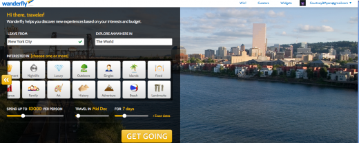
3. Limit distractions. Don’t sell condoms next to the pregnancy tests, she says. Just because items are similar doesn’t mean they should be put together. Hess shows us Wanderfly as a great example of a site that limits distractions. The travel sites’s homepage is a self-contained experience where you can set all the parameters you need to with one main call to action- get going. Interestingly, since Hess last checked, Wanderfly has actually made its home page slightly more complicated…But you get the point. What was once on the left hand side used to be the entire home page:

4. Provide strong information. Remember Tropicana’s epic re-branding fail? No one could tell the difference between the types of orange juice due to poor design. Designers need to provide a clear experience for the user. Hess cites Quora’s suggested search questions as a great example of providing strong information.

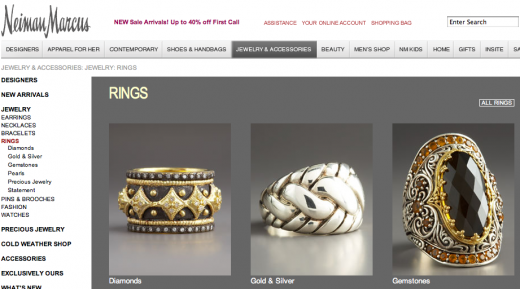
5. Provide signposts and cues. Never let people get lost. Use sub-navigation tools to make your site incredibly clear to the user. Hess says Neiman Marcus does a great job with very clearly marking where you are in the experience.

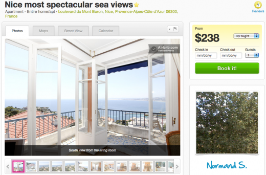
6. Provide context. Don’t make the user go searching for it either. Hess shows us Airbnb’s property listing pages as a great example of providing context. On the site, everything you need to know about the property is in one single contained page.

7. Use constraints appropriately. “By proactively indicating what’s not possible, you make it clear what is possible,” she says. But just don’t be overly cautious. Hess cites the following airline’s warning as a great example of using constraints appropriately:

8. Make actions reversible.
“There is no such thing as a perfect design. We as designers all make mistakes and we have to have a contingency plan. Ensure that if the user makes a mistake that they’re able to easily fix them,” says Hess.
Hess cites Remember the Milk‘s website as an example of a site that uses “Undos” in its to-do list web app.

9. Provide feedback. Hipmunk, a flight search engine that has largely been replacing Kayak delivers a great user experience. When you search for a flight, Hipmunk provides a dialogue box to show you it’s working. It also gives you tips on how to use the interface so you can become a better user of the system.

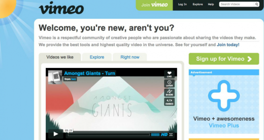
10. Make a good first impression.– Just like in real life, you don’t get a second chance to make a first impression. For designers, it’s important to set expectations and ease them into the process. Hess shows us Vimeo’s homepage, which is simple and not over-engineered.

Hess finishes her presentation by showing the audience the design principles of companies like Google, Facebook and Windows and then showing us how their sites meet the principles (or don’t). She asks, “Without principles, how can we know what we’re trying to achieve or when we’ve reached an achievement?”
Does your company have a set of principles? We’d love for you to share them with us in the comments. We’ll be working on ours too.
You can view Whitney Hess’ full presentation here.
Read all of our coverage of the Future of Web Design NYC here.
Get the TNW newsletter
Get the most important tech news in your inbox each week.


