In case you missed the memo, Apple’s iOS 7 went live today, and many companies will be launching refreshed mobile apps to cater for the new OS. One of those is the New York Times.
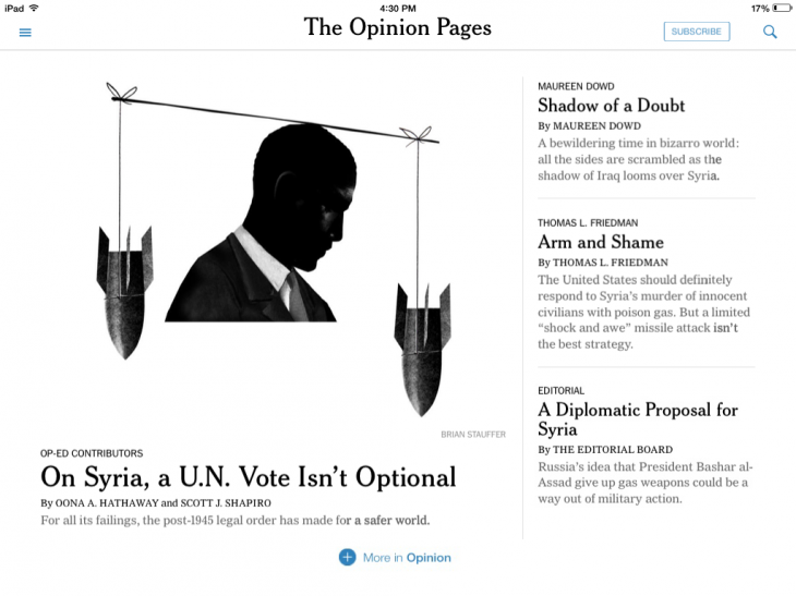
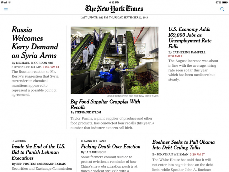
Its updated iPhone and iPad apps are live now, and aim to leverage the new experience offered by iOS 7, with imagery featuring prominently, and “streamlined” navigation. On both the iOS apps, the New York Times has introduced a cleaner design that includes customized layouts for each section of the publication, as well as more diverse fonts.
Specific to the iPhone app, full bleed images will now be used (i.e. edge-to-edge), while it’s also now possible to swipe from section to section, just like the iPad. That said, the iPad’s navigation is changing from swiping pages, to a more scroll-based approach.


“The introduction of iOS 7 allows us to maximize a number of features that help encourage even more serendipity on our iPhone and iPad news apps, allowing users to easily navigate, discover and consume our vast amount of content,” says Denise Warren, executive vice president, Digital Products and Services Group, The New York Times.
Photos, video and other interactive elements will feature prominently, and there will generally be more images and multimedia on the front of sections, with thumbnails for article previews.
Also, with AirDrop finally arriving for iOS 7, users can share articles more easily with other users.
➤ New York Times – iPhone | iPad


Feature Image Credit – Mario Tama/Getty Images
Get the TNW newsletter
Get the most important tech news in your inbox each week.


