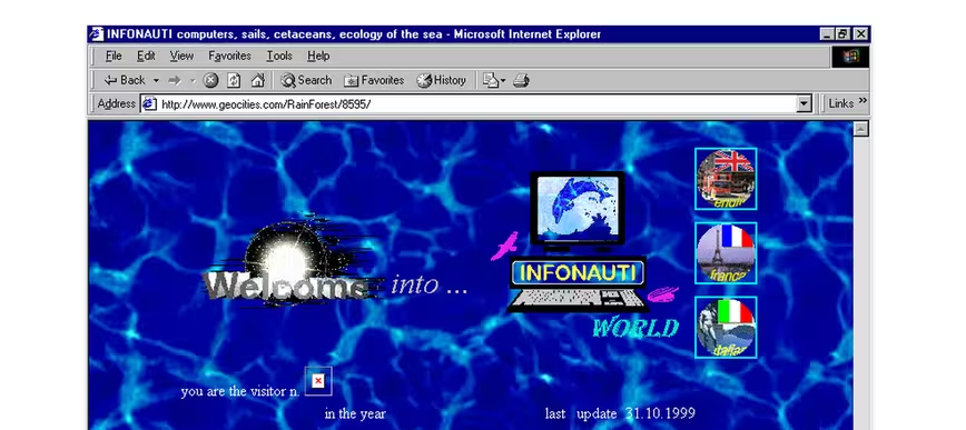
The modern internet sucks.
As HTML5 has hit its stride, we’ve been lucky enough to receive abominations like parallax scrolling, social media buttons everywhere, loading screens for no apparent reason and scrolljacking.
Websites are getting bigger, slower and… frankly, awful.
Yes, the future of the internet has delivered us the glorious ability to finally ditch Adobe Flash and build beautiful websites with complex CSS and JavaScript, but it’s come at the expense of making it an impossible to use nightmare for everyone involved.
Flat design, basically the Web 2.0 of modern times, promised great things and improved the way designers think about the Web. But it’s at the expense of usability and distinctiveness.
It’s often hard to get started on a project. Web developers in 2015 just have so many front-end tools to build their sites with.
Should I use Angular or Ember? Bootstrap or YUI? WordPress or Kirby? Static site or CMS? Gulp or Grunt? React or Polymer? SCSS or… you get the point.
It’s easy to just pile on a bunch of tools and frameworks without thinking of the consequences. Web development got easier in some ways, but the barrier to entry seems to have gotten higher in others.
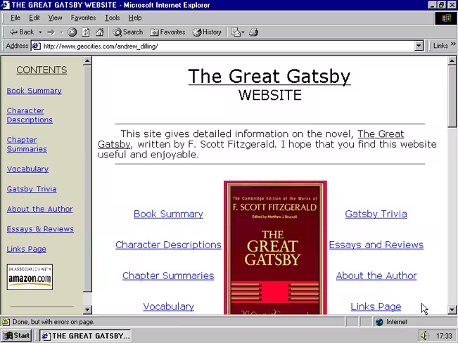
I remember when publishing a website plastered with animated spinning letters that made up ‘under construction’ was perfectly fine. Slapping a few lines of code in a text editor and putting it online was cool and worked okay.
Lately I’ve been longing for the days of Geocities.
When things were simpler and easier, despite being downright hideous. Websites in the kilobytes, not megabytes, that were made by everyone from your grandpa to the middle-grade kids at school. They didn’t have to be perfect, and that was OK.
For serious developers, solving problems was only as hard as tinkering with iframes and tables. If you want a modern throwback to this, try building an email template.
I mean, it was awful shit to work with at the time and I’m well aware I’m remembering it as better than it was, but it sure as hell was more fun.
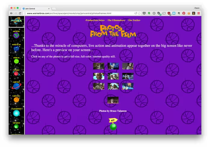
As internet connections sped up, computers got faster and the web got… worse. Building things got intimidatingly complex and the level of “good enough” seems to have risen beyond attainable heights for people who just want to play around.
We had a good thing going two decades ago, why’d we do this to ourselves?!
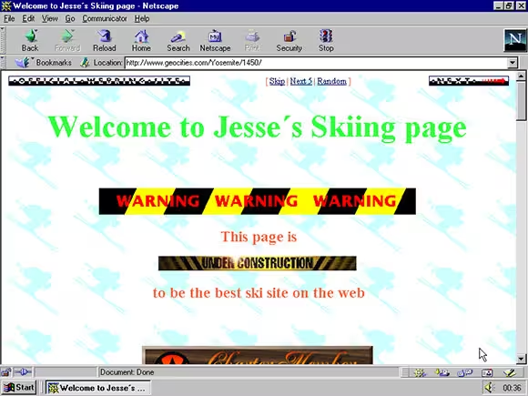
The old internet was content-first and it didn’t matter if things weren’t really done yet. We put them online anyway! Some road-cones would help guide users in the right direction, nothing was ever really done anyway.
I’m aware that I’m remembering the old internet for better than it was — imagine building a website full of table markup for an iPhone — but maybe it’s time to step back again and remember where we came from. You know, the internet of weird shit, where everyone was just building stuff for fun.
In 2015, becoming a Web developer is all about learning Ruby or figuring out Node.js, not just building cool things you like.
The way I remember it, building websites meant just opening a text editor and screwing around a bit with GIFs, weird wallpaper textures and random colors, not spending hours setting up the perfect coding environment, piling on scripts and learning the latest tool.
The days when animated construction signs and rainbow horizontal rules were okay. When blinking text was perfectly fine and marqueeing type wasn’t an eyesore.
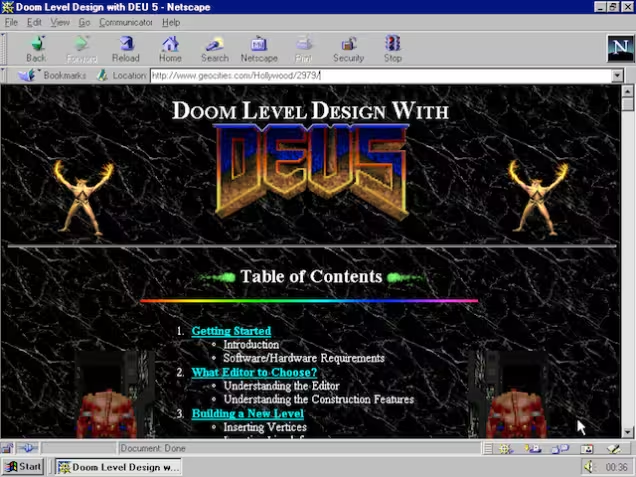
Screwing up your code might have meant you bought down your entire browser, but hey, it can’t be any worse than Google Chrome’s performance, right?
Bring back the weird internet, I think it was better for all of us.
Get the TNW newsletter
Get the most important tech news in your inbox each week.

