I’m not what you’d call a productivity guru. I don’t use any interesting methods or cool combinations of software to do what I do. My philosophy is more along the lines of ‘start doing and stop when you’re dead’.
That’s one of the reasons that I love Fantastical for the Mac so much. It’s a small icon that sits in my menu bar and allows me to quickly dash off appointments and reminders in plain english. It’s blazing fast and it helps me avoid all of the nit picky fields and tick boxes that infest calendar apps, including Apple’s poor built-in option. No fussing, no scripts, no precariously balanced suite of productivity apps that eat up half my day just maintaining.
Today, Fantastical comes to the iPhone bearing that same spirit of no-nonsense calendar management, but with an additional intuitive layer of greatness.
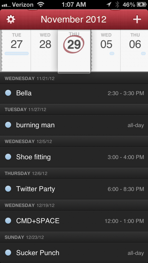
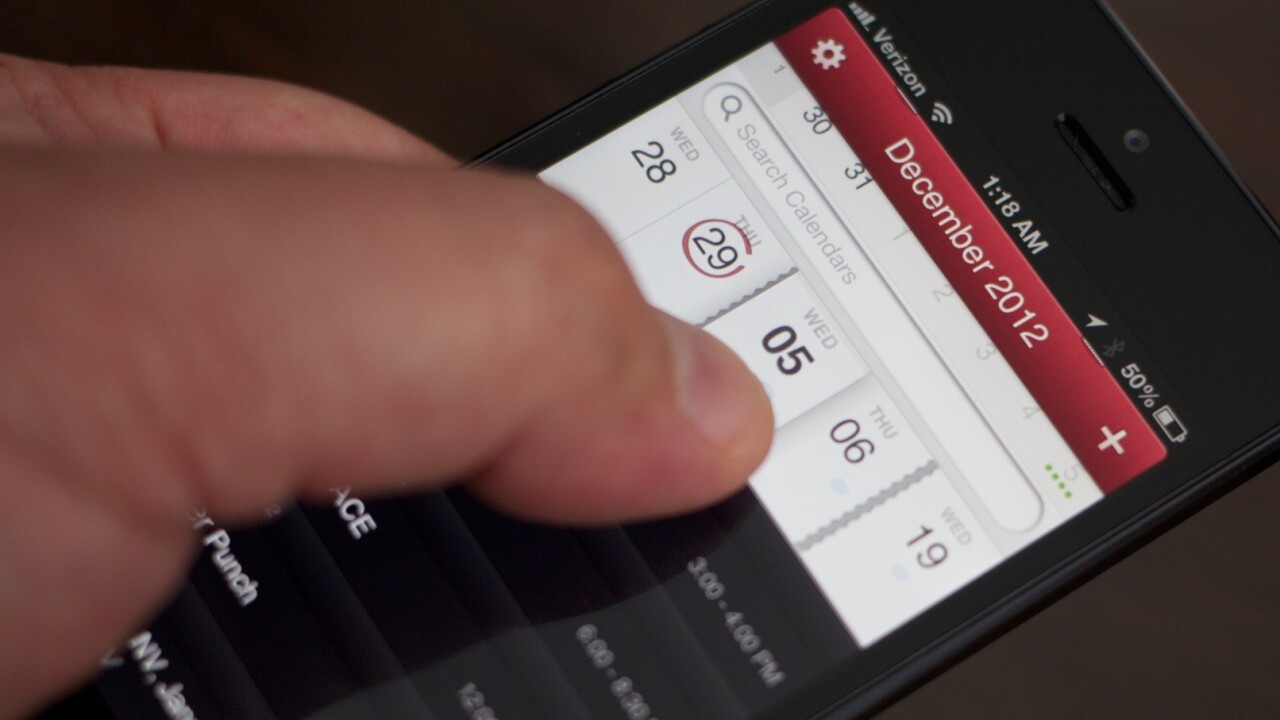
The app features the same natural language parsing engine as it does on the Mac, with the addition of a feature called the DayTicker. The DayTicker is at the heart of the reason Fantastical for iPhone has replaced Calendar for me. It’s a ribbon-shaped display of your current day and the surrounding days that makes it incredibly fast to see what you’ve got coming up at a glance.
The ticker is designed crisply, with a magnifying glass that snaps to a day as you spin through it with a swipe. The timeline isn’t continuous, either. Instead, it shows you only the days where you have something going on in your calendar. In between are small tears that show you that days are missing, but that nothing important is happening here.
This, I believe, is a brilliant re-imagining of the purpose of a calendar. A modern digital calendar should be a list of events, not a list of days.
It seems silly that it would have taken this long for someone to hit on this concept on the iPhone. You can make your display anything that you want, so why do most calendar apps insist on presenting every day in your calendar, even if they’re as devoid of action as your love life.
Reinventing the iPhone calendar seems like an almost Brobdignagian task at first. There’s nothing all that bad about the current version, aside from the fact that it takes forever to enter an event. So much time and tapping, in fact, that I don’t think I’ve entered one manually in the last couple of years outside of testing.
“When we launched Fantastical in May, 2011,” says Flexibits’ Michael Simmons, “we had a lot of requests for an iPhone version. People were actually surprised that we went with the Mac first.”
Simmons and his partner Kent Sutherland saw that the Calendar on the Mac was a bigger problem, a real barrier to productivity, and they wanted to solve that problem first.
“At that point,” says Simmons, “we didn’t really have a concept for the iPhone that we thought would make a really solid app. We knew what some of the problems were, but we didn’t have any solutions.”
Sutherland was the one that came up with the initial idea of the DayTicker as a scrollable strip that was also a timeline. A malleable sequence that molded itself around the events on your calendar, rather than a static representation of every day in existence. The DayTicker concept is what made Flexibits — the duo’s company — move ahead with Fantastical for iPhone, even though it was in the midst of developing a contacts app for the Mac.
“We were so compelled by it, we put our contacts app on hold to work on a prototype of the DayTicker,” Simmons says. “The prototype worked so well that we said ‘we’re going to focus and do this’.”
And once that idea was in place, everything else started to come together. From the idea of the DayTicker, through the prototype and polish stage and on to shipping, the project took less than 6 months. Simmons believes that the speed at which the project came together meant that they had a great idea that needed to be a product.
Though Simmons handles the main design work for Flexibits, Fantastical’s look and feel is bolder and crisper than the smaller and darker Mac app. That look is the work of graphic designer Wolfgang Bartelme, who Flexibits partnered with to polish the app’s pixels. Bartelme is a designer who’s worked on a host of beautiful apps like Djay by Algoriddim, Articles by Sophiestication and more.
His work here is superb. The app has personality and charm without being overwhelming. A hint of texture and staples at the top keeps it thematically close to Fantastical for Mac without overwhelming the interface with arbitrary cutesy details. It also uses trim outlines and transparency to separate events and to keep everything feeling light and fresh. It really is a great looking app.
DayTicker
As I mentioned earlier, the challenge wasn’t just to build a better version of the iPhone’s Calendar app, as it’s not all that bad to begin with. There are a dozen other apps on the market that offer reskinning of the same ‘calendar’ interface, and they definitely look better. But they don’t necessarily work better.
“The built-in Calendar app on the iPhone is not that bad. It’s functional, it works. There’s frustration when you create an event because there are lots of swipes and taps. And anything with a small tappable area causes more frustration for the user,” Simmons tells me. “We wanted to do something more than a calendar app that would make calendaring faster. “Finally, we had the idea for the DayTicker. And we knew, that this was it, this is our solution that we’ve been waiting for to do an iPhone version. We knew we had the natural language parsing. We knew we had some interface things that would be nicer. But those alone [do not] make an app.”
And the DayTicker works as advertised. By default, it sits at the top of the screen, above a list of upcoming events in your calendar. Those events scroll along with the ticker as you swipe along it, presenting a more verbose view of exactly what you’ve got going on. On the ticker, your appointments are represented by color-coded dashes that show you duration.
The ticker’s splits are also carefully designed. If you’ve got events a day apart, for instance, the empty day in between stays in order to help you remain aware of the context. This way an event the day after next won’t sneak up on you because you interpret a tear as a larger period of time.
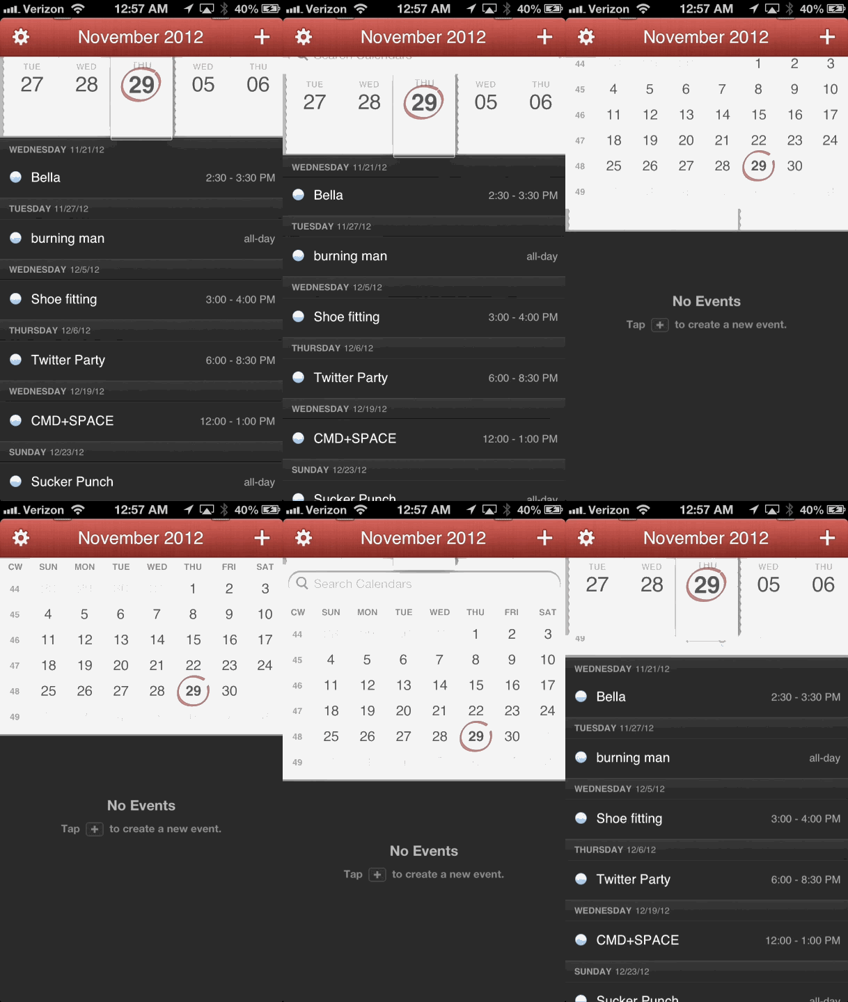
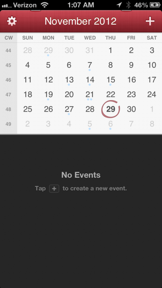
Swiping downwards on the ticker confidently will swap your main view to a more standard calendar view, which still offers the suffix of event details. You can tap about on this view if you wish, but I doubt most users will spend much time here. The DayTicker is such a compelling concept that you’ll end up using it for most day-to-day operations.
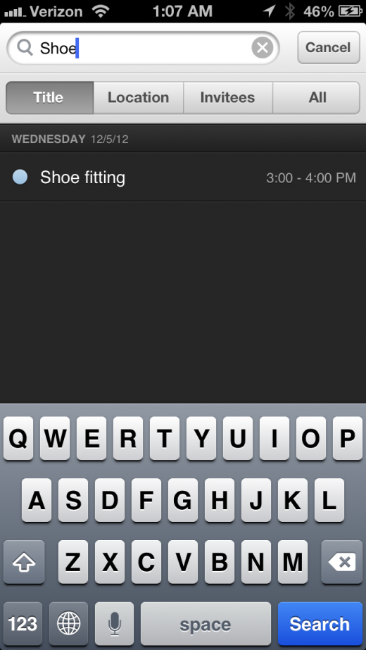
In between the swipe downwards to change is a ‘pull down’ gesture that exposes your search field. In an app that displays a sure hand at nearly every turn, the ever-so-slightly-fidgety nature of exposing the search field was one of my only real sticking points. It feels as if there should be a more concise way to expose the search field, rather than ‘half of another gesture’. It definitely works once you’re used to it, but some tweaking here would be welcome. Perhaps a tap on the split between the calendar/ticker and the list of events.
When you do have the search exposed, you can choose to filter by Title, Location, Invitees or all text in the entries. It works as advertised.
Adding Events
Given that Fantastical for Mac was so good with natural language processing on event entries, it’s no surprise that the iPhone version carries on with that. To enter an event, you tap the plus button in the upper right corner of the main view.
When you do that, you’re taken to a screen that could easily have been the main view of Fantastical, and would have been if Flexibits had followed the paradigm of the Mac app. This screen allows you to just ‘start typing’ to enter an event.
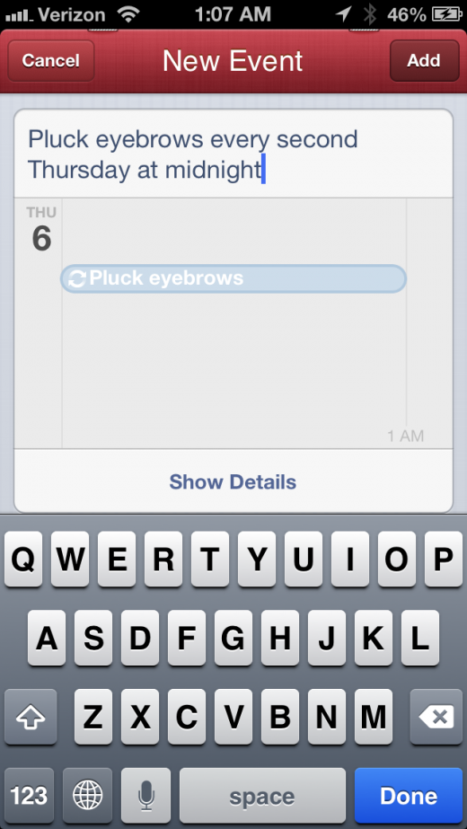
Typing in ‘shoe fitting next Wednesday at 3’ will deliver an appointment set for the next Wednesday on the calendar, beginning at 3 o’clock with the title ‘Shoe fitting’. And it does it all automatically. No navigating through various fields or tapping around little confirmation boxes. Just type and hit the ‘add’ button. It also supports recurring event entry, allowing you to enter things like ”Soccer practice every Tuesday and Thursday at 5pm” or “Lunch every Tuesday until February″.
As you type, you’ll get a clever visual confirmation in which your letters flit downwards as you complete segments, zooming into the appropriate section of the calendar to which they apply. If you enter a date-related word, it flies to the date, changing it when it hits. If it’s a description, it drops into the main view’s event display. It’s beautiful and informative and very clever.
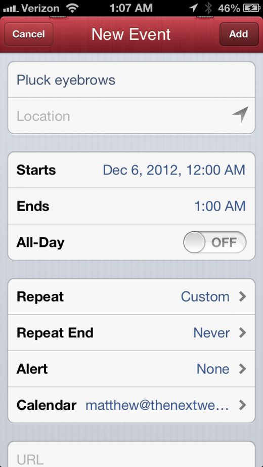
The default calendar is controlled by Settings.app, but tapping the Show Details button gives you access to a full event creation view which lets you manually fiddle and add notes to your appointment. You can also swap calendars and modify your alerts here.
Simmons also notes that Fantastical for iPhone arrives with full Launch Center support. That means that users who like to create shortcuts in Appcubby’s app can blast events into Fantastical from outside the app using a standard URL scheme.
And yes, the main event view does have ‘swipe to delete’.
“We assume that Apple made a decision that delete was a destructive event, so it didn’t want it to go there [in its Calendar app],” says Simmons. “But the odds of someone swiping to delete and confirming it are pretty slim.”
Tapping on any event will take you to the full details page for that event. You’ll be presented with an Edit button, but only for events in calendars that you own of course.
Settings and Syncing
Syncing of calendars is all taken care of by the iPhone’s own calendar section in Settings.app, which is clever. This means no initial set up fuss, no rejiggering of calendar syncing settings or anything at all really. Download and install Fantastical and it’s ready to go from first launch. The normal CalDav and iCloud syncing limitations and speeds apply here, but it didn’t feel materially different from the Calendar app.
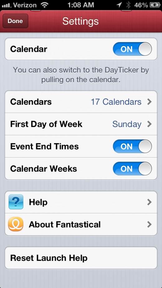
You can show and hide specific calendars, choose the first day of the week, select whether the calendar shows weeks and whether the list shows event end-times in the settings section.
Solving a Problem
“Any app that we do, unless we feel that we’re solving a problem for a user, we won’t do it,” says Simmons. “We really wanted to get [Fantastical for iPhone] feeling right. We spent a ton of time on the performance, you can feel when it’s scrolling that it has a ‘one-to-oneness’ when you’re using it.”
Simmons says that Flexibits, as a studio, never wants to make an app that makes people feel that ‘they just did that to make money’. “Obviously you have to make money to stay in business,” he says, “but if you solve people’s problems, the money will follow.”
He compares it to Apple, a company that owns the platforms that Flexibits has been building apps on for a long time. “If you look at Apple as a company, Apple’s mission has always been to make things better. Not just ‘a cool experience’, but truly better.”
“And there was a period…where Apple was getting ready to fall and go out of business, but still never changed that mission,” says Simmons. “They didn’t just start doing things solely to go after money, they stuck at it and stayed with making the best solution. And luckily…they recovered and their preparation helped them.”
“We believe really strongly in the fact that the solutions in our apps help people, that’s really important to us,” says Simmons. In the case of Fantastical for iPhone, it might actually make you want to use your calendar again, which is nothing short of a miracle for a productivity caveman like me.
Fantastical for iPhone is available now for a limited-time launch price of $1.99.
Disclosure: This article contains an affiliate link. While we only ever write about products we think deserve to be on the pages of our site, The Next Web may earn a small commission if you click through and buy the product in question. For more information, please see our Terms of Service.
Get the TNW newsletter
Get the most important tech news in your inbox each week.
