“Don’t miss out on the this week’s industry trends”, “Sign up to receive the latest insights straight into your inbox” and “Don’t leave yet, why not take a look at our blog?” are all common requests that you come across when visiting websites. What are they? If you hadn’t guessed yet, they are pop-ups.
Hundreds of sites use pop-ups to try and boost their ‘subscribe’ and opt-in rates and to be fair, they do work. But does the rate at which they convert really work compared with the number of people who find them annoying enough to click off your website?
The Good…
The aim of any website is to increase its reach, you want as many people as possible reading your content and ultimately buying your product or service. This is why so many companies have been following the content marketing trend closely, ensuring that they are developing their brand advocacy and gently guiding their readers through the sales process to finally make a purchase.
But what’s the point of all this great content if you have no one to share it with?
Websites will naturally convert but having a pop-up will help to turbocharge those conversions. Take Dan Zarella, the voice of authority on social media. He compared his site before and after the addition of pop-ups and found that his email subscription rates doubled whilst his bounce rates remained, more or less, the same.
Equally, he and countless others are yet to come across any concrete evidence to support the theory that pop-ups actually encourage the drop-off of visitors on your site.
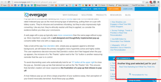
Take the above example from Evergage, I was reading their blog about why pop-ups can actually be a good thing and then a subtle and small pop-up appeared. It was unobtrusive, offered me something of value and was easy to get rid of or ignore if I wasn’t interested in what it was offering.
The Bad…
According to research 50 percent of all ads are closed before they have even finished loading, and whilst this study was only based on a survey of 36 people, over 10 million users of pop-up blocking extensions on Chrome say something about the popularity of these sometimes unwelcome website visitors.
According to general consensus, pop-ups induce the most irritation when they come unsolicited, obscuring the focus of your attention and offer irrelevant information. Most often these pop-ups are for customer feedback or to draw your attention to a new piece of content or product on the site.
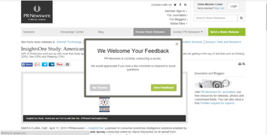
PR Newswire had such an example; almost as soon as a user logs onto their site, a box appears asking for their feedback. Whilst this may be a good way to encourage participation, it would be less obtrusive to ask the user for this information just before they leave your site. There is software out there that is able to track user’s mouse movements enabling you to trigger a pop-up when the pointer moves out of the viewing pane.
And the Ugly.
We all remember the plethora of pop-up dialogue boxes we used to get in the early days on the internet that were almost impossible to get rid of. This is where our mistrust of pop-ups most likely stems from and as marketers and website owners, we want to stay as far away from this as possible. For the most part, websites are employing more subtle pop-ups but there are still a few that persist with more dramatic interstitial adverts.
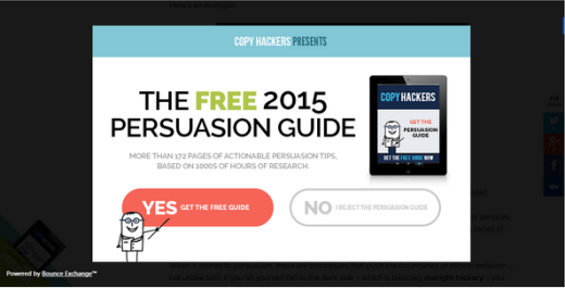
Take this example from CopyHackers, I was actually on their site reading about pop-up efficacy and how to make them less obtrusive and even, less insulting. The article had just explained about the choice of ‘yes’ and ‘no’ language and how some ads use phrases that could be insulting to the user, when this pop-up appeared.
It seemed ironic that they were doing the opposite of what they advised in their article. Alongside this you could only close the pop-up by clicking the ‘no’ button, rather than just clicking anywhere in the background, all the while the ‘yes’ button was flashing incessantly to try and get my attention. Not very persuasive eh?
So what can you do?
It is evident then, that there are certain ways to ‘do’ pop-ups. There is no concrete evidence to support the fact that they encourage user drop-off (bar the general annoyance of users when they come across them). In fact, there is more evidence to support the fact that they do work, when they are done right.
If you are going to implement pop-ups on your site, it would be worthwhile bearing the following in mind:
- Test your pop-ups, then test some more. They are not right for every site and some pop-ups take a few amendments to get spot-on.
- Keep your pop-ups unobtrusive. Your user hasn’t come to your site to be bombarded with them, but a gentle nudge in the right direction isn’t a bad thing.
- Make sure you offer something of value to your user – in the Evergage example, their pop-up offered tailored content based on what had previously been read by the user.
- Tailor your pop-ups to user behaviour – triggering as soon as they land on your site isn’t always the best tactic. Consider using mouse tracking to fire pop-ups just before a user leaves.
- Display a clear way for the user to exit the pop-up, they don’t want to feel forced into clicking through to something they may not be interested in.
- If you have a lead generation pop-up, the fewer fields the user has to fill in the better. Don’t forget, we’re all inherently lazy unless there’s something really good in it for us.
Bear these things in mind and you will start to see the benefits of using pop-ups with minimal USER EXPERIENCE disruption on your site. In the long run, you will see more quality readers, subscribers and, all being well, customers.
Read Next: This Chrome extension kills website overlay popups
Image credit: Shutterstock
Get the TNW newsletter
Get the most important tech news in your inbox each week.


