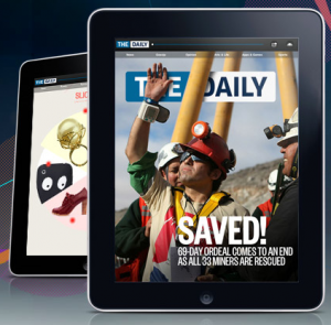
 So, after months of speculation, Rupert Murdoch’s ambitious iPad newspaper project The Daily is finally available in the US App Store.
With $30 million invested in it, does it deliver on the huge amount hype and expectation built up around it? Here are my first impressions.
The launch event said all the right things
Watching The Daily’s live video streamed launch today, it was hard not to be impressed as a product was announced that appeared to answer many of the criticisms levelled at iPad magazine and newspaper apps to date.
It’s cheap: Many iPad magazines and online news subscriptions are criticised for being too expensive – they simply don’t pass on savings in production brought about by not having a physical distribution network to customers. News Corp is passing on these savings in production costs by charging just 14 cents per day, $1 per week or $39 per year.
It’s ambitious: As an operation, there are no toes being dipped in the water here. News Corp has invested $30 million in developing the product and says he wants to sell millions of subscriptions. With an editorial staff of over 100 journalists, including some in-the-field reporting in places like Egypt, and low operating costs of $500,000 dollars cost per week, this is no flash in the pan attempt at an iPad newspaper.
It’s not just “Daily”, they claim: One concern ahead of launch was that it would literally be updated once per day. To audiences used to real-time news, this just wouldn’t be acceptable. The app will supposedly be updated with news as it occurs, and the editorial team can push breaking news into the app via a news ticker if required. It will certainly be interesting to see how they achieve this without breaking the flow of The Daily’s format.
It’s shareable: As it was put in the press conference, “The Daily is not an island”. One of the criticisms of many iPad publications is that they’re completely cut off from the Web. The Daily features links to external websites, plus Facebook, Twitter and email sharing. That sharing isn’t perfectly executed though, as we discuss below.
So, does it deliver?
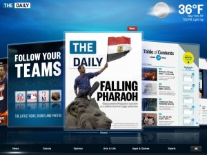
 Loading up the app, it’s hard not to be impressed by the slick video animations and beautifully laid out pages.
Casually flipping through the pages, it’s easy to see that this is a quality production. The writing is generally top-notch and the video reports are as good as anything you’ll see on most TV news shows.
It feels more like a magazine than a newspaper. Maybe it’s the full colour presentation and the video features, but it doesn’t feel much like the “newspaper” it was reported to be, ahead of launch. Seeing as there’s no paper involved anyway, magazine probably works better as a description anyway.
Quality of the content aside, it’s incredibly frustrating to use at times:
The first issue is light on ‘serious’ news: Supposedly aimed at “everyone” (according to the press conference), the first issue’s content definitely sways toward the “light” side of things. Following a report on the situation in Egypt, we get a gallery of photos from snowstorms in the USA, a video report from a prison where inmates makes toys and a story about a disco for dogs – it’s not exactly hard news, on the whole. On pages where serious topics do get a mention, there are sometimes odd juxtapostions. “Missile marketer’s US-to-Iran pipeline” shares a page with “For Grandpa, exercise is worth the weight” and a short piece about Vladimir Putin being a fan of Naomi Campbell – an odd choice of stories to place together.
You can’t search for articles: The main navigation is a revolving carousel of pages, and you can skip to individual sections like ‘News’ and ‘Gossip’ via bookmarks below it. BUT: there’s no search! I wanted to find an article about Bollywood that I had been reading earlier – and I have no way of finding it again without scanning through page after page of other content. I could have ‘Saved’ it earlier, but I didn’t know I’d want to look at it again.
While this encourages a serendipitous approach to discovering articles, it really doesn’t work for an audience used to the “find anything, any time” Internet.
You can’t zoom in: Pinch-to-zoom is nowhere to be seen, so if you find it hard to read small text you’re stuck.
Sharing is flawed: Share an article with Twitter and the iPad keyboard covers the button that lets you post the tweet. If you don’t know how to hide the keyboard you’ll give up in frustration. If you do choose to share, people who click through on your shared link will be taken to a version of that single page on the web – not a whole article if it’s spread over multiple pages.
The way around that (for now) is to share all the individual pages of an article separately, but it’s clear that the only reason you’re supposed to be sharing is to encourage your friends to subscribe to The Daily. That’s understandable of course (they want you to subscribe) but it flies in the face of the sharing we’re used to online.
Questions for the future
 There are still questions that remain about whether The Daily really is the right model for the future of news.
Its target audience: People won’t subscribe to a newspaper they dislike. A lot of that depends on the political “voice” of the writing. Will it be right-wing like much of Murdoch’s output, or will it opt for a more centrist tone to appeal to a wider market? When the panel was asked at the press conference about this, the answer was simply “Read it every day and find out”. The same answer came back when the panel was asked about the level of resources that would be invested into investigative news reporting. It appears that much of this is still fluid and we’ll have to wait to see how it plays out.
Not-quite real-time news: With one major update per day, with updates pushed out as required (an we don’t know how often they’ll be), will that be enough for a web-savvy instant gratification generation, or will they just turn to Twitter for their news?
Other countries: There was no word on when The Daily would be launched outside the US. While it’s possible to download it from anywhere (if you know how) and use it at the moment, we imagine that after the current free two-week trial period is over, US payment details will be required to subscribe, but we’ll have to wait and see about that.
We imagine that Murdoch will want to have a local news team in each country he launches The Daily in, to provide specific news for that market. While that makes sense, it goes against the idea that there’s a global market out there – why limit yourself to the US when others around the world will gladly pay?
Our verdict
The Daily is, in all, just a magazine – a nicely presented, multimedia magazine with lots to read, but just a magazine nevertheless. In the face of innovative social magazine hybrid apps like Flipboard, it feels very much like an old media experience in new media clothing.
Once the UI issues are fixed (especially the need for a search feature) it will be probably the best iPad magazine out there, but don’t get too excited. It will develop over time of course, but version 1.0 is unlikely to get you switching from reading your news on the Web, much to Mr. Murdoch’s annoyance.
Get the TNW newsletter
Get the most important tech news in your inbox each week.


