Android phones are not known for their beauty. There have been bright spots here and there, like the Burtonesque original Droid, the Nexus S and, more recently, the HTC One X. But for the most part, they’re not really known as sharp dressers.
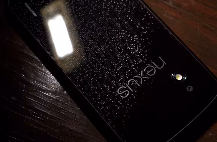
The Nexus 4, however, is a bit of a clothes horse. It’s dressed front and back with Gorilla Glass 2, a tougher variant of the stuff found in the iPhone 4 and 4S. It’s got a deeply intriguing rear face that scintillates in light, and the subtly curved front glass is welcoming. There are pleasant details, like the fact that Google has managed to keep the front face logo free, and that the back is limited to just two: The Nexus imprint and the logo of its hardware partner this time around, LG. Yes, it is mildly hilarious that a high point of the design of an Android device is that it doesn’t look like a Formula 1 racer, festooned in sponsorships, but such is the state of things.

Note that the glass front and back are both flush with the edges of the phone, this means that there is potential for it to get scratched, both on the front face and the back. Though no more so than say, the iPhone 4/4S.
More nice details include the camera that is set behind the large rear plate of glass, without any lens cover of its own, that’s slick. The only speaker is a sharply cut sliver in the back that can get blocked if you lay the phone down (which is why Apple puts the speakers on the bottom on its iPhone), but gets amplified when you hold it in your hand (which is better than it being blocked by your pinky). The chrome edge is subtle, and tinted, rather than raw, in order to blend well with the darker screen and siding. The soft touch rubber of the edges provides grip in the hand, which makes for easy manipulation, but could lead to peeling over time as tends to happen with these.

The overall impression of the phone is one of schizophrenic polish. Staid and glitzy at once. BlackBerry in the front, party in the back.
But I like it, I like it a lot.
It’s compact and dense. Smooth to the touch, but with friction in the right spots. It feels a lot like a Motorola product in that way, tough and worthwhile. The subtly bullnosed glass front is great to touch, and serves the edge swiping actions found in Android 4.x nicely. The Nexus S and Galaxy Nexus had a curved banana shape that—though striking—smacked of Peacocking. The Nexus 4’s screen is directly informed by the software that runs on it. Whatever whip Google was using on LG here, it worked, because the Nexus is better than any device I’ve ever seen come out of that company.
Some very small details do bug, however. The volume rocker needs more definition as it looks like a single bar, with no indication that it is two buttons. The screws on the bottom are ugly, and bring down the build grade of the package. The volume button and power button display slim gaps between the body and the buttons themselves. It makes you appreciate the difficulty in building a seamless device like the iPhone 5 even more.

Oh, and Micro USB is terrible. I don’t care how universal it is, it’s an awful connector and I would gladly pay Google $20 per cable for a month of Sundays if it could come up with something that feels as good as a Lightning connector. That’s not really a fault of LG’s, and people will appreciate that you can charge it with the cable you got in your cereal box, but once again, it doesn’t match up with the polish of the rest of the package.
The Nexus 4 is an enormous step forward in build quality for Google’s titular lineup. It’s not perfect (the soft touch still worries me), but it’s far better than the Galaxy Nexus, which was a cheap feeling, creaky, thin-backed nuisance.
Honestly, it feels like the first real success that Google has had practicing its collaborative design philosophy in smartphones. All while eschewing the auteur approach taken by Apple, Google and now Amazon, who control their designs start to finish.

The screen, however, is too large. It requires a lot of stretch to get out to the upper corners of the 4.7″ rectangle. The Galaxy Nexus was at the upper end of usability, and the Nexus 4 scoots out beyond it. You’re going to be adjusting your grip and straining your thumb to reach buttons on the Nexus 4, though the larger screen does mean more viewing area for text and movies. The screen is bright and colorful, though ‘grainier’ than the iPhone 5’s. It also uses a type of lamination process LG calls ‘G2′, where the screen is bonded to the Gorilla Glass 2 cover, similar to Apple’s in-cell design. This shows, as it’s a close second to Apple’s best in class screen, and far and away better than the punchy, over-saturated blockiness of the Galaxy Nexus’ panel.

I’m sure someone will break down the performance of the 1280 x 768 IPS panel in mathematical terms, but it should be enough for most people to know that this is one of the best screens I’ve seen shipped on an Android phone.

Another area where the Nexus 4 gets a massive leg up is the 8 megapixel camera. It’s better in low light, bright light, every kind of light than the Galaxy Nexus, with quicker firing action and more accurate color. In the unit I tested, however, the autofocus was extremely jumpy, re-acquiring every couple of seconds in a blurry, jerky motion. It seems like it’s a software thing, and if so will hopefully be fixed. It’s a great experience for an Android phone’s camera, but it’s still eclipsed by far by the speed and image quality of the iPhone 5.
Which makes this as a good a time as any to talk about Android 4.2.
The future of Android is Google Now
There are about 10 new features in Android 4.2, most of which can be used on the Nexus 4. These include mostly minor things like a new swipeable keyboard that is competing with Swype and Swiftkey, lock screen widgets, screensavers, accessibility improvements and improved notifications. But there are several marquee bits that are worth discussing further.
I couldn’t test the Miracast AirPlay alternative as I don’t have a compatible device, but lets assume it works as Google says it does. Since the feature is a cross-manufacturer standard, it should end up showing its face in a variety of external boxes and TV devices, much in the way you can find AirPlay in a variety of Apple partner hardware. The difference here is that, though there is a regulatory standard – any manufacturer can get in on the deal. Nexus 4 maker LG has already said it will put the feature in its TVs.
I’ll believe it when I see it. Since this is a universal standard, it’s a bit of a different game than when Google’s Eric Schmidt said that almost every TV sold this past summer would have Google TV in it (didn’t happen). But the situation is remarkably similar and I’d love to see whether this one actually happens.

The Photo Sphere panoramic feature uses similar technology to how Google stitches its StreetView stuff together, to make pano images that can be wrapped to a sphere and virtually toured in Android 4.2 or on Google+. The viewer code can be implemented by anyone who wishes to, so you may see other viewing locations pop up.

The actual shooting of the images is quite slick, and very, very fast, likely due to the top-notch 1.5GHz Snapdragon S4 Pro processor. It works fine, though very few people will use it more than once.
Thankfully, whatever irritating sloth was left over from Jelly Bean’s ‘Project Butter’ updates seems to have been polished out, at least on the Nexus 4. It’s simply not anything to crow about, however. This is one of the most powerful processors ever to ship in a mobile device; if you can’t make your OS run smooth on it, you’re doing everything wrong. The problems with performance typically stem from the fact that much of Android is still built using Web technologies, as it was in the early days. Now, however, much of the UI and many popular third-party apps use the new hardware acceleration frameworks in Jelly Bean, so the experience is a lot smoother than it has been in the past.
I’ve been (I feel) justifiably hard on Android performance in the past, but the Nexus 4 presents a smooth and powerful version of the OS that appears to have left its jankiness behind on other devices like the Nexus 10.
Still, many small Android irritations still exist. The inconsistency of the back button behavior has yet to be corrected in Jelly Bean. Installing a previously purchased app requires four taps for every app, rather than the one it should. The software rotation of Jelly Bean feels hard and the tolerances are weird, leading to some back and forth trying to get it in and out of landscape.


There’s a fantastic new little button in the upper corner of the Notifications pane that lets you access quick settings. This needs to come to iOS, it’s brilliant. For quicker access, pull down with two fingers.
But the jewel of Android 4.2 is absolutely Google Now, and its brilliance overshadows the still lacking aspects of the OS as a whole. If you doubted that Google Now was the future of Android, 4.2 should clear that up for you.


Google Now is classic modern-age Google. It combines a spare interface that sits somewhere between its ‘page of 10 blue links’ and Microsoft’s Metro language. It features the Voice Search component (Google’s Siri competitor), mixed with Google’s Knowledge Graph information and auxiliary bits like location data and personal info. You access it with a swipe upwards from anywhere on your device, locked or unlocked.
It’s clean, information rich and incredibly useful. It presents contextual information in a series of cards that fall into categories like weather, traffic, next appointment, travel, flights, public transit, places, sports, public alerts, movies, stocks, news update, photo spots away from home, concerts and birthdays. All of those categories deliver cards based on contextual information that Google gathers from your location, your habits, your searches and more.
Search for your favorite sports team a few times? Now will start to tell you when they’re playing and what the score is. Spend a lot of time in one place and then move a distance away quickly and Now will know you’re traveling and recommend photo opportunities nearby. It’s breathtakingly brilliant and invasive all at once. But it’s also extremely useful.
And Android 4.2 now crawls your Gmail account as well, with your permission, offering you information on your packages, flights, hotels restaurants and event bookings. It’s like Tripit and Siri and a half-dozen other apps rolled into one. It’s really fantastic.
The best thing about it? It’s completely automated. There are no buttons to twiddle, no questionnaires, no startup acclimation period. You switch it on, and boom, it works. This lack of friction is part of its brilliance.
No one else has anything like Google Now. The closest analogue is Apple’s Siri, mixed with Passbook and a couple of third-party iOS apps like Tripit, but it’s presented all in one place. Google Now is Google at its best. It assembles bits of information—gathered by one of the biggest information connecting companies ever—like a robotic cup stacker, building them into something truly useful and unique.
If the Knowledge Graph is the company’s connecting tissue, weaving its various properties together, Google Now is the end result of that labor, the front-facing fruitage of its fact-finding frottage. And its something that no one else has, not Apple, not Microsoft, not Amazon, nobody.
Unfortunately, Google’s own apps are where the software honeymoon ends.
App Letdown
Every time a new Nexus device comes out, I make it a point to try it out. It’s Android Prime, the benchmark experience, what Google wishes it could deliver to ever consumer, but can’t. Unfortunately, the same thing happens every time I do. I appreciate the improvements that are there in Android, and I get frustrated at the lack of coherence in design language and performance. Then I play with the Google apps and they’re pretty good. Then I try to find a core set of great third-party apps that really show off the system and fail miserably.

The basest elements of Android’s makeup end up working against those who would produce pixel-perfect and polished apps for the platform. There are so many devices, with so many screen resolutions, that it’s difficult to tell how they will display on all of them. So many apps are built-in responsive-web-like configurations, which offer flexibility, but essentially look like a bundle of user interface elements thrown into a bag and scattered out onto the screen in a jumble.
There are exceptions, the rare Android app that looks and works just as well as their iOS counterparts, built by companies that care deeply that the designs work well. doubleTwist, Instagram, Alfred, BaconReader, Bump, Foursquare; there are examples out there. But, by and large, the best development houses, with the best artists and programmers, still build for iOS first.
Until that trend starts to swing, Android will always be a second-class citizen when it comes to great app experiences, and its up to Google to convince developers that they should do otherwise. The raw app numbers are now in parity, but the quality level is wildly in favor of iOS.
The LTE elephant
The Nexus 4 does not have LTE. This is very, very silly and should be a huge negative for anyone who lives in an area where there is LTE coverage. Google says it’s because they wanted the greatest interoperability between carriers, but that totally ignores that they could have offered LTE and an HSPA+ fallback for those without.
I’ve gone over this in length already, so I’ll just put this here:
The real question is why Google is so beholden to the carriers. And the answer goes back to the very beginnings of Android, when Google gave up control in order to speed adoption of the platform. Apple took the world by surprise completely with the iPhone and Google had Android in their pocket already. So they pivoted it from a BlackBerry clone into a full touch-screen OS and shopped it out to the carriers and manufacturers as a way for them to get a smartphone on the market to compete with Apple that they could still shove their crapware and carrier billing systems into.
It was a deal with the devil, made in a moment of desperation, and it’s been haunting Google ever since.
For more on why Google says it doesn’t have LTE, and why that shouldn’t be any excuse, just read the piece.
If you’re not in a region that has an LTE network available, then you’ll love the price tag though. The Nexus 4 is offered in an 8GB flavor for $299, but 8GB really isn’t enough for a modern smartphone. Though a lot of media is available in the cloud, data caps make it impractical for the majority of us to burn through data trying to sync our data. We need it on device. That’s why the best buy for most will be the $349 16GB model.
Nexus Becomes a Family
With the Nexus 4, 7 and 10, Google is finally evolving the line into a family of devices. We knew this day would come sooner or later, but it’s only now that the company’s plan to produce an entire lineup is coalescing. The Nexus 7 is good, the Nexus 4 is really good and the Nexus 10 is a lesson in misapplied force (more on that later). But the package together offers Google ecosystem users more choice than ever.

Google Now is tying all of these options together with a unified and unique service that only Google currently offers, and that I’m not sure anyone else can actually deliver. People complain about how deeply Google has its fingers in your data pie, but Now is a very good argument as to why they should be given that access. Still, if you feel Google already knows too much about you, you’re going to absolutely detest it.
Unfortunately, because the app selection is still not up to par, there is little reason for any heavy app user to make the switch, but if you’re already drinking Google juice, there are very few cups that are better than the Nexus 4. Unless you want LTE, then get a Samsung Galaxy S III.
Get the TNW newsletter
Get the most important tech news in your inbox each week.